Sabres vs Bruins


vs
SABRES
BRUINS
5-4
6-2

The Aesthetics
It's a bit of a toss-up here. I think both logos are pretty aesthetically strong. But these are both logos that have been changed in the last couple years. As far as improvements, I think both are better than what they had, but that the Bruins logo is more of an improvement than the Sabres. The return to traditional colors was nice but for a way to make it better, just ask John Slabyk.
Bruins

The Nickname
This would have been a good showdown if it was bruin and buffalo. But instead, it's Bruin versus Sabre, and with the latter in the hands of an experience swordsman, I have my doubts for the big bear.
Sabres

The Analysis
Neither logo portrays its name it's meant to very well — although the case has been made that there's a blue sabre along the back of the buffalo with the horn also serving as the handle. I'd still like to see the secondary logo on the crest sans the word marks, but that may have to wait until the day third jerseys make their glorious return.
Sabres


WINNER
2-1


Wild vs Coyotes


vs
WILD
COYOTES
11-2
5-4

The Aesthetics
Well this is it for the Wild — last match of the tournament. They're going to be the first ones finished. And for that, we're going to milk this forest scene for all its worth. If you don't see how cool it is, then I'm convinced you're blind. That coyote just looks awkward to me. But then again I didn't hate the original Coyotes logo from the late '90s.
Wild

The Nickname
The Coyotes live in the Wild, true. But so do bears.
Wild

The Analysis
I've said it all before about the Wild logo. I'm not sure what else I can add. It's really a great team icon. But just one more time for posterity: Inside the outline of a bear's head you've got a beautiful forest scene featuring trees, mountains, a river, a sunset and — wait for it — the north star in a fitting tribute to the history of The State of Hockey. Anything I missed? I think the Coyotes logo is designed well but it doesn't have nearly the depth of the Wild. And that's that for the Wild in this tournament.
Wild


WINNER
3-0


Capitals vs Thrashers


vs
CAPITALS
THRASHERS
4-6
5-6

The Aesthetics
The hockey sticks in these logos abound. But that's fine, what I'm staring at is the wordmark that the Capitals are calling a logo. The Ducks made this mistake and I hope they're going to learn from it. Seems we'll have no such luck with the Caps. Plus I think the Thrashers logo has a sharp and rather unique color scheme.
Thrashers

The Nickname
Hmm. Maybe the Thrashers open fire on the Capital by freeing their "droppings" on the buildings causing mountains of paperwork as the government tries to get it all cleaned up. Stretch, yes.
Thrashers

The Analysis
I'm sorry, I was a fan of the Capitol dome logo. I don't know why it had to go just because the colors got changed. But who knows why the Capitals do anything? But I can't in good conscience allow them to have this point. That's a neat bird on that Thrashers logo.
Thrashers


WINNER
3-0


Announcement Teaser

I know I promised an announcement today with regard to the future of the NHL Tournament of Logos, but something came up that prevented me from doing so. Without a doubt, you can expect that announcement to be posted early Sunday. It's nothing earth-shattering despite the hype I've been giving it, but for anyone who's been following along, I'm sure you'll be interested to know. So I'll give you a little preview.

Starting in a couple of weeks, we'll begin a process wherein you will vote for the best logo in the NHL. You shouldn't be surprised. Over 300 people have said they'd vote if I make the site interactive. So I'm going to do just that and tomorrow I'll outline just how that will work. Thanks for reading guys!

Panthers Unveil New Uniforms!

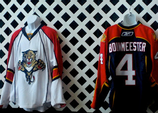
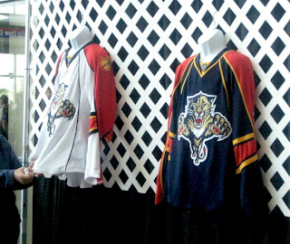
It's finally here everybody! The Florida Panthers unveiled their new Rbk EDGE jerseys tonight at the Year of the Rat Alumni Game. A generous reader pointed this image out to me so I'm posting it to share with everybody.

My initial reaction is very positive. These are sharp-looking uniforms with a great color scheme. I think I almost like the red sleeves better than a red sweater for the home duds, by the way.

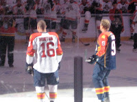
These two images give us different views of the uniforms. The one to the left is a little out of focus (hey, better than nothing, right?) but you can get an idea of how they look on the players at least. Like I said, I like them. I think if anything they're an improvement on what they were wearing.

I'm still dying to see what the Lightning will be wearing this fall.

Big thanks to jrzman for pointing us to the original photos! You can find links to the original message board posts below in the comments if you're interested. When the team or the press make official photos available, I'll have them here as well to perhaps offer an even better look. What are your feelings?

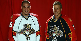
UPDATE (11:49 PM): Nothing major, just got home from work and saw the Florida Panthers had a photo up on their web site of Nathan Horton and Stephen Weiss in the new Rbk EDGE jerseys.

They really do look good and that panther on the front is bigger than I've ever seen it. Now we know what dynamic meant.