Blackhawks vs Blue Jackets


vs
BLACKHAWKS
BLUE JACKETS
2-10
9-1

The Aesthetics
I should start out by saying that despite how many people apparently think the Blackhawks have the best logo in sports, I don't see it. And I don't really like it. I think improvements could be made. I'd also question what makes it the best. On the other hand, the Blue Jackets logo is pretty killer. We should count how many NHL logos have the letter "C" in them.
Blue Jackets

The Nickname
The Blue Jackets in the Union Army would have surely been able to take Chief Blackhawk and his band. Maybe they did.
Blue Jackets

The Analysis
Try not to jump up and down on my head, but i just think that the Blue Jackets logo makes a better symbol for its team. Let the harrassment begin. At least the Blue Jackets logo has a defined color scheme. There's way to much going on in the Blackhawks logo. Let's tone down the colors a little. That's all I'm saying. And the Jackets logo has an Ohio flag that forms a "C" for Columbus.
Blue Jackets


WINNER
3-0


Canucks vs Kings


vs
CANUCKS
KINGS
5-7
6-5

The Aesthetics
This is a hard one. I like both of these logos. How to choose. I actually like the Canucks logo's color scheme better than the Kings. I also like the Haida style artwork. It's very unique in this league. But both of these teams have struggled with an identity for decades, changing logos constantly. But as for right now, I'm going with the Canucks.
Canucks

The Nickname
A King pretty much gets whatever he wants. He can have Canucks do... anything really. Go whaling or something. I don't know. Where are my creative juices when I need them?
Kings

The Analysis
As far as logos pertaining to the team names, a Canuck is not a whale. A King is not a crown, but he wears one. I also like the subtle hockey sticks in the top of the crown and the suns on either side of it. The Canucks logo doesn't offer anything cool like that.
Kings


WINNER
2-1


Possible New Stars Uniform?

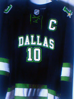
At last I have non-Canucks-related news to post. It seems there's a chance the Dallas Stars new Rbk EDGE uniforms may have leaked. I found the following image posted at HFBoards.com.

What we've been hearing is that the Stars will be going with a jersey that doesn't have a crest on the front but rather the word "DALLAS" and this jives with that. However, it doesn't make a lot of sense to me that a team would put their city on their home jerseys. And we've been hearing the NHL is keeping the dark jerseys for home ice.

This sweater also lacks the current Stars logo which has been rumored to be changing. In fact, there's a whole new logo on the shoulder of a "D" with a gold star in the bottom corner. Frankly, I like it. The horizontal green and white stripes are a classic throwback to the teams early days in the Big D and I think it would be a definite upgrade — assuming this is the real deal.

As far as debunking it — a task which has become necessary as we've seen more than our share of bad to half-decent Photoshop efforts — I can't say the overall feel looks familiar. I could be completely wrong, but I'm checking the real-deal box on this one. What do you guys think? Will Dallas be wearing these in the fall? Or have we been duped?

As official announcements go, a Stars official team message board administrator recommended we mark our calendars for Septmeber 14.

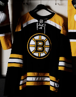
UPDATE (6:29 PM): ...And we've been duped! Just came across this photo of the Bruins new home jersey. Examine the creases and laces and you'll see what I'm talking about. Click the photo to enlarge it.

Stars fans, this will not be your team's new home jersey. Rest easy. Gotta say though, these Photoshop endeavors are getting better and better if you ask me. Sad to see we don't have anything that could possibly be the real thing, but we'll live.

Last Of The Canucks Surmising (Hopefully)

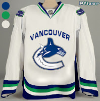
We're anticipating the unveiling of the new Vancouver Canucks uniform tomorrow despite having no official word on that from the team itself. So having said that, there's a little more fan-created artwork I wanted to post prior to that because Canucks fans seem to be the most interested in what's going to happen to their club's uniforms this year.

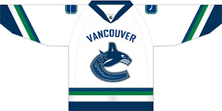
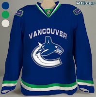
This design is based off of what appears to be "Fin's Friends" promotional material posted yesterday. The only thing is we've been hearing that the bottom part of the "C" will be white, not blue like it has been in the past. You gotta figure this is at least worth a look anyway and may even possibly be close to what gets unveiled by the team.

Another fan came up with these designs.

Personally, I'm not a fan of "Vancouver" being written above the logo but I guess it's not for me to say. You Canucks fans have any opinion on that? Tacky? Cool? Doesn't matter?

If I come across anything else, I'll try to get it posted by the end of the day. Meantime, keep your fingers crossed for an official announcement tomorrow.

Red Wings vs Avalanche


vs
RED WINGS
AVALANCHE
4-8
10-1

The Aesthetics
When these teams get together, it's usually the greatest playoff hockey you could hope for. But when comparing their logos head-to-head, there's really no question in my mind as to who takes the cake.
Avalanche

The Nickname
Red-Winged birds have no fearing falling snow as they can simply fly over an Avalanche. Not too close, though.
Red Wings

The Analysis
I would be remiss if I didn't at least mention the longevity of the Red Wings logo. I'd also get an earful from ultra-traditionalists who fear change with regard to the Original Six like the very plague if I suggested an upgrade of any kind for it. But let me just remind you all of the new Boston Bruins logo. No limbs were lost when that was unveiled. So open your minds a little... and accept the fact that one day the Avalanche logo will be looked upon as a sports logo classic in the same way — except better because as of right now, it doesn't need an upgrade. Any changes would only hurt it. You see where I'm going now?
Avalanche


WINNER
2-1