Penguins vs Senators


vs
PENGUINS
SENATORS
3-8
4-6

The Aesthetics
Both of these teams seem to like a little gold with their black but it's the Senators who add in the red to make the logo stand out a bit more. The Penguins logo just feels so flat. And there's the penguin wearing the hockey gear.
Senators

The Nickname
Since Senators make the laws, it seems to me that they have the upper hand on the Penguins as they could choose to protect them or not.
Senators

The Analysis
The better features of these two logos have recently been pointed out to me by readers. The golden triangle has significance to Pittsburgh. Also the gold circle in the Senators logo makes an "O" for Ottawa while you could say the red galea creates a "C" to symbolize Canada. If that's the case, it means the Maple Leafs and Oilers are the only Canadian teams not to work in a "C" of some sort. But I digress. The point is, the Penguins logo comes off like a '60s cartoon to me (go ahead, take your shots now). I'll go with the centurion.
Senators


WINNER
3-0


Kings vs Blues


vs
KINGS
BLUES
5-5
5-7

The Aesthetics
Some logos just don't look very good next to each other. These two look very good. It's kind of a wonder they seem to be bathed in mediocrity in this competition (or not based on my bad judgment). One thing that always gets me is the two-tone blues of the Blues logo. That's unique and very cool in combination with the yellow trim. I hope they don't lose that anytime soon. Unfortunately for the Kings, all I keep seeing right now are all the little circles. There must be like a dozen of them on that crown.
Blues

The Nickname
All right, you can already tell this one is going to be a stretch. Do you suppose a King would simply be able to hire a person to play music for him, be it Blues or anything else?
Kings

The Analysis
I like the subtle hockey sticks at the top of the crown and the suns on either side of it in the Kings logo. But I also like the Blues logo as it has been recently pointed out to me that the logo is a 64th note and the city of St. Louis was founded in 1764. So what it comes down to is which one works better. Frankly, I think the Blues logo looks more like a wing than a 64th note but it was a good effort. Kings, please.
Kings


WINNER
2-1


Possible New Canucks Jersey?

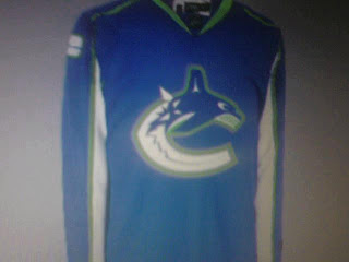
All right, so I thought I wasn't going to have anymore news tonight, but it turns out I stumbled upon something very interesting on the Vancouver Canucks official message board. This.

I didn't have time to read the full details in those posts, but obviously, the skeptics abound. You can go here if you want to learn more. First reactions are that it's a Photoshopped job based on the Washington Capitals or Columbus Blue Jackets jerseys since they've already been unveiled.

Still, I thought it was worth a look. And I don't think it'd be the worst thing in the world if that was the actual Canucks home jersey. The colors are all right and I say that despite the fact that I really did like the two-tone blues, silver and maroon from before.

Any thoughts? Is it a fake-out? Is it the real thing? The Canucks will supposedly answer that question on Wednesday.

Get Ready To Be Horrified

Okay so I didn't want to go to bed before I got one more post in for today. (I go to bed by 7 PM because I have to be at work by 4 AM. I work on a TV morning show. Which should explain why I have so much time to do a blog like this. I get off work at noon. And that's enough parenthetical nonsense for one day.)

Anyway, this is what I have to offer. A joke.

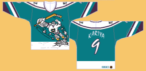
If you don't get the reference, look below. For what served as the inspiration to this mockery, you have to get in your time machine and travel back to the 1995-96 season when the Mighty Ducks of Anaheim donned this monstrosity on a couple of rare occasions.

Probably the worst third jersey ever. And you want to know the worst part? I have one of them in my closet! And if you were thinking that part was the joke... no, sir. I actually bought one back in the day because I was 11 and thought it was so cool. Let the ridicule begin.

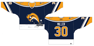
Anyway, how much do Sabres fans hate the Buffaslug?

As far as actual news for your Monday night, I'm afraid I'm at a loss. Maybe Wednesday we'll get to see the Vancouver Canucks' new uniforms. Maybe. That reminds me. I found a bunch of mock-ups and fan art, I believe, at Canucks Central. So we can all look forward to that tomorrow on the day before August 1.

If you know or hear of anything else, I'd be happy to hear about it. Leave me a comment. Thanks.

Avs, Blues Jersey Concepts

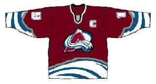
Just when you thought I'd posted enough fake jersey designs for one day, oh no, just you wait. First we'll have a look at something that was put together for the Colorado Avalanche.

If you can look past the poor design quality, well, there's not much to this that rings of goodness. It's certainly interesting to look at, but Avs fans shouldn't worry about this. From what we've heard, there won't be any changes to the logo or uniforms — just an adaptation to the new Rbk EDGE style.

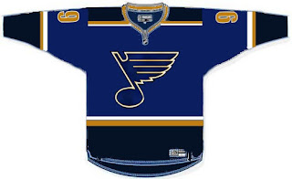
Now here's a look at a St. Louis Blues concept design.

I'm not real keen on the color scheme, but hey, it's not my team. As far as design, it's simple and rather close to what they currently wear. Although we haven't heard anything specific from the team regarding an unveiling of the new uniforms, I wouldn't expect to see anything much different from what they currently wear.