Jersey For New Jersey

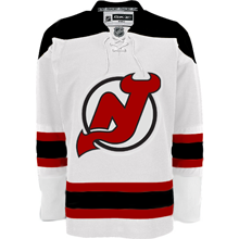
How many times do you think I'll be able to make that joke as we get information about the New Jersey Devils new uniforms? Anyway, today I have a fan-made graphic to share. It comes from a Devils fan message board.

It's not the actual jersey, of course. I mean let's not fool ourselves here. It's merely a manipulation of the Boston Bruins' road jersey which was unveiled back in June. It just gives us an idea of what can be done if the team were to keep its current uniform design on the new Rbk EDGE jersey cut.

I'm not sure I like the collar laces, though. What do you guys say? Should the Devils keep what they've got or go with something completely new in the vein of, say, the Predators?

Panthers vs Sabres


vs
PANTHERS
SABRES
10-1
6-4

The Aesthetics
I wonder if the Panthers logo might just be the most fear-inspiring in the league. I almost said scary. But it's the "Buffaslug" that's scary. But as far as it being a good sports logo, it's a tough call — even though Sabres fans hate it. But come on, is there realy a question here?
Panthers

The Nickname
In the hands of an experienced swordsman, a Sabre is rather dangerous, even to a Panther.
Sabres

The Analysis
Look, the animals in both logos have red eyes. Creepy. Anyway, panther? Check. Sabre? Sort of, check. It's been pointed out there's a very subtle blue sword extending from the horn on the buffalo which doubles as the sword's handle. I kind of see it. But the Panther is much cooler.
Panthers


WINNER
2-1


Blue Jackets vs Stars


vs
BLUE JACKETS
STARS
10-1
6-5

The Aesthetics
Both of these logos have five-pointed stars as a primary element. You could even say the Stars have two stars — a gold one and a green one. Ah, but the Blue Jackets logo has the most when you count the 12 in the Ohio flag. So I'll give them this point for that and the fact that there are no words in it. A logo is a symbol in my book. (And don't start in with how words are symbols too. I don't want to hear about it.)
Blue Jackets

The Nickname
I don't think the Blue Jackets win this war. A bayonet doesn't stop a Star from burning. Not even a little bit.
Stars

The Analysis
This is a difficult decision. Both of these logos are appropriate. I've talked about the big "lone star" in the Stars logo a number of times. The Ohio flag almost forms a "jacket" around the silver star. But I like the Stars logo's Texas reference. It's clever.
Stars


WINNER
2-1


Lightning vs Bruins


vs
LIGHTNING
BRUINS
6-5
7-3

The Aesthetics
The Bruins have a logo that despite only minor changes, is significantly improved. The Lightning logo spells out the team name. And if the rumors of the new logo hold to be true, at least one of those words will be removed. Anyway, no point for the Bolts here.
Bruins

The Nickname
Not even a Bruin could withstand getting struck by a bolt of Lightning.
Lightning

The Analysis
At least there's a bolt of Lightning in that logo. There's no bear in the Bruins logo. But that can't be the only factor for this point. The Bruins logo is just much bolder. I think it makes a better logo. Maybe the Lightning can make an improvement when they unveil theirs later this month.
Bruins


WINNER
2-1


Mull Over These, Sens Fans

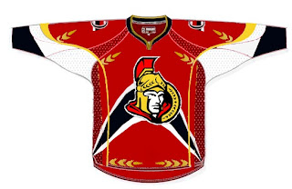
We've already seen the purported new Ottawa Senators logo yet we haven't heard word one from the team with regard to this matter. No worry, because where there's image manipulation software, there's hockey fans to use it. Enter this.

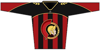
I'm sorry, but what a mish-mash. I applaud the effort but, um... yeah. There's sure a lot going on. And hey, they make use of that new logo we've been seeing. On the shoulder, though, this fan opted for the striped old-time Ottawa logo. Speaking of stripes, how about this puppy?

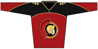
The vertical stripes make it look like a European soccer jersey to me. However, I do like what this designer chose to do with the logo. He dropped the black pointy things from behind the galea and gave the logo an overall 3D effect. For a look at a cleaner version, sans the stripes, see the image below.

Impressions, Sens fans? Do you guys like the potential new logo? Or do you prefer the proposed design in the bottom two concept sketches? Or would you rather not see it change at all?