Red Wings vs Predators


vs
RED WINGS
PREDATORS
4-9
7-5

The Aesthetics
Neither of these logos are very simple in design but they're complete opposites in color. The Red Wings logo is rather monochrome while the Predators logo just goes nuts with color. Ultimately, that will give the Preds the edge here.
Predators

The Nickname
I'd imagine any Red-Winged bird would be smart enough to fly up high so as to avoid the Predators on the ground.
Red Wings

The Analysis
Even though I think the Red Wings logo could use some upgrades (think Boston Bruins), it is still very effective and one of the most well-known in all of sports. That has to earn it some credit, right? The reason I'm giving in this point, though, is because it takes that extra step in referencing their home city with the wheel (you know, Motor City) while the Predators does not. And so ends the tournament for the Wings.
Red Wings


WINNER
2-1


Senators vs Panthers


vs
SENATORS
PANTHERS
5-6
11-2

The Aesthetics
There's a lot of detail in each logo but it doesn't really get bogged down in it. But still, that panther is scary. We're anticipating a logo change for the Senators, but could it really be better than the Panthers?
Panthers

The Nickname
It's a Senator who sits in his government office making laws to protect animals such as the Panther. He, therefore, has the upper hand in this relationship.
Senators

The Analysis
These two teams have nicknames that are associated with their city, so a logo that references it specifically is doing double duty. The Florida panther is from Florida. Ottawa is the capital oif Canada where government representatives get together. But in the Senators logo, you could say there's a gold "O" for Ottawa and a red "C" for Canada. Or at least that's what I'm telling people. And the Panthers are done for this tournament.
Senators


WINNER
2-1


Mailbag: "Buffaslug" A Scam?

Ever since I set up an email address for this blog, I've been getting some of the most interesting and strange emails I've ever seen. I'm filing this one in the nutty bin but I wanted to at least show it to all of you. Before I say anything about it, just have a read and then feel free to laugh to yourself for a little while.

the sabres slug was a scam. they are planning on revealing the final logo this september. the new blue and gold project was in on it the whole time.
http://www.newblueandgold.com/photos/i/sabresconfidentialphoto.jpg


That was the cryptic message I received today. Verbatim. And the image to which he linked can be seen below.

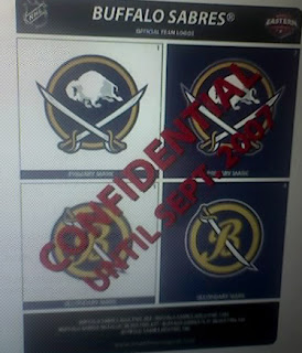
Now, for the record, I think the Blue & Gold Project is amazing. I've had a link to it on the sidebar since I started this site. John Slabyk does some of the best work I've ever seen. I was a graphic artist for a newspaper for eight years and every time I think about going back into the field, I see work like that and think twice. (That's why I'm sticking with television.)

Anyway, having said that, it would be utterly ridiculous for us to really put stock in this email. As we know, Photoshop is more prevalent than ever these days and therefore what you see, is not necessarily what you will get. The reason I say it is ridiculous is that there's no way a multi-million-dollar NHL club goes through the hassle of creating a whole new identity, only to dump it after just 12 months.

Forget the uniforms. Think of all the hats, t-shirts, bumper stickers and other merchandise with the "Buffaslug" logo. Think of how much money it would cost to create all new merchandise with a new logo. I'm sorry, I do love the logo Slabyk created and I hope one day the Buffalo Sabres can use it or something similar, but don't hold your breath for this season.

If you have a question or comment you'd like to submit by email, you can reach me at nhllogos@gmail.com.

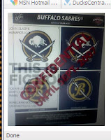
UPDATE (8/5 6:16 PM): We need to ease off on all the confusion here. I'm reading in some places things that would make English teachers everywhere sit down on the floor and cry. If only people would read.

The image featured in this post, as was stated, is just for fun. But to clear things up, I wanted to add the screen grab in the comments to the actual post as an update. As you can see, there's a very clever watermark in the image proving its lack of authenticity as far as that goes. I'm trying not to spread rumors here, but the trick is reading what gets posted along with the pictures.

Mailbag: Senators Fan Art

I got an email this afternoon from Pat with some neat fan art for the Ottawa Senators' uniforms. They have some slight similarities to work I posted back in June, but nevertheless, it's always nice to share.


Those two aren't in the Rbk EDGE cut, but this next one is. Though some among you will complain about it being set in the template of those now-infamous all-star jerseys, try to deal. It's an alternate harkening back to the original Sens from back in the day.

I think the stripes would drive me nuts. Sharp design for the '20s but I don't think it would go over very well today. Feel free to leave your comments for the designer.

And as always, if you have fan art of your own or would like to get in touch, email me at nhllogos@gmail.com.

Deplorable Detroit Design

Not sure exactly where I first saw this design for the Detroit Red Wings new Rbk EDGE uniform, but not to worry, I'd bet money on it being a fake.

Now you can see why. It is rather ugly. I mean, like, really, really ugly! Scary ugly!

But what do you think? Is it really as bad as I'm making it out to be or would something like this work for the Red Wings?