Fan-Created Canucks, Isles Jersey Designs

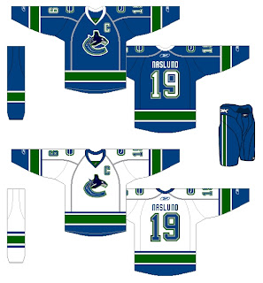
I know I've sort of been beating a dead horse with these two teams, but I've got a couple more fan concepts for the Vancouver Canucks and New York Islanders. These Canucks uniforms seem to be based off of speculation regarding the new sweaters that we have yet to see. Word on the street is Vancouver is keeping the orca logo but reverting it to the traditional blue and green colors.

Supposedly, the new Canucks jerseys will be officially unveiled later this month. But with no official date from the team at this time, it's difficult to say when we'll actually see them. And from what I understand Vancouver fans everywhere are on pins and needles waiting for word. (Guys, as soon as I know, you'll know.)

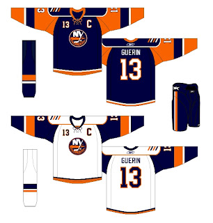
Then, from the same artist is this uniform set for the Isles. It appears to be based off that alleged cell phone photo that is now everywhere.

I'm still on the fence about it. It could work, but I think simpler is better in this case.

Remember, if you have any artwork of your own or which hasn't been posted on this blog, feel free to send it along and I'll try to post it at some point. You can submit questions, comments and fan art at nhllogos@gmail.com.

Possible New Blues Jersey?

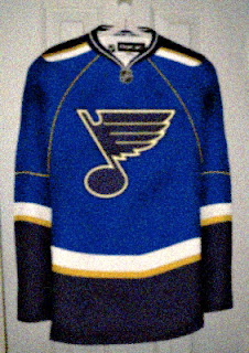
I've been getting lots of emails the last few days. Among them was this photo (?) which may or may not show the new St. Louis Blues Rbk EDGE uniform.

I don't know why, but it doesn't feel all that... real... to me. Perhaps it's the cynic in me having been drawn out by all the other fictional works we've been treated to lately? I'll say this, though. It does seem an awful lot like this Detroit design I posted Saturday.

What do you think? Will this be the new Blues jersey or are we looking at another fan-created, Photoshop-assisted design?

Mailbag: Flames Concept Logo

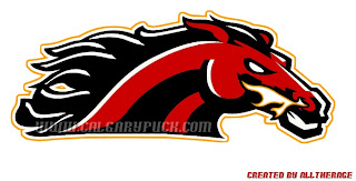
I had a reader send in this Calgary Flames logo which seems pretty cool. It gives a new perspective on the recent secondary logo that featured a horse with flames in its nostrils.

Flames fans might also notice the similarities between the flames coming off the traditional "C" and the mane of the horse in this fan-designed concept logo. It's pretty sharp. But can anything really be better than the flaming "C" or should the Flames go in this artistic direction?

As a side note, it also seems that we'll be getting a first look at the Calgary Flames new uniforms at the Flames Celebrity Charity Golf Classic on September 4. I can't completely vouch for the reliability of this info, but what could it hurt to add it to the sidebar countdown? Check it.

Avalanche vs Stars


vs
AVALANCHE
STARS
11-2
8-5

The Aesthetics
This is the end of the line for both of these logos in this tournament. But its just the qualifying round. You will get to decide how good they really are. But I'll make this short and sweet. No logo has ever been helped by incorporating the text of the team name.
Avalanche

The Nickname
An Avalanche of snow has nothing on a Star of fire. Forget the snowslide, a big one could incinerate the planet. Then there's no snow to fall on anybody.
Stars

The Analysis
The giant avalanche across the "A" is a classic logo, not that you asked me. I see it being around a very long time. However, I can think of better ways to deal with a logo for the Dallas Stars. Maybe one day we'll get one. Until then, I like the "lone star" element, but not more than the Avs logo.
Avalanche


WINNER
2-1


Bruins vs Canadiens


vs
BRUINS
CANADIENS
8-4
9-4

The Aesthetics
Ah, old time hockey at its finest. I think the Canadiens could stand a logo upgrade in the vein of the Bruins. Not that there's anything wrong with how it is right now, I'm just in the mood of modernizing logos. It's looked exactly the same for almost 60 years. Anyway, forget that. Don't change it. I like it just the way it is. But the Bruins get this point for being cooler.
Bruins

The Nickname
I would say that a Bruin could eat a Canadien like it was nothing, but I've recently been informed that a number of Canadians are rather rugged folk so I'll have to put my money on them taking out the bear with their rifles and stuff.
Canadiens

The Analysis
I like the symbolism in both logos that alludes to the history and home cities of each club. More than that though, I still keep thinking I'd rather see an actual bear in the logo as opposed to the traditional spoked "B." This isn't to say the "B" has no place on the uniform. Place is on the shoulder. But take the new secondary logo and use it. But the spoked "B" is such a classic. What would the NHL be like without it? It's really a tough call. Anyway, there's no confusion with the Habs' logo. It is and always will be a classic. And that's all there is for the Canadiens in the qualifying round.
Canadiens


WINNER
2-1