Further Proof Of New Sens Logo?

I first posted this logo back in July but it seems we have more evidence of the new Ottawa Senators logo through official league channels — perhaps accidentally.

I don't know. What do you think? The Senators have yet to announce any sort of official unveiling ceremony for their new duds but it's looking more and more like said duds will feature an upgrade to the logo. And this may be it.

Yet Another Leafs Concept

I posted this design on Sunday and another reader has emailed me his concept for the new Toronto Maple Leafs uniform. He tells me he based it off of the Nashville Predators new uniforms, so expect some of that piping that you all love so dearly.

Oh yeah, that's the stuff. I don't think it's terrible. It's a little similar to a design I posted on Friday with a few exceptions. This one doesn't have the drawstring collar and actually adds silver up the sides along with vertical stripes. The blue also seems to go the length of the sleeve as opposed to covering just the shoulders.

Any feelings on this one? Is all the speculating making you crazy? Should we stop and just wait until the Leafs feel like unveiling the jerseys? Leave your thoughts below.

Hurricanes Concept In Black

Thought this was cool. I know there won't be any third jerseys this season, but one fan came up with a notion for a black alternate uniform for the Carolina Hurricanes. It's far out.

This looks good to me because the Hurricanes are just so... red! No redder than the Red Wings, mind you, but stil very red. Sometimes all the red gives me a headache. This design tones down the red, like, a lot. Any Hurricanes fans reading? What do you guys think? Worthy of a third jersey? Worth of a primary jersey? Or worthy of nothing more than a trash bin?

Mailbag: More Lightning Logo Concepts

With the news breaking today that the Tampa Bay Lightning have been sold, I thought it'd be a good time to share some fan artwork I've received recently.

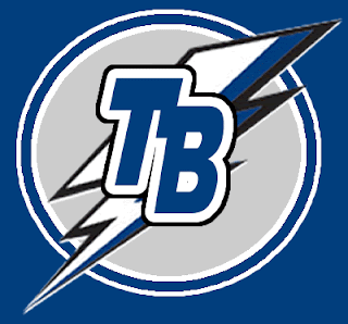
John emailed this design which is basically the allegedly leaked new Lightning logo that's been making the rounds, with a slight alteration. Instead of plastering Tampa Bay over the top of the bolt in weird lettering, he suggests going with "TB" on top of it all.

It's a cool idea. Personally, I like the TB but I'm not sure if I'd like to see anything on top of the lightning bolt itself. What do you guys think?

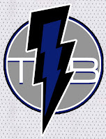
Then there's this design which puts the "TB" underneath the bolt. It also makes the bolt more vertical and in black and blue as opposed to white or white and blue. Would something like this work?

If you ask me, I'd like to see something entirely different from what we currently have so I can better judge. Perhaps not the giant "L" logo, though. I posted that design on Saturday. Along with it, the designer also sent jersey designs

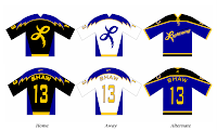
As you can see, yellow might not be the best color to add to the Lightning uniform. But then I think he realized that and tried to correct himself.

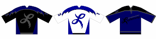
He came up with this design, which features gray as a replacement. I don't know, though. I think it still leaves something to be desired. I do, however, like the lightning on the sleeves.

I don't know. I was always a fan of those late-'90s third jerseys that featured the storm scene. If there was some way we could revisit that without making the uniforms look silly, I'd be all for it.

Sabres vs Rangers


vs
SABRES
RANGERS
6-7
3-9

The Aesthetics
The battle of New York we've all been waiting for is finally here. Before the ultra-traditionalists come for me, I should preface this with a disclaimer: I try not to let nostalgia and tradition get in the way of determining what a good logo is. That being said, I think the Lady Liberty logo from the third jersey could kick everybody's asses. This one cannot.
Sabres

The Nickname
You don't suppose a Ranger might carry a Sabre, do you? Not if he was a park ranger, I guess. Then he would probably be armed with a rifle with a range better than four feet.
Rangers

The Analysis
I know, this is a problem for the Rangers. What is a Ranger? Are they so unsure they don't bother to put a logo on the front of the jersey? Or is that laziness. I've lamented the fact that a buffalo is serving as a logo for a team called the Sabres, but at the very least, there's a very subtle sword on the back of that buffalo. And we'll call it a day for them. The Sabres finish even.
Sabres


WINNER
2-1