Flames vs Blackhawks


vs
FLAMES
BLACKHAWKS
12-1
2-11

The Aesthetics
Both of these teams wrap up their schedule today. Let's see how they fair. You probably already know who I like better for this category. And if you don't, it's the Flames. What's going on in the Blackhawks logo? Do they have a defined color scheme? Is there a way to find it in the logo? No? Meanwhile, the flaming "C" is cool, especially in black.
Flames

The Nickname
Humans have never been able to really control fire, not even Chief Blackhawk himself. A few Flames get out of control here and there and suddenly the entire state of California is under a wildfire watch.
Flames

The Analysis
Many have argued that I'm insane because I don't agree with "many other sports fans" who consider the Blackhawks logo to be one of the best ever. Thing is, I'm insane for so many reasons, and that's not any of them. It's a good solid logo as far as that goes. But as for what makes it one of the best in all of sports, I am at a loss. It looks to me like a well-drawn Indian head that was scribbled on at one point — and then left that way. But, as I've said before, who am I to say? You guys will get to decide once and for all. Voting starts on August 12. Mark your calendars! In the interim, it's a season finale sweep for the Flames.
Flames


WINNER
3-0


Hurricanes vs Bruins


vs
HURRICANES
BRUINS
12-1
8-5

The Aesthetics
I've always thought the puck in the eye of the storm was a clever feature of this logo. But I just don't know if it necessarily stands up to the Bruins logo. It's a piece of hockey history that despite what some of you may have come to believe, I don't hate. I think the recent changes/updates brought about make a world of difference to it. Kudos the Bruins for refreshing an NHL icon.
Bruins

The Nickname
Hurricanes bring hell on nature. Even a Bruin wouldn't be able to escape its wrath.
Hurricanes

The Analysis
We're right down to it now. One point apiece makes this the deciding factor. It's also the last match of the tournament for each of these logos. Time to analyze. The hub reference of the spoked "B" is excellent. But so is the hurricane, which has proved its greatness in the last 13 matches — at least my opinion (call it what you will). Under normal circumstances, I might've taken this point from the Bruins for lack of a bear in the logo. But I'm feeling generous today and the simple fact is, it says Boston. The same can't be said for the 'Canes logo.
Bruins


WINNER
2-1


Oilers vs Ducks


vs
OILERS
DUCKS
1-11
1-12

The Aesthetics
Lately it seems like all the good logos are facing off. Today, it's a couple of the worst. With barely 11 points between the two of them and only three more days left in the tournament, I think that is fair to say. The Ducks logo is a word mark, nothing more. To some extent, so is the Oilers logo, but at least there's a little more to it. They'll squeak by with this point.
Oilers

The Nickname
We've all seen what happens when Ducks and Oil get together. Not a pretty sight.
Oilers

The Analysis
You've got to give credit to the Ducks on the rebranding campaign this season. They're like the Tampa Bay Buccaneers. Change a goofy logo, win a championship. The major difference being, the Bucs have a cool logo. The Ducks lack that, though I am a fan of the webbed duck foot in the form of a "D." The Oilers logo, after 20 plus years just still saddens me. I like the red trip and copper in for orange, but it's just not enough. I'm giving this point to the Ducks in hopes they drop the "ANAHEIM UCKS" in the coming season. For now, the Oilers put the lame Ducks out of their misery. Only 17 teams left with matches in the next few days.
Ducks


WINNER
2-1


Holy Shit! MacLean Buys Bolts!

Sorry, I know this doesn't fit into the uniform/logo news I typically post, but as a Tampa Bay Lightning fan, I've found myself upended by the sudden sale of my team. I didn't even know they were up for sale! Shows how much I know.
If you're inclined you can watch snippets of a press conference with Doug MacLean, Jeff Sherrin and Oren Koules from Absolute Hockey Enterprises. They now own the Bolts and — good news — say they plan on keeping the team in Tampa for the foreseeable future.

MacLean, for those of you unaware, coached the Florida Panthers to the Stanley Cup Finals in 1996 and most recently was the GM of the Columbus Blue Jackets.

Wow.

Cool Sens Concept, Bruins Too!

A lot of people responded well to the Islanders concept art I posted yesterday. It came from the artist who also designed the Thrashers concept art from Friday. (NOTE: I updated that post with higher-resolution graphics if anyone's interested.)

Anyway, I have some more work from that same artist who posted his work on Chris Creamer's Sports Logos Community. As a disclaimer, I need to point out that none of this is official team artwork, but I thought it was fun to look at just the same.

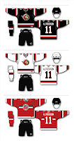
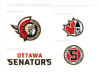
This logo set appears to be merely a revision of the current look of the Ottawa Senators. Personally, I prefer leaning more toward the yellow-gold over the beige color seen here. That's not to say that this color scheme doesn't work well, though.

Do you guys like this designs, the current one, or the one rumored to be taking over in the fall?

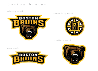
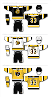
Next, we have a look at some logos that are irrelevant when you consider the Boston Bruins just changed their logos back in June. But have a gander anyway, if you're inclined.

If you ask me, that's a pretty sweet Bruins logo, setting aside the fact that a drastic change like this would likely send the Boston faithful into a frenzy. I'm not sure how I feel about the re-imagining of the spoked "B" though. It isn't sitting well with me.

I'm loving the bear, though no one's asking me, and wondering whether I like it more than the new one that was unveiled a couple months ago.

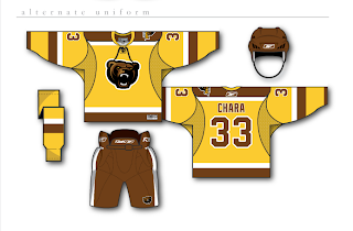
And then for those of you longing for the days of the yellow and brown, our talented designer leaves us with this other alternate uniform design.