Advancing A Minnesota Concept

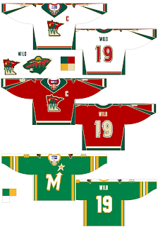
Last Friday I posted a concept design for the Minnesota Wild that featured a new secondary logo. It featured a cool lake scene inside the outline of the state of Minnesota. If you read any of the comments, you know it was a big hit.

So apparently, that designer took another step with that design and created these.

It's pretty sharp though I still prefer the bear head design to the state design for the primary logo.

Then, how about that alternate jersey at the bottom? Any old North Stars fans out there feeling nostalgic? What do you think of that concept?

Sharks, Oilers Fans Design Jerseys

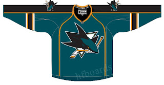
As usual, I have some fan-designed jersey concepts to post today. First, we've got a look at what someone thinks the San Jose Sharks new Rbk EDGE uniforms should look like.

As you can see, someone borrowed elements from the new Florida Panthers jersey designs. Notice the choice of not using the announced secondary logo on the shoulders. Instead they take one of the many other logos and use it. The one we see here is the version of the full shark biting through a hockey stick, sans the background triangle.

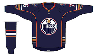
Then I've also got a concept for the Edmonton Oilers to share.

It's a nice design that toys with the current jerseys. Don't expect to see a design just like this as we've been hearing the Oil plans to drop the oil man shoulder patches this season. Regardless of that, I like it.

You all have any thoughts on either of these designs? Feel free to leave them in the comments.

Senators vs Capitals


vs
SENATORS
CAPITALS
6-6
4-9

The Aesthetics
The Capitals logo is a word mark, and with only three days to go in the tournament, you should well know that doesn't work well for me. I don't think we need much more of an explanation than that.
Senators

The Nickname
Somebody recently wrote in wondering how this match would go. Here's how I see it. The Capital is where the Senators convene. If there's no Capital, there are no Senators.
Capitals

The Analysis
Aside from the word mark, all the Capitals logo offers are three stars and a hockey stick/puck. Please. The Senators logo offers up a bunch of cool stuff. It's got a gold "O" for Ottawa and a red "C" for Canada. Win-win. And that does it for the Capitals in this tournament.
Senators


WINNER
2-1


Thrashers vs Lightning


vs
THRASHERS
LIGHTNING
6-6
6-6

The Aesthetics
These two logos are very evenly matched at this stage of the tournament. One of the things I hate almost as much as text in hockey logos are things like blatant hockey sticks that serve no real purpose. Take the stick out of the logo and it only improves it. But even with it, I think it's one of the league's better modern marks. And it doesn't have all that text.
Thrashers

The Nickname
If a Thrasher got struck by Lightning, he would then only serve as someone's lunch.
Lightning

The Analysis
Despite its performance in this tournament to date, I think the Thrashers have one of the best logos in the league. The Lightning have one of the worst, which is why I'm glad to hear they're changing it this summer. One game left for each of these teams.
Thrashers


WINNER
2-1


Predators vs Coyotes


vs
PREDATORS
COYOTES
7-6
5-6

The Aesthetics
Both of these logos are wild animals with wide open mouths. Because of that, there are a lot of similar elements. The biggest difference, aside from color, is the fact that the there's so much more detail in the Predators logo. Normally that wouldn't be a plus, but here it is. The Coyotes logo is just awkward looking to me.
Predators

The Nickname
We've got cats and dogs here. And normally you'd think the dog would beat the cat, but check out the teeth on the Predator. That Coyote never had a chance.
Predators

The Analysis
As a desert icon, the Coyotes couldn't have chosen a better name for the team — not that the Predators didn't. The Coyotes even have great colors, but I liked the original logo better. The Predators logo kind of has a lot of colors. All things considered, I think it wouldn't hurt to simplify it a little. But overall, I find it to be a little better of a logo. The Preds close out their schedule with the sweep.
Predators


WINNER
3-0