Prepare For Voting Mania!

No, I'm not talking about the 2008 presidential election. Har. As you know, tomorrow is the first day of voting for the Championship Tournament wherein you, the readers, will decide which NHL team has the best logo. It's tough work but somebody's got to do it.

Sidebar Changes
In preparation for that, I'm making a few changes to the sidebar. Regular readers will understand. New readers won't have a clue what I'm talking about.

For one thing, there's is now a bracket graphic toward the top. Click on that to see the bracket setup. It's based on how the logos finished in the Qualifying Tournament (a.k.a. my bullshit tournament wherein I wrote a lot of nonsense). In the future, the bracket will be completely random, as this might well have been.

There will also been a block letting you know what polls are open for voting so you can make your voice heard if you hadn't yet. In addition, there's no more need for standings so they're gone — replaced by a list of all 30 teams alongside the year their current logo went into use.

Future Tournaments
By the way, yes I said future. Once we finish with the Championship Tournament, there's still so much we can do. We can decide on the best secondary logo, best uniform, best vintage logos... There's just so much. Anyway, more on that at a later date. For now, we've got the first round of the Championship Tournament ahead of us.

The Championship Tournament
As you can see, all 30 NHL logos are eligible for the Championship Tournament. But since there's an odd number of teams in each conference, the top team from each will get a bye in the first round. That means the Hurricanes and Avalanche get a free pass whether you think they deserve it or not.

For each match, the poll will be open for seven days. That means you have an entire week to vote on any given match so that should make it fair for everyone. It also means this competition will take some time to resolve itself. The anticipated date when we'll know the champion is currently October 3 — just prior to the start of the season.

The Schedule
The schedule is now in place for the first round of the Championship Tournament. Remember, each poll will be available for one week from the date it opens. Below is the schedule for Round 1, showing the matchup followed by the day the poll will open.


  • Devils vs Maple Leafs, Aug 12

  • Wild vs Ducks, Aug 13

  • Panthers vs Penguins, Aug 14

  • Flames vs Blackhawks, Aug 15

  • Canadiens vs Islanders, Aug 16

  • Blue Jackets vs Oilers, Aug 17

  • Senators vs Rangers, Aug 18

  • Predators vs Blues, Aug 19

  • Bruins vs Capitals, Aug 20

  • Stars vs Coyotes, Aug 21

  • Thrashers vs Sabres, Aug 22

  • Kings vs Red Wings, Aug 23

  • Lightning vs Flyers, Aug 24

  • Sharks vs Canucks, Aug 25

The winners from each of those polls will move on to the second round of the tournament. Be sure to vote in the polls where you want your voice heard!

How Often Can I Vote?
Good question. Supposedly, each poll will only let visitors vote once. And I'd appreciate it if we kept it that way. No reason for any one person's opinion to count more than others. Still, if you want to inflate your team's vote count, I recommend wrangling all your friends and pointing them the way of this site so they can vote too.

Hopefully I'll get another FAQ page posted soon for the Championship Tournament. If I don't, you can email me or leave questions here on this post.

Sabres, Pens Concept Art

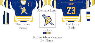
The campaign against the slug trudges on as I can't hit a single Buffalo Sabres fan site or forum without reading the words "death to the slug" somewhere within. That in mind, I stumbled across a few concepts traditional fans should be all right with, barring an all-out return to the 1970s.

If you think the logo looks familiar, look no further than the old red third jersey. Personally, as a non-Sabres fan, I was always of the opinion that the crossed swords would make an excellent primary logo for that team. It could permanently relegate the buffalo to the shoulder where it belongs. Of course that's coming from a Lightning fan

Our designer also came up with an alternate uniform to go with these two. I'm afraid it goes a little overboard with the stripes though. I think we've past the point where it might've looked aesthetically pleasing. As far as the colors, I don't think the blue looks that bad. I think the current blue is a little darker than it needs to be.

Any thoughts, Sabres fans? I know you hate the slug. Is this the way to go? How do you feel now about the red-black-silver days of the late '90s?

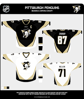
Also, I just thought I'd throw in this nugget. One fan came up with this concept for the Pittsburgh Penguins.

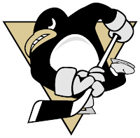
Check out that penguin! That one, I'm afraid of. I'm pretty sure it's culled from a minor league logo and it's a little cartoony.

Penguins fans, would this be a travesty? Would it be that bad to make a return to the old '90s penguin? Should I stop bothering you and deal with the one you've got?

Feel free to leave your opinions below, all. And remember, if you've come across any designs I haven't posted or have any of your own you'd like to share, you can submit them to nhllogos@gmail.com.

Additional Ducks Designs

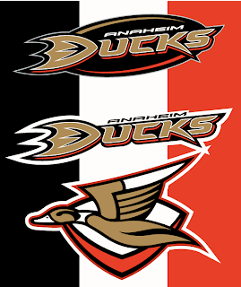
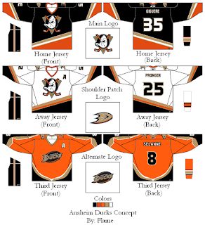
The Anaheim Ducks logo and uniform designs I posted on Wednesday were mostly well-received though a handful of you were wary. So I came across a couple more I thought might be worth considering.

These concepts are in keeping with the current color scheme with some minor alterations. What about using the duck logo from that original design in the new colors and making it a secondary or converting the current logo to secondary.

That's one possibility. Another is more nostalgic, keeping the old Disney logo. It mixes the new colors with the old logo.

Would you buy any of those jerseys or should we just leave well enough alone and stop messing with it?

New Sens Logo In NHL08

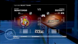
Lending further credence to the now widely held belief that we should be expecting a new logo for the Ottawa Senators on August 22 is this alleged screen shot from EA Sports' NHL08 video game.

This new-fangled logo is now triple-sourced as far as leaks are concerned. I'm going to go ahead and say it's real.

According to the team, the unveiling of the new uniform will take place on August 22 at Scotiabank Place.

Time To Get Your Blackhawks On

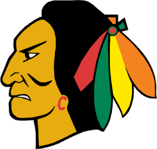
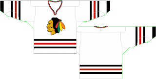
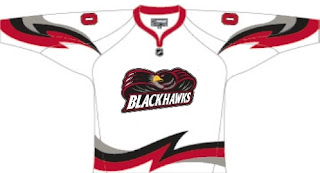
All right, if you've been reading my nonsense in the tournament matches, I have good news and bad news. The good news is, today was the last day of that. Reader voting starts Sunday. The bad news is somebody else, it turns out, thinks the Chicago Blackhawks could use a logo upgrade. (See, I'm not the only person who doesn't think it's the best in all of sports.)

Now I'm not saying this design is totally the way to go. I think it's a good start, but also that it could use a little work. Sneak a peek.

Don't freak out! It's just fan-created concept art. It's not a real 'Hawks logo by any stretch.

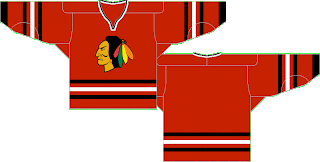
But that, I'm a little more impressed by. I still think a team's logo should be dominated by its primary colors (here: red, black and white), but this wouldn't be all bad. Well, at least as far as I'm concerned, it wouldn't. What do you guys think? Should I take the advice of John Tortorella and shut my yap on this subject or could we have something here? While you consider, check out these jersey designs.


Oh, and just to freak you out a bit, somebody emailed me this concept.

Now lay it on me. I can take it.