Poll: Blackhawks vs Oilers


vs
Chicago
BLACKHAWKS
Edmonton
OILERS


Place your vote and then feel free to leave a comment as to how you came to your decision. Tell all your friends to drop in and vote! The more voices heard, the more accurate the results!

UPDATE (9/2 2:45 PM): Closed the comments. My apologies. That was getting a little out of hand. Just vote for the logo you think is better (for whatever reason you choose) and save the political arguments. Enjoy your weekend!

Poll opening date
Aug 29 @ 4:27 AM
Poll closing date
Sep 5 @ 11:59 PM

07CHTRN | #W2B | CHIvEDM

Reminder: Big Day For Canucks Fans

Just a reminder that tomorrow the Vancouver Canucks unveil their new uniforms. Hopefully once that happens, I'll be able to go more than a day without posting Canucks concepts.

Here's what we're expecting: The new uniforms will likely don the orca logo in the traditional colors of blue and green. Some evidence has suggested green will be a uniform color but not found in the logo itself. We've also heard the old stick-in-the-rink logo may be a secondary mark — a shoulder patch. And there's also the possibility that the orca logo will feature different colors for the home and road sweaters (like the Calgary Flames, for example). Nothing is confirmed and it all remains to be seen, of course.

Fans will first set their gazes upon these new sweaters at 12:30 PM — which is 3:30 PM my time as I'm on the east coast. As has happened in the past, as soon as photos surface on cyberspace, I'll do my very best to have them right here for you.

Also, if you haven't voted on the Sharks vs Canucks poll in the tournament, I'll be changing the logo over to the new color scheme just as soon as I can. So you might want to hold your vote until we see what the new logo looks like.

Good luck, Canucks fans! I hope your day turns out as well as mine did. I was really happy with the new Bolts jerseys. Hopefully you'll be thrilled with yours.

Just To Freak You Out, Part 2 of 5

I'm back with more weird and wacky designs from the world of hockey art. Prepare yourself.

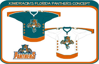
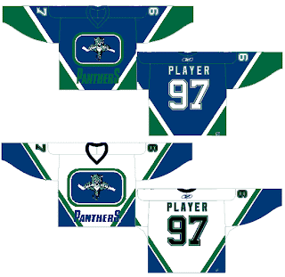
What sports franchise first comes to mind when you think Miami? The Dolphins, right? Well what made them famous? Was it their colors or the fact that football is one of the most popular sports in the U.S.? Well, the colors, obviously! So to help out the Florida Panthers in becoming more famous, one designer swapped out their colors. Take a look.

Go ahead. Rub your eyes. You aren't seeing things. Can you believe that? One incredible design after another, I tell you. Still, I can do better.

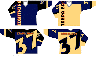
You'll have to look closely to tell, but that, my friends, is another fascinating concept for the Tampa Bay Lightning. No crest. Crazy numbers. The most original design I think I've ever seen. Here's my question: Can anybody Photoshop this jersey onto a picture of a player? Because I totally want to see how that bad boy looks on the ice.

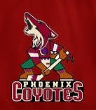
The Phoenix Coyotes had a great logo when for some reason they decided to throw it to the wolves in 2003. They dropped out what made their logo unique and colorful. Guess bland is back. Or not, so this designer thinks. Check that out. It's a wonderful combination of old and new.

Kind of like this. And while we're on the subject of that crazy Canucks logo. What you really need to see is the fully-colored version.

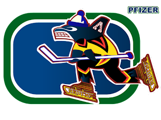
How can you improve upon something like that? It's like finding pure gold in the Black Hills. Oh, and while we're still on the topic of Vancouver — all you Canucks-haters — feast your peepers on these.

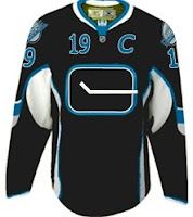
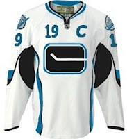
Yesterday we had black and neon green. Today we've got black and sky blue. If I haven't freaked you out enough yet today, just wait until you see this. I'm going to make this lousy post come full circle right before your very eyes. Behold.

From Panthers to Canucks. And I don't even have the words to describe it. No words would be worthy of describing it.

You'll tell your grandchildren this story. And you know it. Stay tuned. More is on its way tomorrow.

Blues Uniform Concepts

There's so many teams to choose from. I'm thinking I'll go with the St. Louis Blues next. I've been emailed some great concept art for their new Rbk EDGE uniforms. You should see them.

For those who fear change, this might be a good option. It's got the same colors and overal jersey design, save for the small stripes on the sides. Not much to complain about. But then by the same token, it's rather unremarkable.

If it's the retro look that suits you, perhaps this is the way to go. Simple blue and gold with the horizontal stripes we all know and love.

Again, plain and unremarkable but not necessarily bad. The Bruins went with plain and easily have one of the best Rbk EDGE jerseys at this point — and that's unlikely to change if you ask me.

Now, if something new-fangled is what you seek, peer below at final concept I have to offer you.

I wouldn't necessarily like to see the Blues undergo a logo change, but if they had to, I'd be all for the trumpet logo. I think it's great! But then I'm a Lightning fan, not a Blues fan. However, I don't feel like the musical note logo is improved by the text above it. I'm also a big fan of the two-toned blue of the uniforms. I hope they don't lose that in the new designs.

Any thoughts? Don't forget, any concepts I post here on the blog will also go straight into the Concepts Gallery along with many other concepts I haven't posted. I add several new designs every day so keep an eye on that.

One more post planned for today then I'm calling it a night.