Poll: Blues vs Coyotes


vs
St. Louis
BLUES
Phoenix
COYOTES


Place your vote and then feel free to leave a comment as to how you came to your decision. Tell all your friends to drop in and vote! The more voices heard, the more accurate the results!

Poll opening date
Aug 31 @ 4:28 AM
Poll closing date
Sep 7 @ 11:59 PM

07CHTRN | #W2C | STLvPHX

Result: Kings vs Red Wings

Detroit
RED WINGS

67% 9,019 votes

Los Angeles
KINGS

33% 4,391 votes

13,410 total votes

Detroit Red Wings
Advancing to Quarterfinals to face Sharks or Canucks

Los Angeles Kings
Eliminated


Poll opening date
Aug 23 @ 4:27 AM
Poll closing date
Aug 30 @ 11:59 PM

07CHTRN | #W1F | LAKvDET

Just To Freak You Out, Part 4 of 5

My week-long series meant to freak you out a little continues today. If you thought the last three days were something, just wait until you see what I have for you today.

Canucks fans, a lot of you were unhappy with the new uniforms unveiled yesterday. But just remember. It could've been so much worse.

Told you. And what if they hadn't gone so far back to find vintage colors? What if they stopped in the '80s?

That's what.

Oh and I had to share this one. The Canucks seem to be all about mixing and matching. So here's what might've happened if they'd gone with this idea back in 1997 instead of the orca. A little scary but not horrible.

If you want to see horrible, imagine the Minnesota Wild in North Stars colors.

Try not to gouge your eyes out. It doesn't get any bigger for a reason. Quite frankly, I think the Wild have excellent colors. If you're among those who only see Christmas colors, I challenge you to find beige and yellow among the more common decorations. But that's neither here nor there.

Moving right along. While we're on the topic of throwback colors, what if the Phoenix Coyotes had gone with Jets colors?

It's a rather frightening thought. You don't know what bad is until you see and red and blue howling coyote.

But I've saved the best for last, dear friends. My pals over at ThePensBlog.com came up with a good bit of satire that pokes some friendly jabs at the Reebok folks.

You may not realize at first glance, but that's the front of the jersey, not the back. I love the giant NHL logo at the bottom. If you want to see the number, there's the damn number. Crest be damned! But don't riot yet. You haven't seen the worst part.

Now you can riot.

Have a nice night. I'll be back tomorrow.

A Bunch Of Concept Logos

I get a lot of emails with concept jerseys but most of them make use of the team's actual logo. But sometimes people send in new ideas for logos. That's what this post is about.

We're going to kick things off with the Buffalo Sabres. Lots of complaints have been lodged over the Sabres' new logo. There is even an entire site dedicated to the subject. Just as interesting is the now-famous design of John Slabyk. His work is nothing short of brilliant. But then someone emailed me this. And it rivals Slabyk's work on a different level.

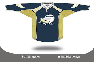
The logo is very abstract but very unique because of it. The colors are a bit muted and I think that is actually a plus. But I feel like this is a very sharp logo. I'm curious to know what you all think of it. Please comment.

But that's not all. You probably know by now I'm not a huge fan of the Detroit Red Wings logo. I get the whole tradition/Original Six thing, but all right already. The Bruins are an original and their logos kick ass. They do. I'm not necessarily saying this is the answer for the Wings, but here's an idea.

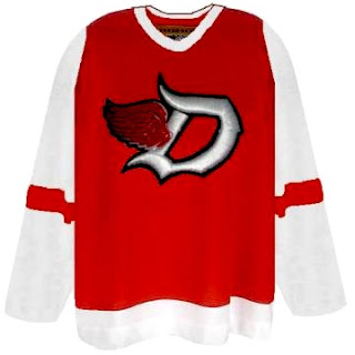
I think the addition of black to the color scheme adds a lot to the uniform. The monochromatic red/white combo rubs me the wrong way — though I completely associate it with a scary good team. A little change never hurt anyone (except for the Islanders in the mid-'90s).

While still on the topic of the NHL's mainstays, you also probably know I'm not terribly keen on the Toronto Maple Leafs' logo. People like to say stuff like, "you don't mess with tradition" and the Leafs logo has been around forever. But the fact is, while the Leafs have been around forever, the current incarnation of logo has only existed since the 1970s. Anyway, what do you make of this?

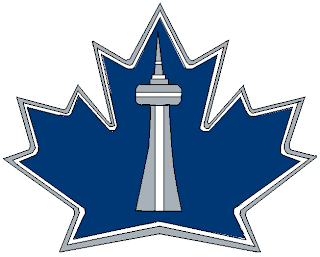
I like the incorporation of the CN Tower, but I think this is more worthy of a secondary logo. I could see it as a shoulder patch, but not a primary for the Leafs. Thoughts?

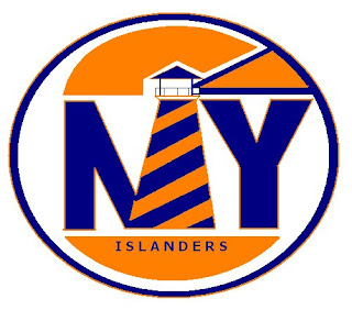
Next we have the New York Islanders. I'm always talking about how a lighthouse would serve as a good logo element for the Islanders. Here's a rather simplistic version of that idea.

One of the most controversial notions I hold is the idea that the Chicago Blackhawks do not, in fact, have the best logo in all of professional sports. (Stop throwing rocks at me.) Here's what someone came up with to alter the Hawks' logo.

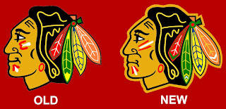
I see the differences and they make sense, but for my money, it's a lateral move. No better, no worse. Anybody else have an opinion on the logo?

One day I'd like to hear a real explanation as for why people think this logo is one of the best out there. There are too many colors in it and it's just so jumbled. A lot of you guys say simplicity rules all. That doesn't apply here. If you can educate me, leave a comment. I read them all.

Pens Announce Unveiling Event

It's just my luck. No sooner do I post Pittsburgh Penguins concept art when I find out they've announced the official event on their web site. It's true. See it here. Or read it below.

August 30, 2007

Pens To Unveil New Uniforms On Wednesday

Defenseman Ryan Whitney and forwards Ryan Malone and Maxime Talbot will be on hand as the Pittsburgh Penguins unveil their new uniforms Wednesday, Sept. 5, at the Galleria at Pittsburgh Mills, just off Route 28 in Tarentum.

The event is open to the public and festivities are expected to begin around 5:30 p.m. with the new uniform unveiling at 6:30 p.m.

All 30 NHL teams will be sporting new uniforms for the 2007-08 season as part of the new Rbk EDGE Uniform System — designed to meet the performance demands of today’s NHL player. The introduction of these new uniforms at the start of season marks the first time in the history of North American professional sports that a uniform innovation has been implemented league-wide.

After more than two years of research, the NHL and Reebok created a uniform system that features technologically-enhanced materials and fabrics that are more breathable, more water-resistant, more comfortable and more compatible with equipment.

The Penguins’ logo and colors will remain the same, although there will be some modifications to the striping, the shoulder areas, the pants and the socks.

Penguins players also will be wearing a special patch for the 2007-08 season that will be displayed for the first time on Sept. 5.

Any idea what the "special patch" is all about? That should be interesting. Looking forward to Wednesday!