Poll: Canucks Logo History


1970
1978

1997
2007


We can't start Round Three of the tournament until Wednesday while we wait for the results of the Penguins/Canadiens match. In the meantime, we have logo history polls for those days off. Today, you can vote for the Canucks' best all-time logo. We're only comparing primary marks here. We'll get to other teams in the future. The Sabres are up tomorrow.

Place your vote and then feel free to leave a comment as to how you came to your decision. Tell all your friends to drop in and vote! The more voices heard, the more accurate the results!

Poll opening date
Sep 3 @ 4:18 AM
Poll closing date
Sep 10 @ 11:59 PM

07BONLH | LHVAN

Result: Hurricanes vs Devils

New Jersey
DEVILS

71% 8,633 votes

Carolina
HURRICANES

29% 3,593 votes

12,226 total votes

New Jersey Devils
Advancing to Quarterfinals to face Penguins or Canadiens

Carolina Hurricanes
Eliminated


Poll opening date
Aug 26 @ 7:05 AM
Poll closing date
Sep 2 @ 11:59 PM

07CHTRN | #E2A | CARvNJD

Sun Says Leafs Jerseys Coming 9/12

I got an email from a reader named Desmond today, pointing me toward some new information in the Toronto Sun. The newspaper is holding a contest where you can win the new Toronto Maple Leafs Rbk EDGE jersey.

The team has not unveiled the uniforms or made any official announcement about doing so, as far as I know. Still, the following was posted in the Contests section of the web site.

The Toronto Sun wants you to win a newly designed Toronto Maple Leafs Jersey. Plus the winner and a guest will attend the unveiling at the ACC Wednesday September 12.

Apparently we can expect to see the new Leafs Rbk EDGE uniforms a day sooner than I'd initially posted — and at an event hosted at the Air Canada Centre. Now, this doesn't come from the team directly, so anything is possible. But I'd consider a newspaper to be a reliable source of information — as that's their job.

I'll let you know if I hear anything else.

Dipping Into The Oil

More concepts! These fan-designed works of art were created for the Edmonton Oilers.

These concepts were created by the same artist who brought us the Chicago Blackhawks jerseys I posted earlier today.

They're very clean designs and would make great uniforms for the Oilers. I especially like the use of the shoulder patch from the third jersey on this set. I don't think it should necessarily replace the crest, but I do like it a lot. I could definitely see them going with something like this.

But I'm not an Oiler fan so it's not really my place to say.

If you're not a fan of the copper, you might enjoy this.

I'm not sure the secondary logo would work at the wrist — being hidden by the gloves. The curvy stripes up the sides are reminscent of the Buffalo Sabres' current sweaters, but not all bad. You could do a lot worse.

I've got one final design for you that eliminates both the copper and red, replacing it with the silver from last year's third jerseys.

I think that's a little too plain. Oiler fans, what really matters is your opinion. See anything you like here? Or does the Oil need an extreme makeover?

Concepts For 'Hawks, Ducks, Devils

I'm curious to see the reaction in this one. A lot of you profess the Chicago Blackhawks to have the "most beautiful" uniform in all of sports. I don't see it but that's only me. However, I could very much get behind a design like this.

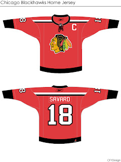
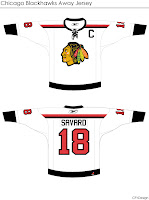
Even the white one is awfully sharp. The striping is clean and very minimalist. But would something like that result in an upheaval of the hockey world? Do things always have to stay the same?

Either way, the design work is very clean and I'm curious to see comments on this set.

This next one will be met with nothing but hate I'm sure. The striping is one thing. The name above the logo is another.

I'm sure that would result in even more blowback than 'VANCOUVER" across the front of the Canucks' jersey. But of course, these are all just fan-created concept designs. A bunch of what-ifs.

Here's a thought for the Anaheim Ducks.

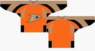
It's the orange sweater Flyers fans have been begging for. Personally, I think it's too much for the Ducks. I think orange needs to be an accent for them. Let gold be the main color. As much as I don't like black jerseys, I think the Ducks' look sort of requires it. Thoughts on that?

And then we have a look at all-star template-based New Jersey Devils concept.

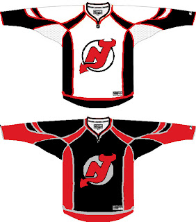
You know you love the piping. I like the idea of a black Devils jersey — despite that fact that I just said I don't like black jerseys. The reason here being that too many teams have red jerseys now. You can add the Wild and Capitals to the fray this season. Red's a good color until it gets overused. Which is right about now.

I'll have more later. By the way, I have tons of Canadiens and Flames concepts for tomorrow — they day before their big unveilings!