Result: Bruins Logo History
/
2007
44% 3,625 votes
8,239 total votes
 1995
199516% 1,345 votes
 1924
192416% 1,292 votes
 1948
194815% 1,249 votes
 1932
19329% 728 votes
| Poll opening date Sep 11 @ 4:24 AM | Poll closing date Sep 18 @ 11:59 PM |
07BONLH | LHBOS

8,239 total votes
 1995
1995 1924
1924 1948
1948 1932
1932| Poll opening date Sep 11 @ 4:24 AM | Poll closing date Sep 18 @ 11:59 PM |
07BONLH | LHBOS
One other thing I meant to mention with regard to Reebok's new EDGE uniform web site that I wrote about earlier is that it's offering us our first official photos of the new sweaters for the New York Rangers.
Not even the NHL.com Shop has photos of the jerseys. In fact, the Rangers are the only team without official photos on that site. But regardless, I just wanted to make mention of that.
That's all I've got for today. Expect loads more stuff tomorrow!
My concept art posts are making their glorious return this week with all the Rbk EDGE jerseys finally released. Today we're taking a trip out West.
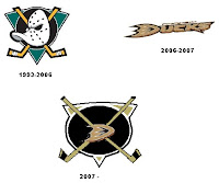
 This one was interesting. It's a hybrid of the old logo with the new. I think it would be millions of times better if they just dropped the "ucks." How many times have I said that?
I mean consider how the wordmark logo actually looks on the jerseys. It's even got fewer letters than "capitals" yet it still seems smaller across the chest. I was really hoping for a change this year. Let them get the whole Ducks rebranding thing out of the way last season and then try something real this season.
I guess we can only ask for so much.
Here's something I don't love but thought it was an interesting idea. It's the current jersey with the old Mighty Ducks colors. Probably not a winner.
And then going all the way back we've got a simple recoloring of the old jersey and logo. Once again, it's not awful, but it just doesn't seem to fit.
Here's the winner.
I think if it were orange, that third jersey would just kill. The Ducks could be among the best-looking teams in the league if they wanted to. But the NHL doesn't hire designers like this. That would be too much to hope for.
So let's move along to Los Angeles. A while back I'd written a post suggesting using the old King head third jersey logo with some modern-day recoloring. The purple beard blended in too much on the dark jersey so I wondered what it would look like in silver. And I got my answer.
I'm sorry, but why isn't that the primary Kings logo anyway? That says "kings" to me! (Not that a crown necessarily doesn't.) Oh and as a personal aside to the designer, what's the deal with stealing the Lightning's armpit stripes?
Anyway, let's head up the coast to San Jose and check out some other Lightning-related designs. One Sharks fans created these concepts based off Tampa Bay's Reebok jersey design, replacing the blue with teal.
Actually, I'm a big fan of the one on the left. The full shark makes for a much fiercer logo if you ask me — not that you were. As for the shield logo, I don't feel it makes a very good crest. It's a little much. I think it looks great on the pants and might even look nice on the shoulder — maybe for a third jersey one day.
The other thing I like is the diamond fin logo found on the shoulders of these designs. I'm a little surprised and disappointed it was left out of the actual uniform design.
What do you guys think of these? And remember, if you've made an concepts or seen any around that I haven't already posted, feel free to send them along. You can email me at nhllogos@gmail.com.
I got an interesting email a couple days ago from a reader who just bought a new Toronto Maple Leafs Rbk EDGE jersey. Matt compared the old sweater with the new one the old-fashioned way — laying one on top of the other. His pictures offer a great look at the differences between the two uniforms.
This shot shows the overall difference in the cut of the sweater itself. The biggest differences are shapes of the sleeves and the hem line across the waist.
Both are authentic jerseys. More photos can be found in the Rbk EDGE gallery.
Reebok has relaunched their Rbk EDGE Uniform System web site to now feature photos of all 60 new NHL sweaters alongside renderings from EA Sports' NHL 08.
You can visit the site by going to www.rbkedgeuniform.com. And that spells the official end of the Rbk EDGE releases. I hope you all will continue to visit the site for the logo tournaments as well as the concept art which is returning in full force this week.
That reminds me. Remember the "Just To Freak You Out" series I ran for a short time that you all seemed to enjoy so much. It's coming back as a weekly feature starting this Friday — assuming we have enough content to warrant it every week.
Anyway, enjoy that site and keep checking my Rbk EDGE photo gallery for new pictures of these uniforms in action during the preseason.