Poll: Flames vs Seals


vs
Atlanta
FLAMES
Oakland
SEALS


Place your vote and then feel free to leave a comment as to how you came to your decision. Tell all your friends to drop in and vote! The more voices heard, the more accurate the results!

Poll opening date
Sun Oct 7 @ 8:42 AM
Poll closing date
Thu Oct 11 @ 11:59 PM

07VNTRN | #1B | ATFvOAK

Seals Will Replace Blues

I got a few more emails today questioning the Vintage Tournament bracket. So I'm seeing the light. Since the Blues logo was a finalist in the last tournament and the vintage logo isn't all that different, I'm dropping them out of this pool. In their place...

...the Oakland Seals. The Seals will face the Atlanta Flames and that poll opens tomorrow morning.

Hope you guys approve. I'm looking forward to seeing how this one turns out!

Rbk EDGE Review: Hurricanes

Part 13 of 30. All 30 NHL clubs have unveiled new jerseys under the new Rbk EDGE Uniform System for the 2007-08 season. Here at the NHLToL, we're going to review every one of them. Read up and then rate the new sweaters. We'll do a full ranking after completing all of the reviews.

Rbk EDGE Uniform System

Carolina Hurricanes


New Uniforms

Old Uniforms

The Unveiling
Thursday, September 6. The Hurricanes unveiled their new jerseys at a press conference where they also discussed plans for the 10th anniversary season.

Home vs. Road
Home: Red. Road: White. The two sweaters are essentially mirror images of each other and feature secondary logo patches on both shoulders.

The red home jerseys feature the signature hurricane flags wrapped horizontally around the waist with a silver-white stripe above it and a white-black stripe below it. A silver stripe wraps around the elbow above a larger white stripe. The cuff is black. White piping extends around the sholders from the collar which is white with a thin black stripe on the inside. The primary logo serves as the crest.

The white road jerseys feature the signature hurricane flags wrapped horizontally around the waist with a red-white stripe above it and a white-black stripe below it. A silver stripe wraps around the elbow above a larger red stripe. The cuff is black. Red piping extends around the sholders from the collar which is black with a thin red stripe on the inside. The primary logo serves as the crest.

In The Details
The Hurricanes jersey, when compared to the rest of the league, has the most going on in terms of horizontal striping around the waist.

New & Old
The striping remains primarly the same between the old and new uniforms. The only differences are the piping around the shoulders and addition of the NHL shield at the collar which is a league-wide change.

Standard FAQ
Numbers on the front? No.
Laces at the collar? No.

NHLToL Editorial by Chris
When we talk about "busy" jerseys, these are the first ones that come to my mind. I do like the originality, however. The hurricane flags (technically tropical storm flags) are are a nice touch. And I think both the primary and secondary logos are top-notch. But those stripes! Not to mention, I for one, could live without the piping around the shoulders. I think it only detracts from the jersey. I don't hate it, but I don't love it either. 3/5


Buy your new Hurricanes jersey!

Sabres, Here's How You Fix It

Apologies for the late posts tonight. I've been working on something I'll tell you more about later. But at the moment, I'm watching the Lightning game via NHL.tv since I no longer live in the Tampa market (sadly). I'm debating whether to go ahead and buy the Center Ice package.

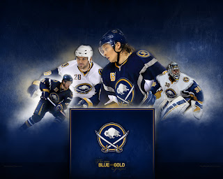
Anyway, that's not what this post is about. We all know the Buffalo Sabres' new uniforms need fixing. I mean it kind of goes without saying. And I think we all know exactly how.

As any Sabres fan knows, John Slabyk's work epitomizes exactly what needs to be done for this team. There should be no question, yet for some reason these designs have yet to hit the ice. What are you guys waiting for anyway?

Anyway, here are a couple of other options borrowing from the designs of some of the other new Rbk EDGE sweaters.

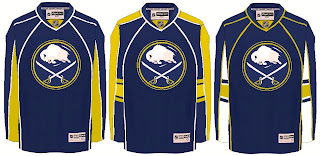
Not sure how I feel about the chest piping, though. I think if you're going to go with a traditional-style logo, you should have the jersey match it. My exception to that rule is the San Jose Sharks.

I also just got sent this design which I really like, as well.

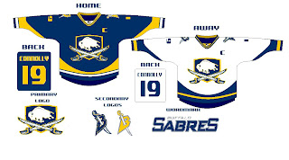
The artwork needs a little cleaning up, so try to see past that. But here we see how to use the buffalo and sword elements without just arbitrarily placing them inside a circle.

But I know there are a lot of Sabres fans reading here, so I'm really interested to see what you guys think your team needs to be wearing. The floor is yours.