Introducing The NHLToL Expert Panel!

The time has come for me to introduce you to the NHLToL Expert Panel! Why an expert panel? Why not?

As this site has gotten more popular over the last several months, I've started to feel like we could use the opinions of some folks educated and working in the field of graphic design. So much of what this site is about deals with design. In fact, just about everything deals with it. So we now have five people who will provide "expert" criticism of the logo and jersey designs featured here on a daily basis.

I'll make an announcement soon about what their first big project will be, but right now, get to know them a little bit in their own words. One thing you'll notice is the logos next to each bio. These logos were designed by each panel member and will identify them each time they write something here at NHLToL.

Doug, Watertown NY

I am an alumnus of The Art Institute of Pittsburgh. Originally from the Buffalo/Niagara Region of NY, I came back home after his schooling in Pittsburgh and began my career.

Starting out as a Photoshop photo retoucher, I then moved away from the Western NY region to enter the world of package design/printing and now am using my prior experiences to help develop and design corporate brands and identities for one of the oldest names in the auto accessory business. With over 10 years of varied design experience under my belt, I have a good eye for what can make a design work in the market or fail miserably in the process.

A passionate Sabres fan for the last 10 years, hockey has steadily creeped into my household where plans with friends are made around the Sabres' schedule come hockey season. With the birth of my first son coming in January, I am already day dreaming about my boy playing in the NHL in 20 years.

Kathleen, Washington DC

I received my BFA in Communication Design from Buffalo State College in August 2006. Admittedly, I am a fairly recent convert to hockey fandom, but always admired hockey logos from afar.

I am an expert (or think I am) because of my chosen field, and being exposed to hockey growing up in Buffalo NY. I understand the great tradition of this sport, and believe out of all of the "Big 4" sports, team logos are most visible in hockey.

Drew, Buffalo NY

I am a freelance web and graphic designer residing in Buffalo, New York. I've done design work for the Official Buffalo Comicon, M&T Bank Corporation, Roswell Park Cancer Institute, as well as logo and flyer designs for local bands, movies, and events.

I'm a lifelong Sabres fan, who infamously ran the Fix the Logo campaign, protesting the "slug" logo design now (dis)gracing the Buffalo Sabres uniforms and merchandise everywhere. For the record, I still buy nothing but vintage logo stuff.

I'm a lifelong comic book fan and collector, and I think that the colorful costumes and iconic symbols of some of my four-color heroes influenced my interest in sports uniforms and logo design. I am also a guitarist, song writer, sometimes actor, sometimes writer, and aspiring craft brewer. Cheers everyone!

Lindsey, Las Vegas NV

I was born and raised in Southern Oregon and I moved to Las Vegas a little over three years ago to get my Bachelor's degree in Graphic Design at The Art Institute of Las Vegas. I have years of training in visual arts, corporate identity, advertising and marketing, and print publication. Graphic Design is as much about the science of how the viewer's brain sees an image as how they react emotionally to what they observe.

But first and foremost, I'm a huge hockey fan and I have been nearly my whole existence. Pens for life!

Ryan, Portage La Prairie MB

Hello everyone. I am your neighbor from the north. I am very excited to be included on this expert panel and cant wait to bring you my opinions and help make this site even better. I have been doing Photoshop for about a half a year and have been taking graphic design courses. I think I will be a good fit and will bring a lot of strong opinions and can be a good critic when choosing the best in the NHL when it comes to jerseys and logos.

So there they are. I hope you all enjoy the diverse input from Doug, Kathleen, Drew, Lindsey and Ryan here at the NHL Tournament of Logos. As you can see, they have their favorite teams, but don't worry, they won't let that get in the way of their actual design analysis.

You will get to see some of their first "critiques" this weekend along with the announcement of their new project. We all look forward to your feedback.


Just To Freak You Out X

It's like watching a trainwreck. It's horrible, but there's just something about it that prevents you from looking away. There's all manner of scary stuff out there and now I'm bringing some of it straight to you on another Freak Out Friday. Here goes.

I wouldn't be able to live with myself if I didn't start with this one.

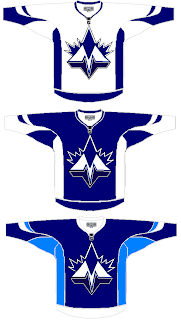
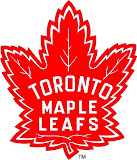
It shouldn't take you more than a second to realize the designer was trying to offer us something different for the Toronto Maple Leafs.

Leafs fans, I really want to hear from you on this one.

We've got a brand new logo with a very prominent "M" worthy of perhaps a place like Minnesota — or Montreal! And that leaf! Don't look it in the eye or it will cut you. Deep.

Even the second shade of blue worries me some. I'm not sure how I'm supposed to feel about this, but let's just say it's not great.

Anyway, I'd like to move along now because I can't take looking at this anymore. There's a point when doing this to a team like the Leafs starts to hurt.

Once again, Leafs fans, please comment.

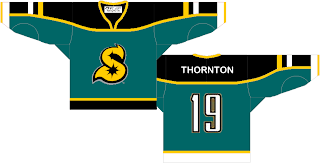
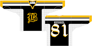
Speaking of prominent letters in place of actual logos, I've got a pair of concepts from each coast.

Cleverly, though, we can't know exactly what these letters stand for as alliteration was employed to mask it. Is the "S" for San Jose or Sharks? And is the "B" for Boston or Bruins? Perhaps, the ultimate question is why dump perfectly good logos for these two teams in favor of members of the alphabet?

Even more disturbing is that "S" keeps reminding me of the Minnesota North Stars. Make it stop.

Each of those were delivered to me with a road sweater design to match. I wouldn't do that to you, though.

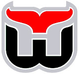
Here's what concerns me, though. I've been send a number of logos which have been converted to red and black for no apparent reason. Do any of these work?


It may be that the blood-in-the-water shark is the scariest one. I do see what's going on, though with the Hurricanes colors on the Whalers logo and the old Sabres colors on the new logo — but that doesn't make it any better.

I'm still worried about the killing to follow.

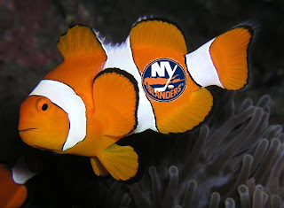
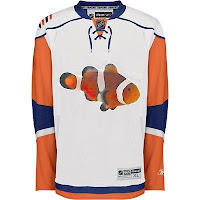
I'll wrap things up today with the thing that might frighten you the most. Did you ever get to feeling like that Rbk EDGE New York Islanders jersey reminded you of something? Perhaps you couldn't quite put your finger on it. But maybe it evoked feelings of being lost. In the ocean.

One reader thought so and sent in this.

If you wanted to know what they were thinking when designing the new Isles uniforms, now you do. Don't you wish you didn't?

So there it is. Another in the Freak Out series is behind us. I'm looking forward to next week. In the meantime, I await your crazy concept art. You can send it to me at nhllogos@gmail.com.

Poll: Rockies vs Penguins


vs
Colorado
ROCKIES
Pittsburgh
PENGUINS


Place your vote and then feel free to leave a comment as to how you came to your decision. Tell all your friends to drop in and vote! The more voices heard, the more accurate the results!

Poll opening date
Fri Oct 12 @ 4:24 AM
Poll closing date
Tue Oct 16 @ 11:59 PM

07VNTRN | #1G | CORvPIT67

Fantasy Update: New Additions

I've got a quick update on the NHLToL fantasy hockey team if you're interested.

I added Scott Walker and Joffrey Lupul to the offense. Unfortunately though, idiot that I am, benched Lupul in favor of Martin Gelinas last night. Lupul was the only guy on my roster to get any points and every member of the team played last night. Disappointing.

But then I also benched Prospal for Staal last week and that came back to bite me as well when Prospal scored twice and Staal was a minus-2. I never claimed to be any good at this.

Anyway, I also added Pavel Kubina to the blue line and dropped Paul Mara. I also got rid of Steve Sullivan since it's anyone's guess as to when he'll actually be back. Plus I realized I had too many Predators on the team.

I've been reading your comments and I really appreciate the advice. Keep it coming.

I still feel like I need an upgrade on defense. I'm thinking about dumping Bieksa and/or Jovanovski. The top players available are Paul Mara, Roman Hamrlik, Tom Poti, Ruslan Salei, Jaroslav Spacek, and Brendan Witt. What do you think?

The team's currently 4th place in the 11-team league, 12 points behind the leader.

By the way, check out Poolhardy: A Guide to NHL Fantasy Pools if you've got the time. It's got some great tips and the writer, Carlo, is the commissioner of my league.