
Hurricanes bring back Hartford Whalers jersey for 2018-19
/
A classic sweater returns in an unusual way as a relocated team pays tribute to their previous identity 21 years later.
Read MoreA classic sweater returns in an unusual way as a relocated team pays tribute to their previous identity 21 years later.
Read MoreA lot of you have been enjoying my series of NHL logo origin stories from the 1990s. Many of those designs were short-lived. Those that weren't are anything but uncontroversial today.
But roll back the clock and we find one of the most universally admired logos of all time.
In 1979, the WHA folded and the New England Whalers were one of only four teams absorbed into the NHL. The franchise was renamed and in need of a new logo. Peter Good was the designer hired to create a new identity for the Hartford Whalers.
On June 29, WFSB-TV in Hartford, Conn. aired an interview between Face the State host Dennis House and Good — from the Connecticut design firm Cummings & Good. During the 9-minute conversation, the two talked about the genesis of the logo and all things Whalers.
What's the deal with resurgence of Hartford Whalers logo? Today on WFSB. Preview here: http://t.co/8GlE0fYIih pic.twitter.com/wP3YioOg5A
— Dennis House (@DennisHouseWFSB) June 29, 2014
If you can't watch the video above, I've transcribed the good stuff below.
Things kicked off with an image of the old New England Whalers logo.
Peter Good: This was given to me as the starting point really. They wanted a new, fresh identity. They just moved to Hartford. There was a lot of excitement in the community.
Like any project, I meet with them. In this case Howard Baldwin, Bill Barnes and I think Jack Kelly was the manager at that time.
Dennis House: And so you started sketching?

Still frame from WFSB-TV
PG: This is where all design projects start. Those are the original designs that I presented not as a design solution but as a way of thinking about the identity.
Curiously, when I did these, Howard Baldwin actually said, "I like the lower right one." Shown here. With the trident. The trident was a reference to the harpoons.
I said, "Why do you like that one?" He said, "The 'H' is there." So I said, "Wait a minute, that was a not a requirement. It was just an idea that I had. But now that I know that it limits the field. So let me have another three or four days to play with it, to go back and rethink this given the idea it should have the 'H' integrated.
DH: And you came up with this?
Still frame from WFSB-TV
PG: This is how it started. I was bothered by the idea of harpoons anyway because their mascot is a whale. So why would you have a symbol that suggests killing your mascot? That seems contradictory.
So I said, what do we have to work with? I have the letterforms 'W' and 'H' and I have a whale. And whales are kind of amorphous creatures. They're not like a tiger where you could characterize it very simply. But the whale's tail is very, very formally interesting. It's symmetrical. So you have three symmetrical elements to play with. This was a gift.

PG: I call it a marriage of convenience between a whale's tail, a letterform 'W' and the offspring is essentially the negative 'H'.
DH: What was the public's reaction when it was first unveiled and first showed up on uniforms?
PG: They liked it. My wife Jan and I designed the first uniforms. There was overwhelming support. I think a lot of it had to do with the idea of Hartford having a professional team.
From there, the two discussed the process of designing a logo in today's climate. The video on WFSB's website becomes choppy at this point, cutting out parts of the conversation. It's impossible to know what they were saying but it seemed insightful. There's mention of focus groups and other things that tend to water down great designs.

Peter Good, Cummings & Good // Still frame from WFSB-TV
Then came the question a lot of fans are curious about.
DH: Who owns the rights to the logo?
PG: Aha, well. This has been controversial since a long time ago. The NHL is licensing it and it's really been a cash cow for them. They are making a profit. We have started doing some things of our own in that we never did sign the rights over. We were asked but we never signed the document. It was never work-for-hire. I still have the check for a dollar that I never cashed to make it legal.
DH: So where do we go from here? Can you sell items?
PG: We're doing some shirts. The products that we're doing are quite different from what I've seen in the marketplace. When we first started this, Jan and I designed a lot of items. It was called the Designer Series and we sold them through the Whalers shop and it was umbrellas and tote bags and shirts and aprons. But they were very sophisticated. Beautiful embroidery. Very subtle. And to tell you the truth, it wasn't successful because sports fans like it big and brassy.
In wrapping up the conversation, House and Good mused on the possibility of the NHL returning to Hartford and whether the name and logo could be resurrected.
DH: How would you feel if the team came back and they hired someone else to change the logo completely?
PG: Believe me, that's happened before. Logos are things that every designer likes to think are timeless and enduring but some that I thought would last for many, many years tend to change.
There's so many factors. The team starts losing games, everything's on the table. Change the uniforms, change the logo and so forth.
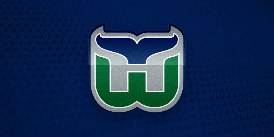
Good may be referencing the fact that for their final five years in Hartford, the Whalers used an altered version of his logo with grey added to the color scheme. That came about in 1992.
Seriously, what is it about the '90s?
FURTHER READING: A Tail of a Whale · Aug 21, 2010
 With word coming down this week that merchandise emblazoned with that classic Hartford Whalers logo is among the hottest selling in the NHL, it's only fitting that we talk about its inexorable return to professional hockey.
It's been 13 years now since the Whalers left Connecticut for Raleigh, N.C. Despite that, T-shirts, hats and jerseys with that iconic blue-and-green mark continue to sell like that of a team that just won the Stanley Cup.
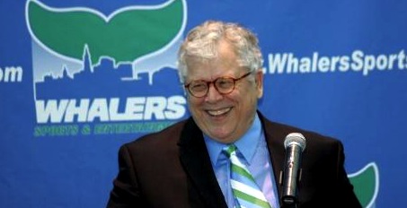 Howard BaldwinHoward Baldwin is a man bent on bringing back his team. And he may get his wish sooner than we think.
In June, Icethetics reported on Baldwin's plans for Whalers Hockey Fest 2011. A day of outdoor hockey featuring Connecticut's best college teams. But he's not nearly done.
Howlings, a blog dedicated to the AHL's Hartford Wolf Pack, has been following some interesting developments. Blogger Mitch Beck says Baldwin will be taking over the Wolf Pack and renaming it the Connecticut Whalers.
As many have read in local newspapers, or here on Howlings, the last hurdle has been cleared for Howard Baldwin and his Whalers Sports & Entertainment to take over operation of the Hartford Wolf Pack.
Well, it is only a matter of time now, as early as next week, that it should become official. When that happens, the Hartford Wolf Pack will be no more and the new team will be the Connecticut Whalers.
This will be a huge moment for the city of Hartford and for the players as well. With Baldwin running things there should be a renewed interest in the team and making it an event once again. Expect the team to once again start drawing big crowds and become the place to be.
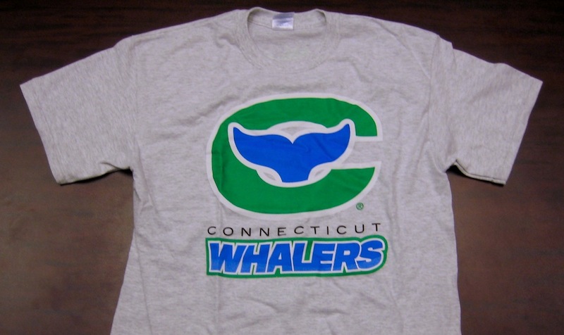 Connecticut Whalers T-shirtThat was posted about a month ago. While we wait for something official, Beck at Howlings continues to stress the inevitability of the change as recently as a week ago.
[The] Greenville Road Warriors will be the new ECHL affiliate for the Rangers and the Connecticut Whalers… Technically they’re still the Hartford Wolf Pack, but that’s only a matter of time.
And even now you can buy a Connecticut Whalers T-shirt from Baldwin's website, WhalersProShop.com — complete with a brand new logo and everything. The potential new logo for a rebranded Wolf Pack franchise?
It's not a great logo, but how much can really stand up to that original HW design? Some people go years before even noticing the H in the negative space. It's a logo so great, it gets featured in a book titled Design Principles and Problems, published in 1995 and referenced by Paul Lukas on Uni Watch last December.
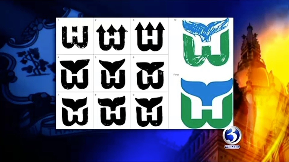
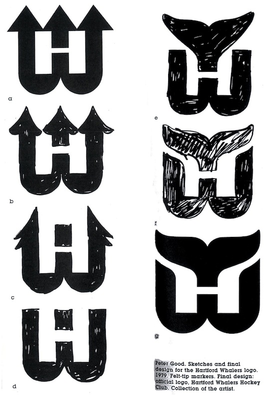 Whalers logo evolutionWhen the WHA folded in 1979, the New England Whalers were forced by the Boston Bruins to change their name before they could enter the NHL. That meant the need for a new logo. The following is an excerpt from Design Principles and Problems:
When Peter Good was commissioned to create a new logo for the Hartford Whalers hockey team, he was given a specific message to convey. Good's challenge was to give the H of Hartford and the W of Whalers equal billing in a design that suggests whaling and the feeling of a partnership between a dynamic team and a dynamic city.
The trial sketches and the final solution reveal Good pushing this basic idea through a variety of solutions until a design evolved that conveyed the desired message well. The first solution shown (a) was accepted by the client but unsatisfactory to Good because the H repressed by the enclosed, unfilled area was stronger than the W.
In the second sketch (b), Good softened the impact of the H by opening it to look more like harpoons than in the first solution. In the third sketch (c) he extended the attempt to soften the H, pushing the harpoons to the side. This possibility he rejected as ugly. In the fourth sketch (d) Good tried omitting the harpoons. The result balanced the W and H but was not particularly exciting.
The fifth sketch (e) reveals the sudden inspiration of using a whale's tail. Sketch after sketch followed, with Good trying to develop a more flowing interlock between the tail and the W. When he hit on the final solution, he wrote, "Eureka! Good 'W' and good 'H' living happily together."
Finally, Good notes a special effect created in the "empty" H space: Light seems to flow into the H legs from the outside, becoming trapped in glimmering optical pools of brightness at their base. This heightens the contrast between the straight-based H and the curved both of the W, giving the design an exciting look.
Stories like this always help me find inspiration when designing.
 Anyway, though Baldwin might get his wish with the Wolf Pack, the chances of the NHL returning to Hartford in the near future are slim. Let's not forget the nature of expansion in the NHL over the past decade. This has been the league's most stable period since the 1960s.
Brian Favat of SB Nation Boston also makes a good point:
Thirteen years later, the primary factors that caused the Whalers to leave town — a viable market and lack of modern playing facilities — are still present. When the Whalers were in town, Hartford was the smallest market in the NHL. As Hartford straddles both the New York and Boston markets, their marketability was severely limited by geography.
In addition, Hartford still doesn't have a new hockey arena. The city's XL Center is 35 years old and there are no plans to build a new arena. The AHL's Hartford Wolf Pack ranks only 18th in the AHL in attendance, drawing a little over 4,000 fans a night.
Hartford's limited appeal as a viable NHL market isn't the city's only hurdle to overcome. Today, the city faces increased competition from cities like Kansas City, Winnipeg, Quebec and Hamilton, all vying for their own NHL franchise. Despite these obstacles, however, Baldwin remains positive about his chances.
Icethetics will continue to track any Howard Baldwin-related Whalers news, including any possible name change for the Wolf Pack.
Some of you have been concerned by my lack of updates lately. Sorry, I'm just one person. And while I have been enjoying all that Super Mario Galaxy 2 has to offer, it's actually vacation prep that's been keeping me away from Icethetics. I'm out of the country all next week so hopefully this extended post will tide you over until I get back.
Chris Creamer's SportsLogos.net is a resource I know many of you can't live without. Earlier this week, new NHL team anniversary logos started appearing on the message boards. Typically there are no big unveilings for these things, they just tend to come out in drips and drabs. So let's take a look.
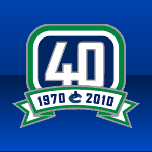 The Vancouver Canucks celebrate their 40th NHL season in 2010-11. This mark will likely find its way onto the jersey somehow. It's a pretty standard birthday logo, although for some reason it reads as a tombstone to me, the festive ribbon notwithstanding. Maybe it's the dash between 1970 and 2010.
In any case, it's basically the stick-in-the-rink logo sans the stick, replaced by a big 40. Not the most creative thing they could've done, but creativity isn't that organization's strong suit these days. Just one opinion. It's plain.
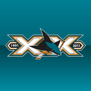 The San Jose Sharks are turning 20 in 2011, but they're getting the festivities started a little early. You'll note that the 20 refers to how many years the team has existed not how many seasons it's played. Anyway, it's a solid logo, built on a pair of Xs with the shark in between.
It features a great use of color and type so I can't complain. It is rather wide, however. And just try to count all the triangles and partial triangles that cover the thing. Overall, thumbs up.
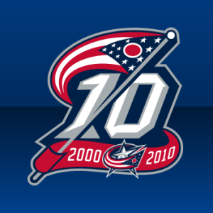 Lastly, the Columbus Blue Jackets will join the Wild in beginning their 10th NHL season this fall. Rumors of a cannon taking center stage on the forthcoming third jersey next season are not substantiated by this mark, which gives us an alternate perspective of the Ohio state flag instead.
For whatever reason, the waving flag just screams Civil War to me. I like it. Definitely furthers the brand of the club. So kudos to all these logo designers. Sharp work for logos that will only be in use for a single season.
Thanks to those of you who pointed them out to me.
 It should be news to no one that the Toronto Maple Leafs will don altered jerseys beginning with the 2010-11 season. And by "altered," I mean "fixed." The missing stripes will return as will a much-needed shoulder patch.
 Will the Leafs wear these in 2010-11?Mike Burse of Bleacher Report offers up an in-depth look at how Leaf fashion directly correlates to Leaf success/failure. He also offers up this mock-up/concept (right, from LeafsHQ, see below) of what these new jerseys might look like.
As I've mentioned prior, no final decision has yet been made public. To this point, all we have is what team management has said. But for the record, Burse also says the Leafs have had these alterations in the pipeline since April 2009.
The article also says that a new third jersey is in the works to replace the current one, but that won't happen until the 2011-12 season at the earliest. There's a lot of history to choose from.
 Howard Baldwin wants to bring hockey back to Hartford. NHL hockey. Whaler hockey. For those that have missed that iconic logo, he's trying to bring it all back.
Icethetics reader Gennaro Schiano writes in about the newly announced Whalers Hockey Fest which will consist of a series of outdoor hockey games to take place in February 2011. You can read more about it on Baldwin's website, WhalersSports.com.
Man, all this talk about changes to the league; will any of them happen? Will the Coyotes stay in Phoenix? Will Hartford get a team back? Will Winnipeg? Kansas City? What about new markets like Las Vegas? It's all kind of exciting.
Hopefully Whalers Hockey Fest is a big success. I'll be keeping an eye on it.
 Tampa Bay Rays in hockey sweatersBy the way, if you're interested, over the weekend the MLB's Tampa Bay Rays sported NHL jerseys on a road trip to Toronto. They had Blackhawks, Penguins and of course Lightning jerseys. Even the Bruins and Predators made an appearance.
There's more to this story and TSN has it covered for you.
It was brought to my attention that the above Maple Leafs jerseys were actually created by Jeff of LeafsHQ. You can see more images and his take on the forthcoming sweaters over there. Plus, as the Leafs ponder a new historical third jersey for 2011-12, Jeff has put together some concepts based on past uniforms. All worth checking out. Enjoy!
This upcoming season will mark the 30th anniversary of the Hurricanes franchise — this includes their time in Hartford as the Whalers. The guys over at Hockeybums have a contest going to mark the occasion. It's something a lot of you might be up for.
They want artists to submit designs incorporating both the Whalers and Hurricanes jerseys. I'm guessing they also want some sort of hybrid logo as well to keep it from being too easy. They're also promising a "special prize" to the designer of the best jersey.
The contest runs until the start of the season.
