Just To Freak You Out XIV

It's the end of another work week and we all know what that means — Freak Out Friday! A series, which by the way, has become very popular. So as long as you guys keep sending in crazy crap, I'll keep posting it every week. I'll start things off tonight in New York.

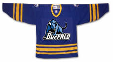
I felt I couldn't properly begin a Freak Out Friday without involving the Buffalo Sabres somehow.

See? This is what happens. What is that anyway? Somebody call Paul Bunyan. We found his ox. Yay.

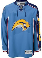
Easily the most maligned logo in the NHL, imagine the "Buffaslug" on what's been one of the most maligned jerseys here at NHLToL. How much do you guys love this concept right here?

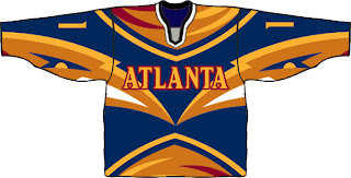
Not that much? Just when you thought it couldn't get any worse. Anyway, while we're on the subject of the Atlanta Thrashers, see if you can endure this monstrosity.

I know that wasn't easy, but don't worry, it's over now. Let's not let this happen again, all right?

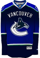
Gradients on jerseys is a personal pet peeve of mine. Who was it that thought these looked good?

Oh yeah, those guys did.

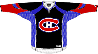
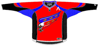
Have you ever tried to use red, blue and black together? Here's why you don't.

And here's another reason.

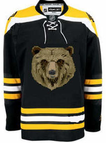
Finally, I'll leave you this evening with one simple concept and a profound statement.

Only you can prevent forest fires.

Until the next time, try not to freak out too much.

Poll: Wild vs Avalanche


vs
Minnesota
WILD
Colorado
AVALANCHE


Place your vote and then feel free to leave a comment as to how you came to your decision. Tell all your friends to drop in and vote! The more voices heard, the more accurate the results!

Poll opening date
Fri Nov 9
Poll closing date
Tue Nov 13

07TJTRN | #1E | MINvCOL

Poll: Stars vs Oilers


vs
Dallas
STARS
Edmonton
OILERS


Place your vote and then feel free to leave a comment as to how you came to your decision. Tell all your friends to drop in and vote! The more voices heard, the more accurate the results!

Poll opening date
Thu Nov 8
Poll closing date
Mon Nov 12

07TJTRN | #1D | DALvEDM

Connecticut Day

One last post for today. It's Connecticut Day over at the Tournament of Hockey Logos blog. Reason being the state's two AHL franchises are going head to head in the AHL Tournament of Logos today. Head over and vote!

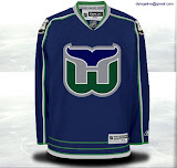
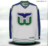
Meanwhile, I figured I'd draw in The Nutmeg State's NHL connection — the Hartford Whalers. Got some concept art, of course.

It's a peek at what the Whalers might've looked like had they made it to the Rbk EDGE era — and hired the same designer as the Calgary Flames. Notice the shield from the state flag on the shoulders.

I do like the designer's choice of thin lines on this jersey. I bet it would look killer on the ice. Too bad we'll never find out.

Anyway, I hope you enjoyed Connecticut Day. Perhaps one day soon will be Pennsylvania Day. I've got a ton of Flyers/Penguins artwork.

Reworking The Oil

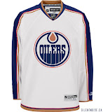
The concept art has been flooding in over the last several days, so it's time to share a bunch. We'll begin with the team whose uniform finished second to last in the NHLToL's Uniform Ranking. The Edmonton Oilers.

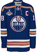
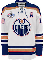
Starting with my personal favorite, here. They're much busier in comparison to the current sweaters, but it would be a welcome improvement. Perhaps I speak for myself, though. Let me know. I just think that the Boston Bruins hit it right on the nose with their new sweaters. Why shouldn't other teams have a shot at something similar?

Especially the Oilers.

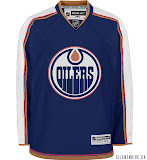
Another sharp design that was submitted seems to be based off of the Columbus Blue Jackets. See what we're getting at here? The Bruins and Jackets finished #1 and #6 respectively, in the Ranking. That has to say something.

Finally, it's not so much a jersey concept I wanted to share, but a logo.

I don't like it as a primary mark, but certainly something similar would be nice on the shoulder as a secondary. Of course you'd have to get past the whole Houston Oilers logo in there. But a little imagination would solve that problem.

So kudos to the artists on all these designs. Really top notch work! Keep it coming, everyone!