Hi Ted, Caps Fans

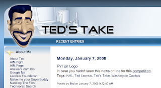
I noticed yesterday the blog got a mention on Washington Capitals owner Ted Leonsis' blog at AOL.com. On Ted's Take, there was this post.

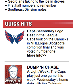
Then also, right there on the Caps' official web site is a link touting the secondary logo's recent victory in the logo tournament.

Unfortunately they got the name of the site wrong (also misspelled the word "competition"), but I guess I can forgive them. And then combining both Leonsis and the official team site was a mention in the Owner's Corner column posted today.

...

And finally, congratulations to our secondary logo mark, which won the NHL Tournament of Logos at nhllogos.blogspot.com. We edged Vancouver’s secondary mark in the finals. Previously we had tied for second in the Rbk Edge Uniform Ranking, joining Montreal behind Boston. The Hershey Bears were edged out in the semifinal round of the AHL tournament by the Bridgeport Sound Tigers.

That’s why I love the web; there are so many ways for fans to interact and connect. Well, I look forward to seeing many of you at our season-ticket holder Meet the Team Party Thursday night and others at the stretch of home games we have ahead. I hope you share in my excitement for what I believe will be a promising 2008.


Pretty cool stuff. I can't believe the kind of recognition this site is getting. My thanks go out to Ted and all the folks with the Capitals' organization for supporting the site — and coming up with such an outstanding logo!

NHLToL: Quest For The Worst

It's a big day here at NHLToL. First, I'm introducing the new logo tournament which will be starting soon.

Introducing...

There's currently a video at the top of the page so you can learn which logos made the cut for this competition which will crown the worst logo in the history of the NHL.

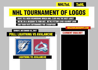
You might also notice that the graphics in the video don't quite match the graphics on the site here. I'm considering a design overhaul for the site. You can see the rough idea I've come up with in the preview below. It's very much a work in progress at this moment so don't expect to see it any time soon.

Just wanted to keep you guys posted on what's going on here. I welcome any comments or criticisms. Thanks for continuing to visit the blog!

UPDATE (1/9 5:21 PM): As you may have noticed the video I referred to in this post can no longer be found at the top of the page. Instead, I've moved it here to the bottom of this post for posterity. Enjoy!

Result: Canucks vs Capitals


CAPITALS NAMED CHAMPION!


Congratulations go out to the Washington Capitals' secondary logo tonight for being named by the voters here at NHLToL as the best in the league! The Capitals finished the final poll with a 52% of the more than 2,200 votes.

Thanks to everyone who voted!

As far as what's next, you guys have been putting in your nominations over the last few weeks for the NHL's worst logo. Stay tuned for news on which logos will make it into the bracket on the way to being crowned the worst in the league.

Concepts In Photos

It's my favorite thing. Concept renderings in pseudo-photographic form.

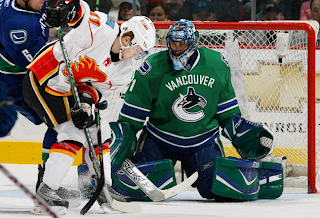
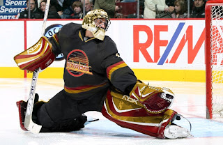
The most commonly used player for these jersey redesigns has overwhelmingly been Roberto Luongo. And it hasn't just been Canucks concepts for him, either. But tonight, yes, they are both Canucks concepts. Here's one.

Seriously, I would buy that. That green looks phenomenal. I don't know why his teammate isn't also wearing green over there on the left, but that team would still look a million times better if only Luongo wore a good sweater. While I'm thinking of it, are there still people left who liked the old '80s logo and colors?

Don't be fooled, though. It's not the jersey. Luongo can make anything look good.

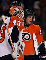
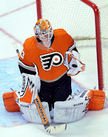
Next we're moving on to the Philadelphia Flyers.

It's a simple redesign that incorporates orange and a bit of silver. But if you want to see the goalie wearing it, well you'll have to look at the image on the right (not the left).

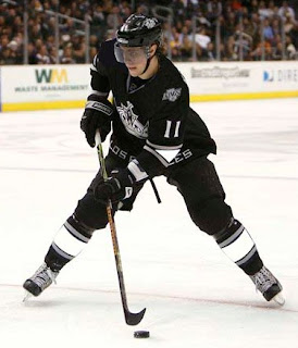
Back to the days of black-and-white Kings here.

And hurricane flags that are actually hurricane flags.

Now we see why the team didn't do that in the first place. The shoulder thing is cool because it incorporates both of the Carolina-named states. I don't think a dividing line at the border would be too much to ask for clarification's sake.

Lastly, if you hated those mustard-colored jerseys once worn on special nights by the Nashville Predators, then you're absolutely going to adore this.

And one final note (which may or may not explain the late hour of this particular post) if you are into things that are funny but not necessarily hockey-related. First, go see Juno. Great film. (In one scene there's a guy wearing a Minnesota Wild jersey. The green one you all like.) And buy a copy of Stephen Colbert's "I Am America (And So Can You!)". (I'm pretty sure he's all about the OHL's Saginaw Spirit.) These two things will complete your life. If they don't, you have no soul.

Just To Freak You Out XXII

I can't believe how long this series has lasted. At 22 and still going strong, what follows is another edition of Freak Out Friday. Where do I begin?

I think I'll start with a play on the Winter Classic which took place this week. It's an "If They Mated" featuring the two teams involved in the big outdoor game.

Curiously though, while the designer went with the original Sabres logo, they opted against the original Penguins colors.

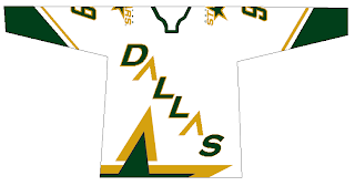
Now is where I really get into the scary stuff, so be warned.

Though well executed, that can't be a good idea. Speaking of which...

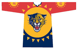
Let the eye-gouging begin. It makes great use of the Panthers' colors but what is with all the suns? We get it they're the Florida Panthers!

Here's what we need.

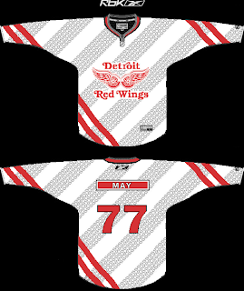
Because nothing says we're getting rolled over like a jersey with tire tracks. A sentiment less suited for the Red Wings (first place) and more so for the Lightning (last place) who can't seem to remember how to win games. But I'm not bitter.

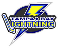
Speaking of the lackluster Lightning, the one color I hope is never incorporated into the Bolts' identity is yellow.

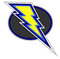
Did I mention how I hate the yellow?

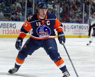
And finally, it appears that not a lot of effort was put into this, but I thought the logo was funny enough to revisit.

Keep the crazy artwork coming so I can continue to frighten and freak out the readers here at NHLToL. Enjoy your weekend!