Poll: Sabres '06 vs Sabres '96


vs
Buffalo
SABRES '06
Buffalo
SABRES '96


REMEMBER: You're choosing the WORST logo!

We're kicking off the Quest For The Worst tonight with the Buffalo Sabres. Fans have lamented each new logo since 1996 from "The Goathead" to "The Buffaslug." Time to decide which is worse.

Place your vote and then feel free to leave a comment as to how you came to your decision. Tell all your friends to drop in and vote! The more voices heard, the more accurate the results!

Poll opening date
Mon Jan 14
Poll closing date
Fri Jan 18

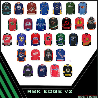
Rbk EDGE v2 Concepts

A reader recently sent in about a league's worth of concept art I thought I'd share with the rest of you to today.

It's cool because most of the jerseys have small changes but are really great while some are — not so great. Some have no changes at all. But here's the thing. There are only 29 teams represented up there. The first one who can figure out who's missing wins.

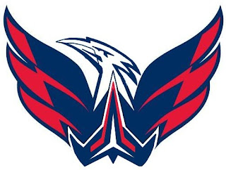
Anyway, I like the green Dallas and Vancouver jerseys. Nice change. Anaheim's is really awesome. My favorite is Buffalo. What doesn't work: Lightning, Flyers, Capitals and Islanders.

Hope you guys enjoy the Quest For The Worst tournament. It's starting today!

Quest For The Worst Starts Monday!

The NHLToL Quest For The Worst officially has a start date. It's Monday, January 14!

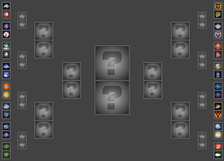
Tomorrow afternoon, the first poll will be posted in the competition which will include 32 of the worst logos in the history of the NHL as determined by you, the readers. While you wait, have a look at how the first round will shape up. Below is the bracket for the tournament.

Hope you guys enjoy this one. As always, feel free to drop me a line in the comments if you so desire.

Just To Freak You Out XXIII

I've been pretty bogged down with getting this next tournament ready. I really hoped I'd have it posted by now, but obviously it hasn't happened yet. Patience. In the meantime I've got some other cool stuff for you guys to enjoy.

First thing, a reader emailed in a link to a site called MG's Helmets — specifically to a page where the designer has come up with a bunch of NHL concept football helmet designs. It's quite clever actually. My favorite thing is how any references to hockey have been removed from the logos. You'll find no hockey sticks and no pucks. Haters of the "Buffaslug" might notice at a quick glance how ridiculously appropriate that logos looks on a football helmet. The only other logo that even comes close to looking good on a helmet is the Flyers.

It's just weird.

Now you're good and prepared for the freak out stuff. I would've done this yesterday, but I didn't. This one is all wacky logos.

First, the Atlantington Thrashitals.

Then the Phitroit Flyer Wings. I know, creative names.

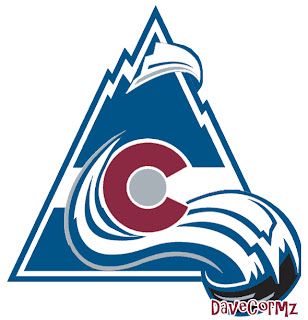
This next one here is a combination of the two Colorado clubs that have graced the NHL — the Rockies and Avalanche.

Not too horrible. I haven't quite figured out how the avalanche of snow has passed directly through the mountain, but I've found in my life it's best not to ask questions.

Here, I think we've got an amalgamation of just about every Edmonton Oilers logo ever used.

Learn what it means to be freaked out. Learn it well.

And finally, a weird generic Bruins logo design that could be used for absolutely any team called the Bruins whether they happen to be located in Boston or not.

Thanks, but I'll keep the spoked B.

Saw Charlie Wilson's War tonight. Philip Seymour Hoffman is my hero. Enjoy the other half of your weekend. The Quest For The Worst is imminent.

The Rest Of The Worst

Just wanted to point out that you can now see Part Two of the NHLToL Quest For The Worst video at the top of the page.

That's right, it's going to be the biggest tournament yet with 32 logos involved! I hope to have the bracket up along with the first poll by Friday or Saturday at the latest (sorry, it's a lot to organize).

A quick note about how I came to use these 32 logos in the tournament just so everyone's clear. Basically, I scoured through all of the comments left in the nomination post from back on December 21. I tallied up every nomination and developed a pool based on which logos got the most nominations.

I didn't choose the logos myself. I really wanted to make this a very democratic process. You guys are going to be voting, so it was up to you to decide which logos would be involved in the first place.

As far as how the bracket will be set up, just know that this one will not be random. I went through and meticulously matched up logos for this first round in a way that just felt natural. At its core is similarity. For instance, the two stink-in-rink Canucks logos are paired up in Round One. You'll see the rest of the match-ups when I post the bracket. Then you'll start voting on which logo is the worst!

Meantime, if you have any questions, I will absolutely answer them. Leave them in the comments area and I'll get back to you as soon as I can.

By the way, you can still see the original video by clicking here.

UPDATE (1/10 2:26 AM): There was a very good question posed in the comments that I wanted to answer here.

I dont get it, the Canucks' stick in the rink is in the worst logo pool, yet it finished 2nd in the last tournament.

In fact, the stick-in-rink logo used now is very different from the one used in the 1970s. (Look at them side-by-side if you don't believe me.) Part of the criteria for logos in this tournament was that they could not have made it past the first round of any previous tournament they had already been a part of. Otherwise that would've meant there was at least one logo you guys thought it was better than — obviously meaning it wasn't the worst. (Did you follow that?)

The 1970s stick logo lost to the Whalers in the first round of the Vintage Tournament if you recall.

Initially, my plan was to make this tournament out of all the logos that were defeated in the first round of the previous tournaments. But ultimately I opted against that to let you guys make nominations.

By the way, I don't think this question was asked yet, but in case it comes up, I thought I'd address it. The Mighty Ducks third jersey and the Canucks' yellow V jersey both have pseudo-logos featured in this tournament. While these may not entirely be considered logos in the general sense, I made them part of the competition because of the large number of nominations they earned.

Hope that explains everything. Again, feel free to ask questions if you've got them.