Canada III: Calgary & Edmonton

Just 46 more hours now until I first set foot on Canadian soil. But before I go, it's my duty to continue to share the concept art that many of you have been so gracious to send in. Continuing with the Canada theme we're visiting the province of Alberta tonight on our way to BC.

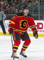
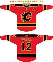
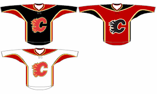
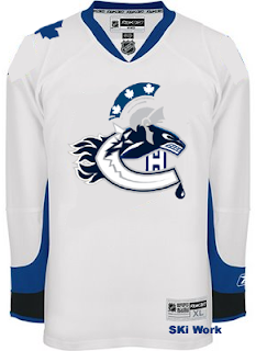
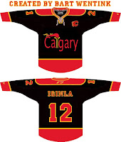
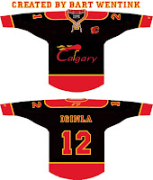
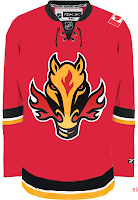
So then. The horse with the flaming nostrils. I always liked him. Here he is on red.

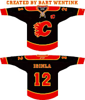
It suits his apparent rage. And for a refreshing change of pace, the white Flaming C on a black sweater.

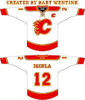
Doesn't really say fire to me somehow.

Nor does it work in white. I'm sorry but I think the Flames by nature have to be a red team.

So with that in mind, here's a new idea based on an old concept.

There are also white and black versions of that design.

And this next one just looks like a hoodie to me.

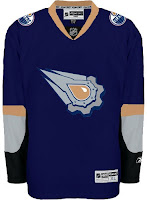
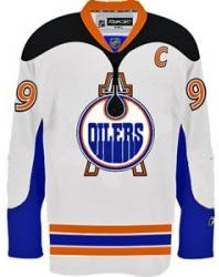
To finish this out we've got a couple of Oilers concepts. The black around the arms makes this one interesting.

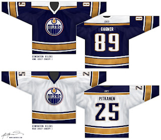
Needs something for contrast around the logo which is outlined in blue. And this final set I thought was really sharp. No reason a professional hockey club shouldn't look that good.

That's a nice uniform. But now I've got to put the final touches on packing, go to work tomorrow and then prepare myself for seven hours of flying across the North American continent. Fun stuff.

Canada II: Ottawa & Montreal

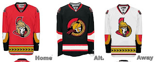
Tonight's all about the Sens and Habs. I've been sent some really nice Ottawa concept art over the last few weeks. Also some really strange stuff. Take a look for yourself.
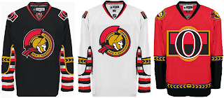
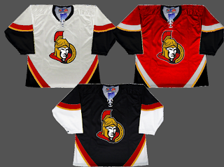
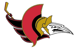
I really love that 2D logo. I wish the Lightning had a logo that looked that good. Here's a different set along the same lines.

The next design has odd striping patterns in my opinion.

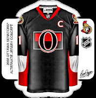
And finally, all the talk about third jerseys brings this black version of the Sens' sweater.

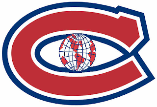
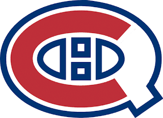
The last two items are Canadiens logos. The first one's pretty self-explanatory to anyone who knows the logo history of the Montreal Canadiens.

This one would work if the Habs were to change their name to the Quebec Canadiens. Or something like that, I guess.

Tomorrow will be Calgary and Edmonton. Tuesday will be Vancouver. In the meantime, I'm almost all packed and more than ready for my vacation. I'll be in Canada in about 65 hours from now. Can't wait!

Canada I: Toronto

I'm probably getting annoying with all the talk about my Canada trip, but can you blame me? I've got concept posts coming specific to Canadian clubs for the next few days leading up to my trip. (I fly out of Tampa on Wednesday morning, by the way.)

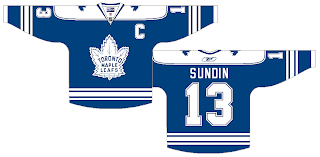
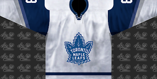
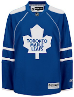
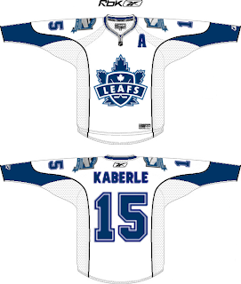
Anyhow, tonight we're getting things going with the Toronto Maple Leafs. First up is a simple design that would be acceptable as an alternate sweater.


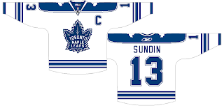
With the same logo, but on a different tack comes this set.


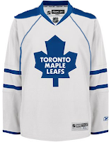
That's really cool but probably somewhat unrealistic. More on the realistic side is this next set.

But most folks probably won't like the piping. However, I think the shoulder yokes make up for it.

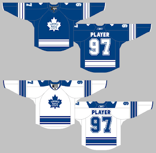
These jerseys are nice. A lot of people will probably complain about the broken stripes around the waist.

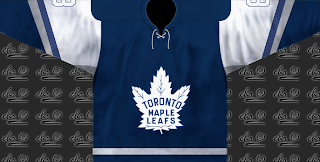
I understand that, but it's a unique feature. What I like about the next set, which is similar to this one, are the shoulder logos.

These last two are just for fun. One designer suggests the Leafs use a version of the Marlies logo.

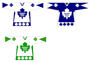
Probably not the best idea. And the last one recommends green for an alternate sweater.

I don't really know what to say about any of that.

But that's it for tonight. Can't wait for Vancouver!

Just To Freak You Out XXIX

Since I leave in four days for my trip up to Canada, I'm going with a Canadian theme here in order to freak you out tonight. So let's start with the most obvious one. The usual "If They Mated" concepts typically mix two and in rare cases three teams. One artist went above and beyond, mixing all six Canadian teams onto one jersey. The result will shock you.

I warned you. And I love how it's on the Lightning's white sweater. Creativity at its finest there, friends.

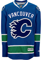
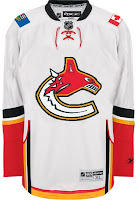
But back to more familiar territory now. Imagine the Canucks and Flames swapping colors and sweaters. Wait, you don't have to. I've got it right here for you.

The Atlantawa Thrashators, if you will.

What happened to that dude's face? Not to be outdone, ladies and gentlemen, the Edmonton Oilers.

Gotta love the oil shooting out onto the shoulders. But back to the nation's capital, for a small handful of teams the state/provincial outline works well in the logo — Lightning, Islanders and Stars to name the only ones. Here's a good example of why not everyone should try it.

Yeah, I didn't even mention the stripes. Can you believe that?

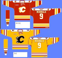
And as you know, it's difficult to pull of a yellow jersey that actually looks good. Unlike most of you, I was a fan of Nashville's gold alternate jersey but not Boston's yellow third. Weird, I know. But the Flames should absolutely not try yellow.

That's why. And if they ever decide to look for a new logo, here's what else they shouldn't try.

Balls of fire! And that is all I have to say on the matter.

And with that I'm going to go pack a bag and prepare myself for weather in which a native Floridian can only freeze. But I'll be loving every frozen second.

Bruins Show Third Jersey "Finalist"

I got a few emails from readers tonight regarding the NESN broadcast of the Bruins-Penguins game. Apparently, they showed what's being called a "finalist" for a third jersey to be worn, I'm assuming, next year.

Here's an email I received about it:

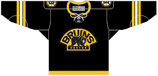
NESN just showed one of the "finalists" for the Bruins third jersey next year. It was a black jersey with a thin gold stripe on the very bottom of the jersey, white, black and gold stripes on the elbow. The secondary logo is the primary and the spoked "B" is the shoulder logo.

Evidently, the Penguins broadcasters mentioned it to, according to this email:

While watching the Pens-Bruins game on Thursday, the Pens announcers made reference to the Bruins practicing in new jerseys that they intend to use next season. I have no photos but I thought that you could know about this.

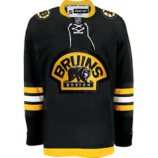
The best part is one person even sent in a mock-up of what he saw. He says he's unsure about the collar and which logo was used (Boston or Bruins), but the uniform apparently looks a little something like this.

At least it's not yellow, right?

If anyone happened to record the game on NESN, perhaps you can send a screengrab my way so I can post it here. In the meantime, this appears to be a decent possibility for a Bruins alternate jersey for the fall. I'll post more as I find out.

UPDATE (2/29 4:33 AM): Got one more concept for the Bruins' new third from a reader, based on the NESN broadcast. Check it out.

I'll post more as I get it.

UPDATE (2/29 2:20 PM): Turns out someone did record last night's Bruins game and now there's video posted on YouTube. See the third jersey finalists for yourself right here.

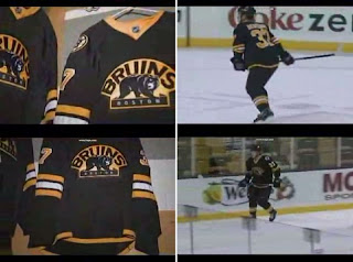
UPDATE (5/4 8:13 PM): Because I'm slow I just realized that video above has been removed from YouTube. If anyone knows where another copy might be available, please let me know so I can embed a new link. In any event, someone was smart enough to grab freeze frames from the clip before it disappeared.

It's better seeing the video, but what can you do? At least you're getting a glimpse of what might be.