Just To Freak You Out XXXIII

Hell has frozen over!

Indeed, the Freak Out Friday has returned. After two weeks off, it's been resurrected. All the talk last month about the league returning to the third jersey program next season has died down, but folks are still trying to come up with the best solution to this alternate sweater issue. The ones that fail tend to end up here.

See what I mean? What happened with the D there? And don't get me wrong, I like that blue for my Bolts, but I can't imagine having that written on the front of the jersey. There's more.

Same goes for the other team that joined the league the same year as Tampa Bay.

I know these are designs based on previously discussed rumors, but I always thought they were too horrible to actually see.

I've got some other stuff too — like a new alternate logo for the Blue Jackets.

And a sweater to boot.

But my favorite pair of sweaters for this week's Freak Out are based on the Minnesota Wild and the previous NHL club that occupied the state.

And finally, I know you guys hated the guitar thing, but someone else made this one and I thought it was kind of interesting.

So keep the crazy artwork coming in each week if you want me to be able to continue this series. I'm counting on you! Yes, you! And that's that for this week. Hopefully I'll return next Friday with a brand new batch of insanity.

Desert Art

The last time I posted any good Phoenix Coyotes artwork was... well, it was never. I've never posted any good Phoenix Coyotes artwork and for that I am ashamed. That streak ends this afternoon.

If there was ever a reason for the 'Yotes to don a black third jersey, this would be it.

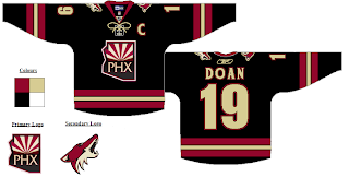
I never would've thought that PHX logo would look good as a crest. Proved me wrong, right there. Here's what made me think that in the first place.

Yeah. Don't worry, though, I'm not wasting it. We've got some decent Freak Out stuff for Friday too.

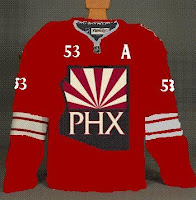
Below is a simple redesign concept with the old moon logo I liked a lot.

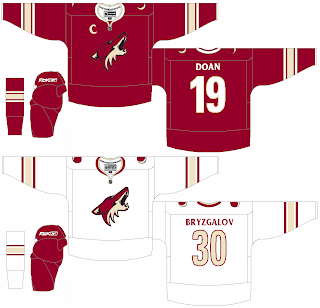
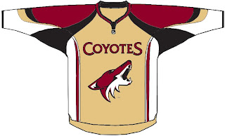
This does make me miss the PHX logo, though. However, the Coyotes still wear that moon logo on their pants. But what if we combine it with the current primary?

And then slap it on a jersey?

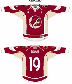
Lastly, we get a look at the reason why text needs to stay off the front of jerseys.

That's all I've got for you today. Tune in next time for more fan made concept art. You know you love it. In the meantime, keep voting on the NHL's best goalie masks! Despite being just over halfway through the first round, we're actually making some headway. We'll have a winner before you know it.

Something BIG is coming... May 1, 2008!