Popularity Experiment

The word "popularity" has been getting tossed around in the comments a lot lately. Every poll I post is an opinion poll. I want a consensus of opinions on various topics like logos and goalie masks. So the idea that folks are saying you should vote based on aesthetics or any other specific element is, well, wrong in my mind.

In every poll I ask "which is better?" If there were set guidelines to make this determination by, a poll would be irrelevant. We'd simply gather data per the guidelines and come to a logical conclusion. But this is art, for lack of a better term. There is no good and bad, there's only the opinion of the person looking at it. The line about beauty being in the eye of the beholder comes to mind.

That being said, I want to try out an experiment. I want to do a series of "popularity contests" to prove a point as the Tournament of Goalie Masks winds down. I'm starting with the obvious question for a hockey blog. What's your favorite team?

About halfway down the sidebar is a ginormous poll with 30 possible responses. You're to simply select your favorite team and cast your vote. That's it. I'm curious to see who has more fans visiting the blog. So go VOTE NOW!

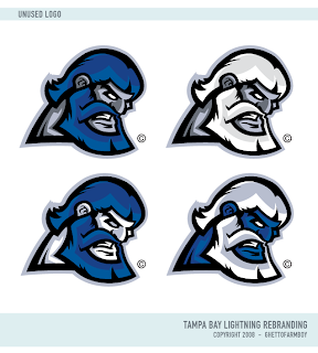
GFB Exclusive: Unused Lightning Marks

Earlier this month, I posted Matt's new Tampa Bay Lightning logos as part of his Rebranding The NHL series. They were met with much admiration. But there is a logo you haven't seen yet.

It was left out of the final design but as part of my partnership with Matt (aka GhettoFarmBoy), he's made some of his unused work available for your viewing pleasure.

I'm not sure what to make of it myself, so I'm looking forward to your comments. Post them below!

Don't forget, there's a Freak Out Friday coming at the end of the week. Get your wacky artwork in by tomorrow night if you want it included! Email me at nhllogos@gmail.com.

Albertan Art

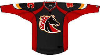
No new poll today (first time in weeks, I know). Instead I've got concept art all for our favorite two clubs from Alberta. We'll start in Calgary and work our way north.

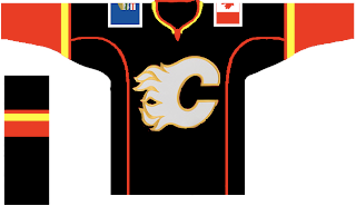
It's a flaming horse. I was a fan of the original black third jersey, but I'm not so sure on this one. Especially on a black sweater. But speaking of black sweaters, one might make for a nice, if not predictable third jersey.

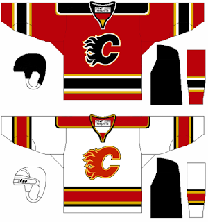
This one's even got the provincial and national flags on the shoulders. But if your tastes are more suited to the traditional striping patterns, well we've got that as well — in red and white.

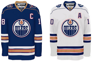
Next we head to Edmonton for a nice pair of jerseys.

The secondary on the shoulders of the white one is cool. But both of them work really well and have stripes that are actually stripes.

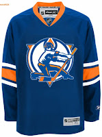
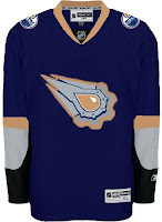
In this next set, we reintroduce the rigger in an updated version of the original logo as well as revisiting the old third jersey.

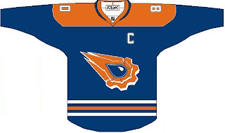
Believe when I tell you it could be worse. And if you don't, here's proof.

That thing should definitely always be silver. Never orange. Ever.

The next poll in the Goalie Mask tourney is coming up tomorrow. It's Luongo against the winner of the Fleury-Theodore match-up. At the moment, Fleury is ahead. Enjoy what's left of your long weekend — for those of you not in Canada.