Icethetics Launched!

Hey everybody! Icethetics is officially here and I know you're excited about that. It's a little bare right now, but give it time.

If you're new to this, Icethetics is a brand new blog born from the merging of the NHL Tournament of Logos and Tournament of Hockey Logos blogs. Icethetics will feature the same great combination of reader-submitted concept art and logo voting as well as so much more!

Over the next few weeks I'll be rolling out all the new features and additions including a brand new concept art gallery, an artist partnership program and a brand new tournament for you to cast your votes! And actually, I'm announcing the new tournament today. It's something I've been talking about for several months at NHLToL.

Get ready for the NHL Tournament of Center Ice Logos! (I know you saw that coming.) Each team has in their arena a unique design painted onto center ice — usually incorporating their primary logo — so in this tournament, you'll be voting on whose is the best.

Last year around this time we did a primary logo tournament which was won by the Montreal Canadiens. It'll be interesting to see if they keep that title for another year.

Anyway, I've got a lot going on today as I get this blog up and running. And like I've said, NHLToL and ToHL aren't going anywhere. But as of today, they will no longer be updated. All of your concept art and logo voting needs will have to be fulfilled by the brand new Icethetics blog!

By the way, my email address is not changing. It will continue to be nhllogos@gmail.com.

Enjoy!

Red Wings Alternate Logo Art

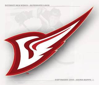
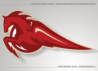
I've got Detroit Red Wings concept logos tonight. The first comes from an artist I like who's come up with new marks for the Devils, Predators, Senators, Flyers and last week, the Coyotes.

It's a great piece of artwork, I'm just not entirely sure it's worth considering as a replacement for the Stanley Cup champs' current symbol. That aside, he's got a pretty nice secondary as well.

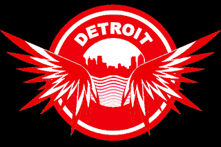
The last logo I have to share with you is from a different designer. Have a look.

Two more days until ICETHETICS launches. Get excited!

ToHL Up And Running Again

After a brief period of a down time, ToHL is up and running again with the latest poll in the QMJHL Tournament of Logos. GO VOTE!

And in case you're wondering, the final poll of the tournament will take place at ICETHETICS (which launches July 1). Then the CHL Tournament of Champions — which will feature the winner from each of the three CHL leagues — will take place there as well. I'll also be introducing a brand new tournament to begin after that is complete. It's something I've been talking about for quite some time.

Colorado Concept Logos

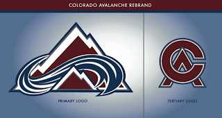
Recently I noticed in the comments of various posts, some of you pointing out that among others, the Avalanche may indeed have the perfect logo. That is, there's no way to improve upon it. Some even went so far as to challenge anyone to make one that's better. And a few people responded.

This is the best of what I received but even it doesn't come close to the Avs' current logo. A valiant effort to be sure, but certainly no replacement.

There were a couple of others, not as great, but worth a look.

And then this one which borrows a major element of the actual Colorado logo.

That does it for tonight. I'll have a look at some Detroit Red Wings concept logos tomorrow.

Just To Freak You Out XXXVIII

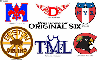
The absurdity continues here in my little corner of the world. First thing's first. We all have to be able to laugh at ourselves every now and then and god knows I make a habit of it. But this whole "rebranding" thing — it's a little weird, right? I mean it takes a special kind of person to keep an entire blog dedicated to the redesigning of NHL logos by various artistically inclined hockey fans.

I got a graphic emailed in this week that really made me laugh and I have to lead off with it.

Let the petty sniping begin (we all know that's what the comments are for anyway). I think it's absolutely hilarious. And when it comes to well-designed artwork, I get inspired regardless of whether I think a team should actually wear it in real life. That's what art is for anyway, isn't it?

But this post is about freaking you out, so you won't find any detailed and well-thought-out designs here. Instead, imagine the Quebec Nordiques going out west to become the Denver Dekes.

I don't have the words for it. Nor this.

I need a prescription for a drug that will allow me to fly. What's that? You say they don't make one? Hmm...

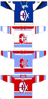
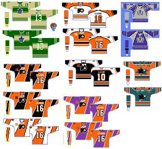
Forgive the poor quality of the jerseys in the next image, but these are worth looking at.

Be sure not to miss the purple and orange Flyers jerseys.

And lastly, an article on Yahoo! was pointed out to me today. The writer talks about the horror that was the Mighty Ducks third jersey back in the mid-'90s. (You guys should know, you voted it worst third jersey logo EVER!)

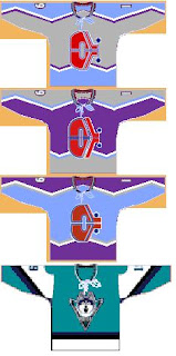
Anyway, that got me thinking. A while back I got these logos from a reader. He took the duck bursting through the ice and painted a different team's logo and jersey onto it — and then did it again for every team in the NHL! It's an absolute riot and this is the perfect time to start posting them.


As you can see I started with the Pacific Division so that I could show you the crazy duck with the new Ducks logo and colors on it. Just wait until you see the rest of the league. I'll post a new division in each Freak Out Friday post until we get through all six.