Making Up for the Week
/Being sick is not fun. I'm certainly glad to be back. The good news is that the season has started so most of you probably haven't even missed me.
All right, so since I haven't updated the site in a week, there's a lot to catch up on. I'll try not to overlook anything, but it's inevitable. We'll start with your favorite — third jersey news.
 First, another rendering of the Colorado Avalanche's forthcoming third jersey has surfaced.
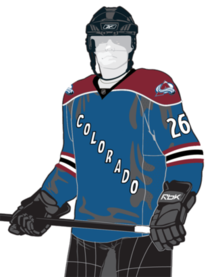 Avalanche's new third jerseyWhile surfing the web, Icethetics reader Colin stumbled across this graphic, which gives us a better look at the Avs' new alternate. It's not a bad looking jersey, though I am surprised they chose not to try something new.
It's a blue version of the burgundy third introduced in 2001, in service until the Age of Reebok in 2007.
The main difference is the addition of a burgundy shoulder yoke and the lack of any striping around the base of the sweater. The primary logo will still appear on the shoulders.
Still no word yet on when the team plans to launch the new sweater or even make official mention of it in any way. All information about it so far has been coming through the media.
 That brings us to the Florida Panthers, who are in kind of the same boat. After a summer of silence, I'm now getting mixed reports on whether they will even have a third this season.
However, various sources have me convinced there will in fact be a new sweater in the Cats' arsenal this fall. For one thing, it's available for pre-order on some web sites.
According to the latest round of rumors, the Panthers are set to unveil the new alternate sweater sometime this month, with its on-ice and store shelf debut scheduled for November. I'll keep an eye and ear out for any new information.
It's all speculation of course, but my guess is they'll be red and feature the stick-breaking panther logo on the front, as seen above. Technically, I live in the Panthers' market so I may even see something on TV.
 I suppose the biggest newsmaker of the week would have to be Buffalo Sabres when managing partner Larry Quinn went on the radio and told everyone the club is scrapping their jerseys once again.
Charlie at Sabres Not Slugs has a report, which includes a link to the WGR 550 audio interview in question. In it, Quinn confirms that new uniforms are on the way in 2010.
"We have the 40th anniversary next fall," Quinn says. "We will have a permanent uniform change and a new third jersey."
Of course the word "permanent" is used loosely in Buffalo of a team enduring its fourth uniform in as many decades. However, Quinn assures us that fans will not be disappointed this time around and that a return to the classic look is indeed coming.
He says it "probably won't be [released] until next summer." Icethetics will have coverage.
He doesn't say specifically what they'll look like — whether we should expect versions of the current third or something more like the true vintage worn at the 2008 Winter Classic — but it's a safe bet that the slug is on its way out the door.
As a side note, I would guess that the Canucks might have a similar plan in pushing the 40th anniversary celebration back a year so that they can call it the 40th season (damn lockout). Wonder if they too will make a "permanent" uniform change. So many similarities between Buffalo and Vancouver.
 So much news to cover still. Although this may barely pass as news, it's a win for all of you who loathe the Age of Reebok. Slowly their fist of stone is being chipped away. Both the Flames and Senators have done away with the socks whose stripes don't go all the way around the calves.
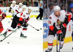 Senators get new socks
Icethetics reader Ryan has provided this side-by-side comparison (right) of Jason Spezza last year to this year.
Notice they've even changed the design of the stripes. I thought last year's worked better because of the similarity to the stripes in the "O" patch on the shoulder.
As you can see, real stripes are back in. This leaves just a single team wearing those other socks — my team, the Lightning. Oh well, it works for them. (What else can I really say?)
 And since we're on the topic of socks, my previous report on the Calgary Flames came merely from a video game — NHL 10 to be precise.
It's time to take a look at the real things in action. Look no further — here are the Flames in preseason action against the Islanders.
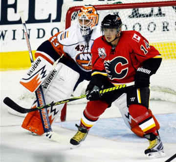 Flames get new socks as well
Yes, that is Theo Fleury. Poor guy. (Well, not really.) He's also got that laughable 30th anniversary patch on his shoulder there.
 But despite all the bad Calgary Flames news, there's some good as well. The 2009-10 NHL season opened this past Thursday with the Flames taking to the ice against the Canucks looking like they haven't in 15 years!
It was the debut of their new retro jersey — which only sees action in four more games this season — one of which is tomorrow. Now this is a hockey jersey!
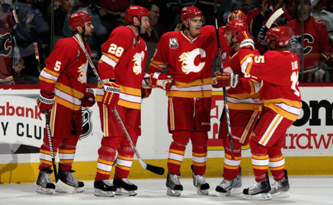 They're not just celebrating a goal — they're happy about their jerseys too
I like they there were no compromises with either the socks or pants. Flames fans, as I said, you have four more chances to see these in person. If I were you, I wouldn't miss them.
I'm sure there are things I've missed, but I will get to them this week. This should hold you over for now.