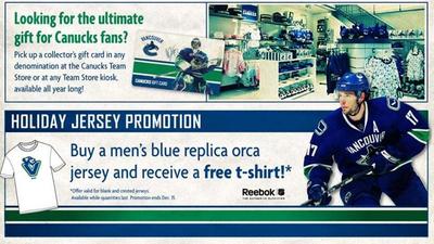
Merry Christmas to All!

Welcome to the improved Icethetics! It's been a long time coming but I'm excited to once again get back into the swing of things.

The New Look

The first thing you've noticed is the brand new layout. I'm always excited to be able to improve upon the look of Icethetics and I'm very happy with this one. It's an ever-changing beast and while I don't think I'll ever be satisfied with my own work, I think each iteration has been an improvement over the last.

The biggest change beyond the extra 120 pixels in width is the primary font — which has been Trebuchet since I launched the blog in 2007 — to Georgia, which is easier to read. Trebuchet is still sticking around, however, for headings and other elements. Plus, the new banner at the top of the page now includes the .info domain.

More Concept Art!

Of course the new look is not the best news of the night. What I'm really excited about is the implementation of a new approach to concept art. It's a process that will make it easier for me to offer more frequent updates. Rather than going for a week or more between posts, you'll be finding something new every day or two. The idea being to keep you guys coming back for new concepts on a regular basis.

In fact, tomorrow morning you'll find brand new concept art — and it's NOT the fourth installment of the Strauss NHL Rebrand (that will come later this weekend). More good news. By popular request, there will be new concept art auto-posted every day while I'm off in Las Vegas getting married in January. Details to come.

New Sweater Gallery

The best news of the night — a brand new hockey sweater image gallery like no other available on the web. I've always tried to make Icethetics a place for content that's hard to come by or found nowhere else — a tradition I intend on continuing in 2010.

My resolution is to make more of an effort to keep Icethetics fresh and new every day in the new year. I miss that and I know many of you do as well. There will be plenty of jersey news to follow in the coming year as well as loads of awesome concept art and new logo and uniform tournaments!

But enough talk from me. You've heard it all before. Keep checking back for the proof!

By the way, I'm open to any and all suggestions for making Icethetics more awesome than ever. Just drop me a line by email or in the comments. And while you're at it, let me know what you think of the new design.

Merry Christmas to all!

JerseyWatch 2010

The NHL has really started to understand the value of marketing hockey jerseys over the last few years. They know that fans like us like whatever is new (or not so much) and that even if we don't spend the money ourselves, we build the invaluable buzz needed to get others to do so.

I mention this because, not since the years before and after the lockout have we seen all 30 teams wearing the same logos and uniforms in back-to-back seasons. In a way, it's what's kept Icethetics in business (and probably the league, too). That's five straight years with at least one team getting a new logo or jersey — or both — including the upcoming 2010-11 campaign.

Now that all of this season's new sweaters are out, the aim of JerseyWatch 2010 is to keep us all on the same page as far as what's new for next year. And we begin with Howard Berger. Berger became the first to leak descriptions of all 18 third jerseys when the program was re-launched in the Age of Reebok, 2008. Now he's at it again.

According to his most recent blog post, six NHL teams will be donning new or altered uniforms in 2010 — some of which we already knew, some we didn't. He says a "league merchandizing source" is his mole. Whether it's the same person as before, who knows? But you have to admit he was pretty accurate the last time.

First, here's what Howard knows. Later in the week, I'll write up a summary of everything else we know.

The Buffalo Sabres will lose primary mark that's served them since 2006. Unaffectionately referred to as the "slug" by fans, the ambiguous logo is finally going by the wayside.

Taking its place in all likelihood will be the classic logo that's as old as the team is (seen to the left). Evidently, the current third jersey (a veiled throwback) will become the new home sweater and a white version now in the works will be worn on the road.

This has been no secret as the organization's managing partner Larry Quinn has stated on a number of occasions that this will be the case. Sabres fans may rejoice.

The only real question: Will they introduce a new third jersey? I doubt it.

Perhaps the biggest surprise from Berger's post is with regard to the Nashville Predators. While he has no details on the look, he does say the Preds will "be making a significant alteration to [their] original design."

That original design had been worn by the team since their inception in 1998 — up until the Age of Reebok. Is it too much to think something along the lines of the new third jersey could be in the cards?

Berger also mentions the change could be even more dramatic if the team is relocated. But I think he's just being dramatic.

It's no secret the New York Islanders are hoping for a return to their glory days by returning to the jerseys that won them a handful of Stanley Cups.

They'll be following the Sabres in promoting their third jersey to full-time use and adding a white version for away games. Consult the AHL's Bridgeport Sound Tigers for an idea of what that would look like. Just try to see past all the jersey advertising.

Oddly enough, while Berger doesn't have the details on this one, NYI Point Blank blogger Chris Botta does. Saturday night, he wrote a short post saying the white version is currently in the works. I have no reason not to trust him, but we haven't heard official word from the Isles on this yet.

The Philadelphia Flyers will become the third team in as many years to give their Winter Classic jersey an extended stay beginning in 2010-11.

No surprise here, but the Flyers, who this season made their orange third jersey the new home sweater, will take the white version of it, being worn this New Year's Day, to be worn on the road. This seems to be the era for throwbacks. I think the '90s killed uniform creativity. Or something.

By the way, as I read Berger's take on the Flyers, I have to wonder whether he's an actual hockey writer as he mentions the "Outdoor Classic" and misuses the term "piping." Still, he was pretty much on the money last time.

The powder blue third jersey the Pittsburgh Penguins introduced originally in the 1960s then later brought back for the inaugural Winter Classic has apparently run its course as a third jersey (after just two seasons).

This isn't news as I've mentioned it previously here on Icethetics. But now Berger is saying it too. So there's that. He also points out, as we know, that the Pens will still have a blue-infused third jersey for 2010 — it just won't be this one.

At last we've reached Berger's own team, the Toronto Maple Leafs, who are making some alterations their home and road jerseys for 2010-11. The third will remain the same.

Added to the blue and white sweaters will be the much-missed horizontal waist stripes. There was no reason to get rid of them and every reason to bring them back. Berger also says the "TML" shoulder logo, introduced in 2000, will also make a comeback. I could take it or leave it.

Coming soon to JerseyWatch 2010, the Vancouver Canucks and possibly the Ottawa Senators. I'll have a summary later in the week. 

Let's Catch Up

I made some free time tonight to get some new items here on the blog. I've got a bunch of items so settle in.

First on the list are the Pittsburgh Penguins. Tribune-Review beat writer Rob Rossi says the Pens are ditching the baby blues next season. That's his story and he's sticking to it.

Initially published just before Thanksgiving, this rumor is gaining new details — still from Rossi. During an ESPN.com live chat last Thursday, he added that a blue alternate jersey is still in the cards for the Penguins.

Rob Rossi: By the way, Pens donning the baby blues tonight. Best uniforms in team history, IMO; they will scrap them for next season, but I'm told the new alternates will have some blue coming back.

Joy_Russo: That's a travesty. Those power blues are great.

I don't know who this Joy is but she's right. If you'd like to read that chat in its original form, I'm told you have until Thursday before it turns into a giant pumpkin. My thanks to Ryan for the link.

And I'm done. Except to say this: Why shed the best jerseys currently in use in the NHL? Is a simple reason too much to ask for if you really have to do it? Regardless, we'll add the Pens to JerseyWatch 2010.


Anyway, the Kings are next on the list. Well, not exactly. Actually, Los Angeles is next on the list — having recently been announced as the host city for the 2010 NHL Entry Draft. The new palm tree-infused logo is making the rounds.

2010 NHL Entry Draft event logo

They could do worse. They have done worse. But it's just so not what you'd expect to see on NHL Draft Day. Palm trees and the like. It's what I see on my drive to work every day.

All right, knocked another one out. 


That brings us to Atlanta. Somehow the Thrashers' 10th anniversary logo managed to slip under my radar a few months ago when I posted the Icethetics Season Preview. Embarrassing. Anyway, a lot of you have been noticing it on the players' helmets.

Atlanta Thrashers' 10th anniversary logo on a player's helmet

It's wretched, is what it is. This is how you celebrate and symbolize ten NHL seasons? You know me. I rarely have a harsh word to say about a new logo or jersey. But this? Let's break it down.

What should we be seeing there? An "ATL" next to a stylized thrasher head? An "AT" (Atlanta Thrashers) next to a 10? A mish-mash of all of that? Whatever it is, it's bad. Go back. Try again.

Maybe the reason I overlooked it for the Season Preview was that my brain was unwilling to actually admit to seeing it. Let's move along now.


The Ottawa Senators are worth a mention here. Remember that whole ordeal back in August where The 6th Sens blog picked up on the "O" jersey making an appearance on the team's official web site?

via Sens ChirpWell another Sens blog has joined the third jersey fray. Icethetics reader Julian writes in to point out that Sens Chirp is adding to new unsubstantiated rumors. See the tiny, unenlargeable image to the right.

Why their version of the vintage alternate is red, I don't know. The Senators already wear red at home. However the red helmet is an interesting touch. But let's stick to the black "O" jersey as that is actually aesthetically pleasing.

Beyond this image, I have no new information regarding a change to the Senators' third jersey — except to say that they've only had it for two seasons. I think it's a little soon to be dumping it already.

Don't make me add the Senators to JerseyWatch 2010.

Fine. They're added.


Speaking of ridiculous/wishful thinking, the New York Rangers popped up on the old Icethetics radar this week. A reader sent in this picture claiming it was a leaked third jersey prototype.

This is not a Reebok Edge third jersey for the Rangers.

It doesn't take an expert to figure out it isn't. Sewing an NHL logo into the collar does not a legitimate Reebok Edge jersey make. And while I'm sure we'd all like to see the Lady Liberty sweater make a comeback, getting my hopes up for no reason is just... mean.

Anyway, thought you might like to know. 


That brings us to the final item of the night. The 2010 Olympic Games are just weeks away and so the IIHF has taken it upon themselves to give us a look at all the new hockey jerseys for the participating nations — all in one place.

There's Belarus, China, the Czech Republic, Finland, Germany, Latvia, Norway, Russia, Slovakia, Sweden, Switzerland, and the U.S.A. Wait, I feel like I'm forgetting one. Is Canada fielding a team this year? Someone double check for me.

You'll notice that the U.S. is the only country taking advantage of the third jersey cash grab. Because this is America, dammit, and if we're not selling something then the terrorists win.

Hey, incidentally, does anyone know how I can go about getting Canadian citizenship? That only sounded like I was kidding.

The Orca Debate

I don't mean to dwell on a topic born out of speculation, but after Tuesday's post regarding the possibility of the orca logo going the way of the dodo, my inbox was inundated. And I feel like this is the kind of subject matter that we'll hear an awful lot of different opinions on. So here are some more of them.

Hey Chris! I do believe the Orca in Canucks nation is endangered and becoming extinct, but the logo that I believe that will take its place as the primary will be the Johnny Canuck V logo, not the stick in rink.

The licensing agreement for the Orca logo is almost over, not sure exactly when, but possibly in time for next season, and the clues of the Johnny Canuck V logo becoming the primary are all over the Canucks website as well as on merchandise. I've attached a few pics to this email which lends me to believe this is true.

Matt

That's an interesting notion. A free Johnny Canuck t-shirt along with your orca jersey, perhaps so that when the orca is phased out you won't be completely left without a current Canucks logo? Just a hunch.

Here's another email regarding new upcoming merchandise.

I work at a sports store and we get all the merch catalogues early. I never thought much of it until I read the article. But after reading that I do notice that the Canucks stuff (hats, shirts, mini-sticks, etc.) has changed.

There is still stuff designed with the current logo but the new catalogues compared to the old ones do have a lot more of the non-orca logos. The stick-in-rink logo is used the most and the Johnny V and Johnny Canuck logos are popping up all over the new stuff.

There is also a lot more of the green being used as well. Not sure if this is really an indicator of a change or just a money grab though.

Adam

The money-grab idea does make sense. But is that really all it is?

This last email may just be silly, but it's worth the read nevertheless.

Take it for what it's worth, but while working a concert at the Commodore Ballroom a couple months back, a gentleman presented the local band that was on stage with a maroon Vancouver Millionaires jersey and proceeded to claim that this was going to be new third jersey for the Canucks next year — which coincidentally is the 40th anniversary. 

At first I brushed it off, but now I'm starting to see these great vintage maroon jerseys in local hockey shops. I, for one, would love to see the Canucks playing in the only Cup-winning sweaters this city has seen.

It looked great on the Giants when they wore it and I believe it'll look fantastic on the Canucks if they do as well. Hopefully this does indeed become reality.

Michael

Ridiculous? Maybe. But the Canucks never cease to surprise us with their new sweater choices — however usually for the worse.

Feel free to add to the discussion in the comments. I'm going to put it to bed as far as new posts go — at least until we start getting some concrete information. But we can bet that won't happen until at least the summer.

By the way, big day in Montreal tomorrow! A century in the making.

The Endangered Orca

I got an interesting email from a Vancouver Canucks fan yesterday. He told me about all the signs he's been noticing that leads him to believe the orca logo, introduced in 1997, may finally be on its way out.

Rather than paraphrasing what he had to say, I thought I'd go ahead and let you all read the email for yourself and make up your own minds.

Just a heads up for next season. Although I'm drawing conclusions based on current marketing efforts by the Vancouver Canucks I think we should look to expect the end of the "orca whale C" logo next season and seeing the stick-in-rink third jersey come into full time use. 

Why, you ask? First, the new ownership group renamed operations away from Orca Bay Sports and Entertainment to Canucks Sports. Second, the current third jersey is used exclusively in current marketing and branding efforts, including the team website. In fact, the players are wearing this one whenever they do public appearances, hospital visits, etc.

Third, the stick-in-rink and "Johnny Canuck" logos now dominate team store merchandise and team merchandise available throughout the province. And likely the biggest clue are the huge price reductions and promos offered through the team store encouraging people to buy the current orca whale jersey. The ads even say "orca whale jersey" in ways that clearly distinguish it from the more popular current third. Every week there's a new incentive being advertised on Vancouver sports radio from the team store to sell off this jersey. 

Will Canucks fans finally get their wish? All signs are pointing in that direction.

Dave

For the record, both the Canucks and Buffalo Sabres celebrate their 40th NHL seasons in 2010-11. Sabres brass has already talked publicly about reverting to the classic logos and uniforms from the '70s and '80s.

It's funny how these teams appear to be having mid-life crises — just like a guy who hits 40 and longs to recapture his youth with sports cars and such. It's weird in a way, you have to admit.