
All Star '11 Logo Coming Soon
/The 2011 NHL All-Star Game logo will be unveiled on Monday. Details on the blog.
Read More


View ECHL Map in a larger map
As expected, here's the ECHL logo map. We thought the Heat had it rough in the AHL, but they've got nothing on the Alaska Aces. It's great seeing a pro hockey team in Alaska, but the money they must spend on travel!
As for the rest of the league, there's a clear divide between east and west. A 1,600-mile divide, actually. The Great Plains are completely devoid of ECHL action. But the map will fill in a little bit next season when a new franchise begins play outside of Chicago.
And because there are only 19 teams, there aren't too many clumps — the closest teams are in Reading and Trenton. It's also surprising to see Canada is only represented by a single team. Shame. But the ECHL is home to my closest team, geographically, the Florida Everblades.


View AHL Map in a larger map
Yesterday's NHL map was such a hit I figured you guys would enjoy the AHL today. It's crazy to look at this one. I can't believe the concentration of teams in New England. Plus, New York has five teams while Illinois and Texas each have three. What about the west?!
The Abbotsford Heat and Manitoba Moose might as well play in Europe with as far as they have to travel during the season. I'm honestly floored. I never realized how lopsided the AHL map was until this morning.
What are you thoughts on the AHL's spread of locations?


View NHL Map in a larger map
Just threw this together this morning. A little something to pass the time, I suppose, while news is light. It's a cool way to get an overall geographical look at the NHL. If you guys like it, no reason we can't do other leagues.
By the way, I recommend zooming in for a good look around the northeast. Lots of teams clumped together up there. Also, Terrain view reduces the clutter of roads and things.
Some observations:
Share any observations of your own in the comments. Or feel free to tell me this map was a waste of time. Just remember that aside from this, not much else to report lately.


View NHL Heritage Map 1967 in a larger map
More maps!
That's what I keep hearing from you guys. So here's what the NHL looked like after the first expansion in 1967. It's part of our NHL Heritage Map series, which will also include maps from 1974, 1979, 1993 and 1997 — all key transformational years for the league.
And of course I'll get to all the minor leagues as well. ECHL is up next. Then maybe CHL? — and by that I mean Canadian Hockey League. All 60 teams in one map. Whatever you guys choose.


View NHL Heritage Map 1974 in a larger map
Here is the second in a series of five NHL Heritage maps. This is what the league looked like in 1974-75 season.
I chose '74 because it was the culminating year of a handful of expansions. After the first big expansion of 1967, Buffalo and Vancouver were added to the map in 1970 along with Long Island and Atlanta in '72. Then Kansas City and Washington joined the NHL in 1974 — bringing us to a total 18 teams.
Up next is 1979 when the WHA folded and a few teams found their way into the NHL.


View NHL Heritage Map 1979 in a larger map
Today we travel back to 1979 for the newest NHL Heritage Map. Take a good look at the logos of the NHL in the 1979-80 season.
I selected 1979 because it was year that saw the NHL expand by taking on teams from the failed WHA. The Quebec Nordiques, Winnipeg Jets, Edmonton Oilers and New England (now called Hartford) Whalers managed to survive the storm and increased the size of the NHL to 21 teams.
So what else changed in the five years between the '74 and '79 maps? Not much. The Kansas City Scouts moved to Denver in 1976 and became the Colorado Rockies. In 1978, the Vancouver Canucks got a new logo, something they would make a habit out of over the years, and the California Seals franchise, known as the Cleveland Barons beginning in 1976, ceased to exist.
For the next Heritage Map, we'll jump ahead 14 years to 1993.
 The Pittsburgh Penguins will unveil their 2011 Winter Classic sweater early this fall, according to newspaper reports in Pittsburgh. And after its New Year's debut, expect it to replace the powder blue third jersey.
Yesterday, the Tribune-Review and Post-Gazette offered up a few tantalizing details regarding the outdoor game which the Pens will host at Heinz Field on January 1. Let's take a look at what they've got.
Rob Rossi of the Tribune-Review writes the following:
More details about the 2011 NHL Winter Classic at Heinz Field — including ticket information — will be unveiled at a news conference tentatively planned for the final week of this month.
President David Morehouse reiterated that the Penguins will debut a new alternate uniform at the Winter Classic but said details would not be made public until the fall. This uniform will replace the baby-blue look the Penguins wore at the 2008 Classic and for a handful of games the past two seasons.
It's only a guess, but the league may use this opportunity to officially reveal the new Winter Classic logo — which we got a sneak peek at the day the season schedule was released. One detail not expressed here is whether the new WC sweater will take over third jersey duties in 2011 right after the outdoor game, or be pushed to the 2011-12 season.
The Post-Gazette's Dave Molinari may have gotten an answer to that question:
"The new jersey we unveil will be specially designed for the Winter Classic," said Tom McMillan, the team's vice president of communications. "That's become a Winter Classic tradition."
... "It could become the third jersey in the future," McMillan said.
In other words, nothing is set in stone right now. It all depends on fan response. Molinari also confirmed with the team that the powder blues will be worn for "about 10 regular-season games" in the 2010-11 season.
As expected, neither report has any details on the design, but fans have started a number of rumors. The tradition that McMillan spoke of is all about teams digging into their history for a classic look. For the Pens, they have a decent variety to work with.
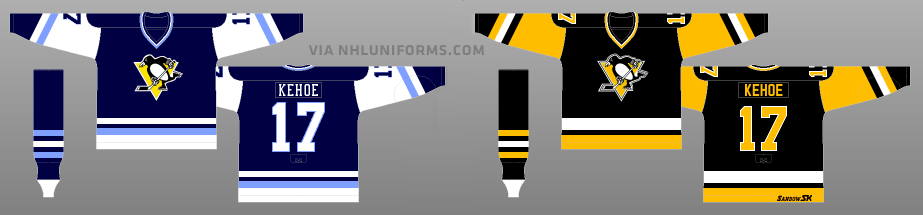 Rumors suggest these are the Penguins' Winter Classic jersey options
Their history, as showcased by the Hockey Uniform Database, reveals a number of possible sweater designs. The dark blue jerseys, worn from 1977 to 1980 have been rumored as have the black/yellow sweaters used between 1980 and 1992. (Both above.)
Which do you prefer? Drop a line in the comments.