 Over the past two weekends, the AHL has been celebrating its 75th anniversary by calling on its six oldest teams — sort of — to sport special throwback uniforms. Some for the better, others not so much.
For those of you that enjoy Icethetics history lessons, boy do I have a doozy, but first let's review what these six teams looked like in their retro threads.
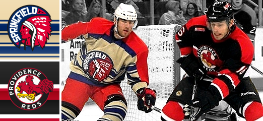
Springfield Indians vs Providence Reds
Why is it the Peoria Rivermen should've played as the Indians, instead of the Springfield Falcons? And do the Connecticut Whale really have a better claim to the Reds than the Providence Bruins?
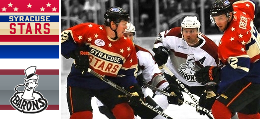
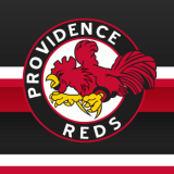
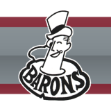
Syracuse Stars vs Cleveland Barons
Plus, are the Buffalo Sabres responsible for killing the Syracuse Stars? And are the Worcester Sharks more worthy of skating as the Barons than the Lake Erie Monsters?
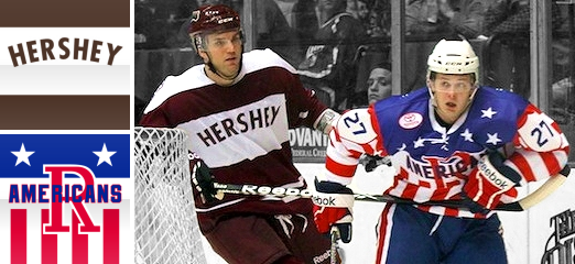
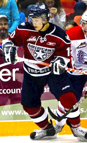
Hershey Bears vs Rochester Americans
And finally, two teams just the same as they've ever been for more than a half-century. What more could you need to know?
All of these questions will be answered. It's time for that history lesson.
When the AHL was formed in 1936, known then as the International-American Hockey League, eight cities were represented, six of which have teams today that took part in the anniversary festivities: Springfield, Providence, Syracuse and Cleveland. Hershey and Rochester joined later but most of the other teams are suffering through an identity crisis of some kind. Let's break this down.
Springfield Falcons
The Springfield Falcons were founded in 1994 so they certainly aren't among the AHL's oldest franchises. But last weekend, they played as the Springfield Indians, who were. In fact, the current Falcons team has no ties to that original franchise, which now exists as the Peoria Rivermen. So how did that happen?

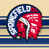
The city of Springfield, Mass. has had pro hockey since before the AHL formed. The Springfield Indians were founded in 1926 and played in the Can-Am, or Canadian-American Hockey League, under that name until 1951 when they were renamed the Warriors. That lasted only three years before the club reverted to Indians moniker.
In 1967, the name was changed again, this time to the Springfield Kings. But a classic name dies hard and this time seven years passed before the Indians name was brought back once more. Then finally, in 1994 the franchise was relocated to Worcester, Mass. and dubbed the IceCats. Because it was the '90s and minor league teams did that sort of thing. Not willing to go down without a fight, ex-Indian players were granted a new franchise, now named the Falcons.
The IceCats moved to Peoria, Ill. in 2005 and so goes the story of the Indians franchise. However, the league couldn't very well dress the Rivermen in their old Indians uniforms while hockey was still going strong in Springfield. So the Falcons paid tribute to their city's past in style.
Providence Bruins
The Providence Bruins franchise was founded in 1987 but has only been playing in Rhode Island since 1992. Again, it's definitely not one of the league's original teams. Actually, just like Springfield, this city had pro hockey long before the AHL in the form of the Providence Reds, who are now about to become the Connecticut Whale. What?

Just like Springfield's story, it all began in 1926 in the Can-Am. The Providence Reds were one of the eight teams that joined the new International-American Hockey League in 1936. They were successful and stuck around a long time. But when they affiliated with the New York Rangers in 1972, things were changing. And it started with a new arena.
Then in 1976, the team name was changed to Rhode Island Reds. But that would be the team's final season in the Union's smallest state. When the North American Hockey League folded in 1977, the owners of a Binghamton, N.Y.-based franchise, called the Broome Dusters (not kidding), bought the Reds and shifted them about 300 miles west and appropriated their own name for the club.
The Binghamton Dusters became the Binghamton Whalers in 1980. Then a decade later, they were named after their NHL affiliate, the Rangers. In 1997, the team became the Hartford Wolf Pack, and later this year, Howard Baldwin will officially rename them the Connecticut Whale. What a lineage. Ouch.
Once again, the Providence Bruins will only wear Reds jerseys as a tribute to their town rather than their own team heritage — a team which began life in 1987 as the second incarnation of the Maine Mariners and relocated in 1992.
Syracuse Crunch
The identity crises don't end in Providence. The Syracuse Crunch is a franchise only slightly older than the Falcons, having been established in 1992. And would you believe this? The team once known as the Syracuse Stars was actually killed by the Buffalo Sabres in 1970.

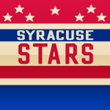
The Stars' story is long, but not all that complicated. Founded in 1930 as a member of the International Hockey League, the team from Syracuse, N.Y. hooked up with the I-AHL in 1936. By 1940, they were on the move, however, to Buffalo. Renamed the Bisons, the new team was a replacement for the club of the same name which disbanded in 1936 when its arena collapsed.
The Buffalo Bisons were effectively sent to slaughter in 1970 at the announcement of the Buffalo Sabres NHL franchise. They vacated the Memorial Auditorium for the new major league team and that's the end of their story.
Meanwhile, the Syracuse Crunch were founded as the Hamilton Canucks in 1992. After just two seasons in Ontario, the club relocated to New York. Just like the Falcons and Bruins, they don Stars attire not as a tribute to their own past but to their city's and that of the AHL.
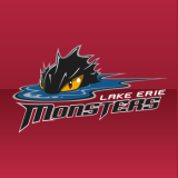
Lake Erie Monsters
Once again, we have a club still in its teens masquerading as one of hockey's oldest. The Lake Erie Monsters franchise was founded in 1994 but only moved to Cleveland, Ohio in 2007. The actual Cleveland Barons were founded in 1929 and the lineage of that name can be quite confusing as you're about to learn.
The Cleveland Indians were a member of the International Hockey League from 1929 until 1936. However, they were known as the Cleveland Falcons for the last two years in the IHL and in their first season as a charter member of the I-AHL.
The following season, in 1937, the Cleveland Barons were born. And that's where things get interesting. Everything was fine until 1972 when the WHA and the Cleveland Crusaders came along. This spelled instant death for the minor league franchise, which was forced to relocate midway through the 1972-73 season. Unfortunately, they moved to Jacksonville, Fla. so they only got in one more full season before folding. The bloodline ends there.
As a side note, the Cleveland Barons name was revived in 1976 when the NHL's California Golden Seals relocated to Cleveland, forcing the Crusaders to St. Paul, Minn. But the Barons lasted only two seasons in the NHL before disappearing again. Ironically, the players from the disbanded team went to the Minnesota North Stars.
One more attempt was made to revitalize the Cleveland Barons moniker when the AHL's Kentucky Thoroughblades were bought by the San Jose Sharks in 2001 and relocated. Five years later, the Sharks moved the club to Massachusetts and renamed it after themselves. So technically, the only existing team that came claim the Cleveland Barons name in their heritage is the Worcester Sharks.
Yet the Lake Erie Monsters, founded in 1994 as the Denver Grizzlies, donned Barons duds last weekend. The Grizzlies played in Colorado only one season before the Quebec Nordiques announced they were to move there. So the Grizzlies went to Salt Lake City, Utah for the next 10 years.
The club suspended operations for two years while it looked for a new owner, who would then put the club in the home of the departing Cleveland Barons. By the way, don't confuse these Utah Grizzlies with the ECHL club of the same name. They have a long history of name changes and relocations but actually began life as a charter member of the East Coast Hockey League.
Hershey Bears
At last, a true original AHL franchise. Almost. The Hershey Bears joined the I-AHL in 1938, two years after its founding. End of story, right? Not quite.
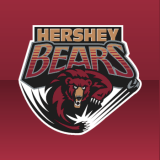

The Bears were actually founded in 1932 as the Hershey B'ars. Then it was changed the following season to Hershey Chocolate B'ars in case the original name was too subtle for you. Then back to Hershey B'ars once again in 1934.
The Bears nickname actually came about by way of New York sportswriters who thought the B'ars name was overtly commercial. Gee, you think? In 1936, it stuck. Officially. And though the Hershey Bears have endured minor uniform, logo and color alterations over the last 72 years, the name has remained the same.
Rochester Americans
The Rochester Americans didn't join the American Hockey League until 1956, but at least they're not masquerading as some other team just to celebrate an anniversary.
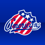
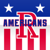
Now in their 55th season, the Amerks, like the Bears, have been through logo and uniform changes over the years but have always kept the name. It's refreshing to see that some teams can exist over long periods of time like this. We could all wish for more of them, but that would just make for a much duller history lesson, wouldn't it?
Hope you enjoyed this post, by the way. Spent over two hours working on it this afternoon. But it was rather fascinating.
Update on 2010-10-18 00:20 by Chris
Just did a quick bit of research after posting this. Clearly, not all of the teams wearing throwback jerseys for the 75th anniversary are the oldest members of the league. In fact, that's a rather different list. So who are the oldest six teams in the AHL?
- They got it right with the Hershey Bears (1932) and Rochester Americans (1956).
- The Peoria Rivermen, as stated above were founded in 1926 as the Springfield Indians/Warriors/Kings. They were the Worcester IceCats from 1994 to 2005.
- The Hartford Wolf Pack/Connecticut Whale were the Providence Reds in 1926. Between 1977 and 1997, they were the Binghamton Dusters, Whalers and Rangers.
- The current incarnation of the Hamilton Bulldogs were founded in 1969 as the Montreal Voyagers. They were the Nova Scotia Voyagers from 1971 to 1984 and the Sherbrooke and Fredericton Canadiens between 1984 and 1999. From then until 2002, they were the Quebec Citadelles.
- The Milwaukee Admirals were founded as an amateur club in 1970. The didn't become a pro team until 1977 when they joined the IHL, so if you only want to count pro seasons...
- In 1972, the Binghamton Senators were founded as the New Haven Nighthawks. They changed their name to Senators in 1992 when Ottawa joined the NHL then moved to Prince Edward Island the following year. They shut down in 1996 and were resurrected in 2002 in New York.
Seems like I need to put together a history section for Icethetics pretty soon.


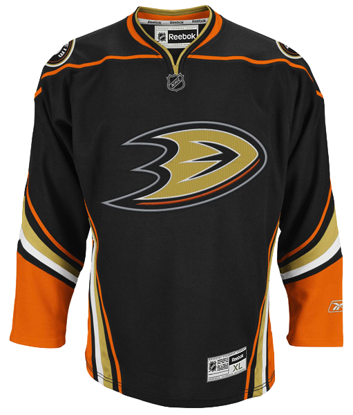 Anaheim Ducks 3rd jerseyThe Anaheim Ducks new alternate jersey has been leaked by the online sports retailer FansEdge.
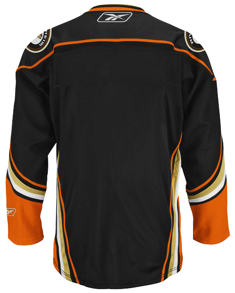 But one image wasn't enough. FansEdge kept going. Here's a look at the back of the jersey (left).


