NHL Realigned for 2012-13 Season

I went on vacation for a few days only to return to find an NHL nothing like the state in which I left it. Apparently, the NHL's Board of Governors decided yesterday to radically realign the league from six divisions into four conferences.

And based on the emails I'm getting, a lot of you want to see Icethetics host a contest to name new conferences and create its trophies. Sadly, I have too much going on here already to conduct another contest, but I'm more than happy to at least offer this blog post so we can all share our opinions.

Here are how the new conferences break down:

Conference A

Conference B

Conference C

Conference D


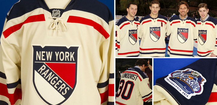
If you're curious about my take on the new setup, here it is. It's annoying because I'm a Tampa Bay Lightning fan. If I weren't a Lightning fan, I'd have to call it perfect. Dallas, Columbus and Detroit should be beside themselves over not having to play so many games in the Pacific Time Zone. Most of the great rivalries are intact. It's fantastic.

But why do Tampa and Sunrise have to get lumped into the "Northeast Division" basically? And even as I ask the question, I know the answer. You can't break up Philly and Pittsburgh nor any of the New York area teams. You can't separate the eastern Canadian teams nor break up rivalries like Sabres/Leafs, Habs/Bruins or Penguins/Capitals (especially now that HBO just released the first 24/7 Winter Classic on DVD!).

I know everyone has there two cents on how to improve things for their own teams. And that nobody cares what anybody else things. But here's mine anyway. Move the Pennsylvania teams to Conference C and put Tampa Bay and Florida in Conference D. I know, it simply can't be done that way.

The way it is now is just sort of a geographical necessity. So like Boucher says, let's start building the new practice rink in Vermont. We'll be spending a lot of time up there next year. And we'll only play the Hurricanes as many times as we play the Canucks.

Though I suppose the good news out of all this for me personally is that now I'm guaranteed that the Lightning will visit my neck of the woods (Vancouver) at least once a season. This year, they're not making that trip at all thanks to the current setup. (Interestingly, however, I will still be seeing a Bolts-Canucks game this season.)

That's all. Your turn, now. How do you fix the new alignment? Or do you? And what do you name the new conferences? What about the trophies? And how should the third round of playoffs work?

Rangers Unveil Winter Classic Threads

Today, the New York Rangers officially unveiled their 2012 Winter Classic sweater. And I'm happy to report that every so-called "leak" along the way proved wrong, leaving us all surprised this afternoon. For the most part.

While no fan concept or Chinese knock-off scored on the details, some of the larger, more obvious ideas are on display here. For example, the jersey is vintage white — in other words, not white. It's got a tie-up collar and a traditional striping pattern.

It's a very simple design but there's something about the oversized stripes that make the players almost look like kids. Not sure if that was intentional. But if it was, it's kind of brilliant. Part of the draw of the outdoor game is to recapture that feeling of children playing on the pond in tattered old sweaters. The vintage white adds to that, making the jerseys look unwashed.

Rangers unveil Winter Classic jerseyMany are likely to cry foul at the notion of the Rangers wearing the shield on their chest. For two short seasons between 1976 and 1978, the team stepped away from the text-only sweaters they'd worn for 50 years. And then of course in the late '90s they introduced the Lady Liberty jerseys, which were quite a hit. But other than that, they've basically used the same uniform design since, well, forever.

Much like the Boston Bruins' Winter Classic jersey from 2010, the Rangers' 2012 edition isn't based on any single design from their history, but is rather a combination of elements from the past spruced up with some new ideas.

Despite that, you have to ask yourself, when you look at it, do you immediately know it's a Rangers jersey? And I'd have to say yes. Regardless of seeing the crest, how can you call this anything but a Rangers sweater? Could be the colors. Could be the shoulders. Whatever it is, it works.

Time for links. In their official release, the Rangers credit the design to a partnership with Reebok. Our friends at the Hockey Uniform Database have the Rangers' complete sweater history on display for you. And you can find a few more pictures of the new threads on the team's Facebook page. And a lot more on Blueshirts United.

And if you've been living beneath a rock, the 2012 NHL Winter Classic at Citizens Bank Park in Philadelphia between the Flyers and New York Rangers takes place on Jan. 2 at 1 PM ET. Both jerseys are now officially out. (For those keeping score at home, we now have all of the new uniforms expected for the 2011-12 season — that is, unless the NHL breaks out new All-Star threads, which I don't expect.)

Anyway, what are your thoughts on what the Rangers will wear to the Winter Classic? It's close to what we had been expecting. Is that a good thing or a bad thing?

QMJHL: Sherbrooke Rises from the Ashes

Sherbrooke Phoenix jerseys unveiledThe QMJHL's only U.S.-based team shut down over the summer, but a new one will be resurrected in that franchise's old home next fall as the Lewiston MAINEiacs give way to the Sherbrooke Phoenix.

The club's new name, logos and uniforms were unveiled at a press conference today, according to this release written in French (translated). Click here for more photos from the event.

As you may have read in the (incomplete) Icethetics Season Preview, the league bought out the floudering franchise after last season and ceased operations.

At the same time, it announced an expansion franchise had been awarded to Sherbrooke, Quebec and an ownership group led by ex-NHLer Jocelyn Thibault to begin play in the 2012-13 season. I find it a little weird. Why end the lineage of one of the league's oldest franchises? Why not simply transfer the franchise? (In the end, I'm sure it all comes down to money.) As I wrote in the Season Preview post...

The franchise itself is actually one of the QMJHL's oldest. The Trois-Rivieres Ducs were a founding member of the Q in 1969. They were renamed the Draveurs in 1973. In 1992, the club relocated to Sherbrooke and became the Faucons for six seasons. In 1998, the name was changed to Sherbrooke Castors. The club moved across the border into Maine in 2003.

There had been speculation that one of the previous Sherbrooke monikers would make a comeback, specifically Castors or Faucons. But as it turns out, they went the more literal route for a team that's "rising from the ashes." Of course this will be confusing for folks in Quebec if the Phoenix Coyotes end up moving there. (Kidding!)

Here are the other logos that were on display at today's unveiling.

Sherbrooke Phoenix secondary logos

Brilliant logos and a fantastic overall look for this team. I'm impressed. But are you noticing a trend? Two other Q teams, the Armada and Olympiques, introduced monochromatic logos this season, just like the Tampa Bay Lightning and Los Angeles Kings. Seems like a trend toward less color. If so, I'm not sure that's a good thing.

But when you look at Sherbrooke's jerseys and logos, it's clear they're still a three-color team: dark blue, powder blue, and yes, that's the trendy vintage white rather than actual white. Don't get me wrong. I think these colors look great together, but they tick all the boxes in terms of what's "in" right now.

A local creative agency called Lubie designed the new brand (with an awesome video), which appears to have been influenced by the municipal coat of arms of the city of Sherbrooke, Quebec.

Anyway, what do you think? How is this not a great look for a hockey team?

Rangers' Classic Jersey Coming 11/28

Exactly a week after the Philadelphia Flyers unveiled their 2012 Winter Classic uniform, the New York Rangers have announced they will do the same. The event will be streamed online for fans.

The unveiling is scheduled for Monday, Nov. 28 at 4 PM ET. Details of the jersey have been well guarded, but that hasn't stopped more than a few rumors from making the rounds. One such rumor is this design, which is what I currently believe to be accurate:

Rendering of rumored design of New York Rangers' 2012 Winter Classic jersey / icethetics.info

We'll see on Monday if it proves as true as the Flyers jersey leak.

The following information about the unveiling was posted on the Rangers' website:

Fans can log on to Blueshirtsunited.com and Facebook.com/nyrangers to tune into the live streaming jersey unveiling which will feature select current players and will be hosted by MSG Network talent Dave Maloney and Al Trautwig. Official Winter Classic jerseys will be available for purchase beginning December 5th at Madison Square Garden.

If you're unable to watch the stream, just check back here for pictures on Monday. In the meantime, feel free to share your thoughts about what we should expect for the new sweater.

Oh, and Happy Thanksgiving to all my American readers!

Flyers Unveil Winter Classic Jersey

Modeling the new sweater / Schuyler BaehmanAfter a long wait, the Philadelphia Flyers finally unveiled their 2012 Winter Classic sweater. And interestingly enough, it lived up to the leaks.

The new sweater has no place in Flyers history, but then neither did the Bruins' or Penguins' second outdoor game uniforms. Though unlike those teams, this one isn't even based on anything in the team's 44-year history.

And to explain a little about why that's the case and what inspired them, here's a what the team has to say:

Designed by Reebok, the jersey’s primary color is the team’s current recognizable orange with secondary colors black and a vintage off white.

The Flyers primary front crest and player numbers are executed in rich felt black and vintage white appliqué. The player name and number name bar is a contrasting off-white color on the core orange jersey body.  This is a design element unique to the Flyers current and past uniforms.

The shape of the jersey consists of a new silhouette and striping pattern that has never been worn by the team in its history. The heritage striping is inspired from a sock design worn by the Flyers in the late 1980's. A very strong retro inspired neck lace closure will ground this jersey’s place in NHL Winter Classic uniform history. 

So, striping from a sock design, eh? All right. Can't say that's not getting creative.

Flyers Winter Classic jersey unveiling — photo gallery

I like the black shoulders. It's an element that's never been part of a Flyers uniform and I've always thought it should be. It's a good look. Overall, I'm a fan of the design. You've heard me bemoan the "vintage white" to no end (and I still don't like it here) so there's no need to go on about that.

But that's just my take. What about yours?