Leafs Reviving the '30s This Winter?

The Toronto Maple Leafs will be resurrecting their 1930s-era jerseys for a second time when they hit the ice for their first Winter Classic next January, according to one report.

The usually-reliable Howard Berger posted details yesterday on his blog, Berger Bytes, citing a "merchandising source" who tipped him off to last season's new third jersey as well.

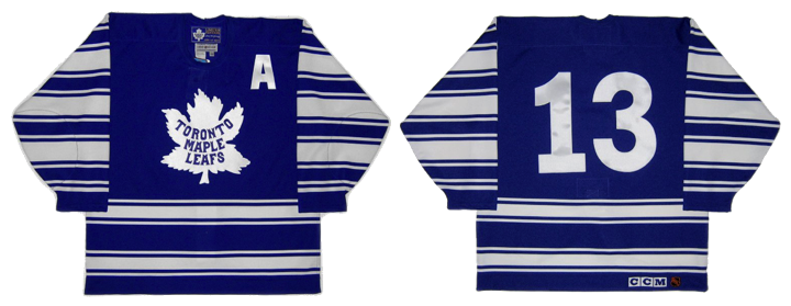
Berger refers to it as the 1931 jersey, but according to the well-researched Hockey Uniform Database, it actually debuted in 1927 when the Leafs first changed their colors from green to blue. However, in 1930, shoulder stripes were added to the design.

The look, featuring 12 white stripes down each sleeve, was retired in 1934 in favor of just two white stripes at the elbows. But the Winter Classic will, in fact, be the second time fans will get to see these sweaters in action since 1934.

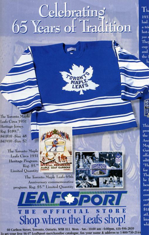
They were worn at least twice during the 1996-97 season. Berger even has dates and newspaper clippings with photos (Nov. 2, 1996 and Feb. 22, 1997). The team wore the throwbacks to commemorate the 65th anniversary of Maple Leaf Gardens.

So what do you think? Should the Maple Leafs go with this look for their first outdoor appearance? Or is there something else they should consider?

By the way, it's August 2, and not only have jerseys yet to be unveiled for Detroit or Toronto, but we still haven't seen an official 2013 Winter Classic logo. I can't imagine we'll have to wait too much longer for any of it to be unveiled.

New Sweaters Around the Minors

One after another this summer, teams across the minor leagues have been overhauling their looks. We've mostly been focusing on logos lately, so today we're switching gears. Check out some of the new jerseys that have been recently unveiled.

On Friday, the ECHL's Wheeling Nailers not only unveiled new sweater designs, but a revamped logo and color palette. Most notably, red is no longer one of the team's primary colors.

The Nailers' have been red, gold and black for as long as I can remember. But beginning in 2012, they switch to black and gold, just like their NHL affiliate, the Pittsburgh Penguins. In fact, their new home and road uniforms look awfully familiar.

The new dark jersey (right) was actually introduced as a third last season. It gets the full-time treatment this fall along with a white version to match. Of course the red isn't completely disappearing. The Nailers will wear a red alternate uniform (center) which features the old logo on the shoulders.

A bit of a downgrade here, if you ask me. Shrinking the color palette often provides a cleaner look, but in this case, it just sort of flattens the Nailers' logo. As we've seen with the Penguins, Vegas gold is just too bland to be a team's only color.

For those not familiar with the ECHL, teams wear white at home for the first half of the season and switch for the second half. The Nailers say the red jersey will be worn on Sunday afternoons at WesBanco Arena.

Elsewhere in the ECHL, the South Carolina Stingrays unveiled their 20th anniversary logo along with a pair of new jerseys for 2012. The North Charleston-based club made the announcement on May 31.

The Stingrays have done it right. These are some great-looking uniforms — even if the anniversary logo is a little too busy. Fans should be thrilled to see them hit the ice this fall. By the way, if you find yourself needing to add one of these to your collection, they're available.

And finally, the OHL's recently rebranded Mississauga Steelheads officially unveiled their uniforms last Friday. Here's a closer look at their new secondary logo.

And they'll look a lot like the nearby Toronto Maple Leafs when they hit the ice.

If you need a recap on where this team came from, see this blog post from May 31. Before the name change, the Steelheads were known as the Mississauga St. Michael's Majors. 

Now what do you think of all the new threads hitting the lower leagues this fall?

Providence Bruins Update Logos

The parade of new minor league logos this summer continues with the AHL's Providence Bruins, who made their updated look official on Monday.

The new primary and secondary marks have been in use on the team's alternate jersey since 2010 and the upgrade is a welcome change. And it's all about simplifying the club's look, which is derived from its NHL affiliate, the Boston Bruins. Presumably, that third jersey will become the primary dark sweater now alongside a new white one.

The new secondary logo is based on the mark used in Boston since the Bs' 2007 facelift.

Founded in 1992, the Providence Bruins are celebrating their 20th anniversary. Perfect time for a sharp new identity. Even if it isn't completely original. Here's a blurb from the press release:

This new logo also represents a fundamental shift in focus for the Providence Bruins brand towards a more traditional, “old-time hockey” look and feel. This move coincides with the 2013 Dunkin’ Donuts AHL All-Star Classic, hosted by the Providence Bruins the weekend of January 25-28, which also reflects the new direction of the team’s visual identity.

Ah, yes the 2013 AHL All-Star Classic. We have the logo for that, too.

No surprise it features the Bruins' new refined spoked P logo. It's a really nice All-Star mark, actually. Too bad it had to be marred by a corporate sponsor who's colors are neon orange and hot pink. So how do you feel about the new look of pro hockey in Rhode Island?

Pensacola Ice Flyers Get Revamped!

For three years, they were the team with — unquestionably — the worst logo and uniforms in all of professional hockey. That all changed on Thursday.

The Pensacola Ice Flyers unveiled a brand new identity that's millions of miles beyond the monstrosity they entered into the world upon joining the Southern Professional Hockey League in 2009.

If you're struggling to remember said monstrosity, allow me to remind you. It was terrible. Objectively terrible, if that's even possible. I'm not sure that thing could actually be considered "design" as we know it. But now it is no more, I'm happy to report.

The Florida panhandle team still has a pretty awful name, but it has meaning to the people of Pensacola and, heck, these phenomenal logos just make the "Ice Flyers" moniker look cooler, if nothing else. This is a definite win in the minor league logo design department. And it may well be the best logo in the SPHL at this point — which, to be fair, isn't exactly saying much.

I'm very excited to see this team recognize the need for a revamp and hire a pro to make it happen. Incidentally, I haven't been able to track down the name of the designer or creative firm. If anyone knows, I'd love to be able to add a link to this post.

Here's a look at the new secondary marks designed for the Ice Flyers.

Certainly playing up the Top Gun theme. I sense some specialty jersey nights in the seasons ahead. All of these elements just look great — at least in comparison to their predecessor.

Anyway, enough gushing from me. Time for you to weigh in. While you put your thoughts together on this new look, I'll leave you with Pensacola's new set of sweaters.

Las Vegas Wranglers Launch New Logos

We may be light on new NHL logos and uniforms this summer, but the same can't be said for the minors. Today, the ECHL's Las Vegas Wranglers unveiled a brand new set of logos.

The Wranglers are celebrating their 10th anniversary in Sin City and have decided a revamped look is in order. Gone is the shadowy cowboy and his bull. In its place, well, what the team is still calling a cowboy — wearing an old time hockey mask.

Have to be honest. His head covering looks a lot more like a fedora than a Stetson. Combined with the creepy mask, that's almost unquestionably a Freddy/Jason hybrid depicted in that logo. And overall, it does feel like a downgrade from the Wranglers' previous visual identity.

Las Vegas joined the ECHL's ranks as an expansion member in 2003. So 2013 marks a decade in action. And while I may not be able to offer a glowing review for the new primary mark, I absolutely love the creativity behind the 10th anniversary mark — fives on a pair of dice. When have we ever seen an anniversary logo do anything so outside the box?

The two secondary wordmark-infused logos show us that the Wranglers are retaining a portion of their original identity. Basically, the font's not changing.

So how is the team spinning their new look?

“It’s a simple and bold new look to celebrate a terrific ten-year run in one of the greatest cities in the world,” said Wranglers president and COO Billy Johnson.

“We have always striven to bring a major league caliber experience to Las Vegas through sights, sounds and entertainment, and the new branding is the next step up.”

I don't know if a couple of logos can really do that, unless they think people are less likely to buy a ticket with John Wayne on it.

So it is certainly a simple design and that always wins points in my book. I just wish it looked a little more like a cowboy. What's your take on the new look?