Imagine the Oilers in Seattle

Sorry, I just can't. It's ridiculous and we all know it.

In the midst of a lockout and negotiations to have a new arena built in downtown Edmonton, the bigwigs from the Edmonton Oilers paid a visit to Seattle today — just to poke around and such.

Monday, Seattle's City Council officially approved a plan to move forward with the much-discussed new arena project. That's great but the entire thing still hinges on securing an NBA or NHL franchise. And all the cities that already have them really like them and don't want us to take them. So that's the trouble.

To help alleviate that trouble, apparently, the Oilers brass was in town for "meetings" and a stop at KeyArena — down the street from me. (Oh, and to watch the Seahawks beat the Packers unconvincingly, as well.) Oilers fans hate it.

This is a stone that kills two birds. On one hand, it's the Oilers saying, hey Edmonton, you don't want to buy us a new arena, we'll find a new city that will. (Even though they really won't.) And on the other, it's Seattle trying to convince itself that there are potential teams out there to snatch up. (Even though there really aren't.)

Trying to follow it all is a nightmare. So I count on Chris Daniels. As a Seattleite, I just want to wake up one morning and find out we have a hockey team and an arena. And that I have season tickets.

But then I'd just have to wake up again.

Gladiators Mark 10 Years in Georgia

Before we dive in, two things: 1) I'm back. The The IceHL 2012 Yearbook — a labor of love and some intense work over the last few months — is finished! And 2) that means I'm getting back to the blog. And even though it's been a quiet year, I'm determined to find ways of keeping Icethetics interesting. Even if I have to make up news.

For today, however, I don't have to make anything up.

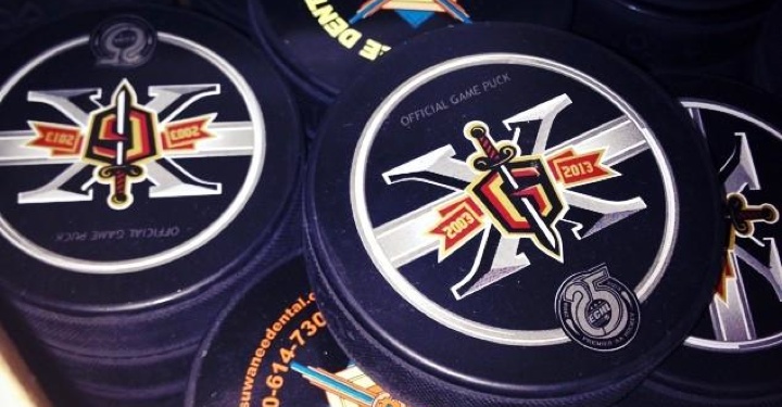
The ECHL's Gwinnett Gladiators unveiled their 10th anniversary logos last Thursday. During the 2012-13 season, they'll be celebrating "A Decade of Excellence and Achievement," as they put it. Of course that's ignoring the eight previous years the club spent in Alabama as the Mobile Mysticks.

The Gladiators primary 10th Anniversary Season Logo is a stylized number ten with the distinctive Gladiators head profile logo incorporated into the zero. It also features roman numerals along the side denoting the years of operation, 2003 to 2013. The Gladiators will also utilize a secondary logo that features a roman numeral "X" incorporating the classic "G" shield/sword logo version and stylized banner indicating the team’s tenure.

The Gladiators are affiliated with the Phoenix Coyotes. And most of the people at their games used to be Thrashers fans, right? There's gotta be a joke in there somewhere about fans getting shafted. I'm just not clever enough to find it.

Guys, the IceHL Yearbook was a huge weight off my shoulders and I'm tired of seeing this page so static. There's been a lot of news I haven't covered over the last month or so and it's my goal to put it here with new posts every day or at least every other day for the next several weeks.

After that? I don't know. Maybe we get some Top 10 lists going. We all like lists, right?

And let there be NHL hockey before 2013... please!

Sabres and Stars Plan Looks for 2013

While the owners and players debate whether there will even be an NHL season in 2012, a couple of teams are already looking ahead to 2013 as they plan for new uniforms.
They may not seem like the most likely source of NHL jersey news, but Business First of Buffalo is reporting that the Buffalo Sabres have a new third jersey in the works for the 2013-14 season.

The bigger story was about a real estate deal involving the team acquiring new land near their arena, but ended on this note:

Ted Black, Sabres' president, confirmed that more than HARBORCenter will be debuting during the 2013-2014 season.

Black said he expects the team to unveil a new, third jersey for the 2013-2014 season. Yes, it will be blue-and-gold and feature the team's beloved original logo. What else is on the jersey is still being determined.

The Sabres debuted a blue-and-gold third jersey two years ago as part of their 40th anniversary celebration. But after two seasons, it's been retired. Nice to hear the original logo will be coming back. What do you guys think we could expect for this new sweater?
Also in development for 2013-14 is an entirely new look for the Dallas Stars. When the ownership changed hands last year, the process of rebranding the team was put on hold. But it looks like it's back on course for next season. And there's a new report floating around.

This Stars update also comes by way of an unusual source — LAKings.com. In a web series called 4 on 4, "four writers answer the biggest questions surrounding hockey." And at a time when the possibility of a lockout could ruin the entire season, half of the "biggest questions" have to do with uniforms. Weird, I know.

Number 3 is, "Which teams have the best and worst jerseys in the league?" That alone could be worth a read for uniform geeks like us. But what's more interesting the answer given by Fear the Fin blogger Derek Tanabe.

The alternates Buffalo have rocked for two seasons now with the city name on the front look terrific too. As for worst, it's a tossup for me between the Stars sweaters that don't even have an appropriate color scheme or logo on the front and the new Dragonball-inspired Nashville sweaters. In both cases, the teams should really consider switching back to a pattern closer to what they were sporting at the beginning of the 2000's and I've heard rumblings that something along those lines is slated to happen in Dallas.

I have to scratch my head, though. Tanabe talks about the Sabres' alternate as though it's a current jersey when he should be talking about it in the past tense. So can we really trust what he's saying about the Stars?

Lots of people have gone on the record to talk about the redesign coming to Dallas, which may involve new logos as well as uniforms. TV color analyst Daryl Reaugh and Dallas Morning News writer Mike Heika have both talked about it and you've seen their quotes in previous editions of NHL JerseyWatch.

But if Tanabe is talking early 2000s, he must think the Stars are reconsidering the star-shaped jersey design. And we know Reebok has complained that a design like that isn't conducive to the Edge Uniform System. But you never know.

We'll keep an eye on both the Stars and the Sabres over the coming year. This summer has been a quiet one for uniform changes, but 2013 is already shaping up to be much more interesting.

Winter Classic Logo Finally Unveiled!

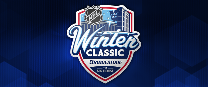
Earlier today, the Detroit Red Wings unveiled the newest NHL Winter Classic logo via Instagram. And I can't help but notice how this one doesn't have a year on it.

On one hand, I was thinking this unveiling is a good sign for the season. The higher-ups must have hope they'll reach a deal that won't create an extended work stoppage. On the other hand, if they were so confident, why wouldn't they put the year on the logo — just like it has been for every other Winter Classic?

So I'm still not sure what to think. You guys have any thoughts on this?

If the season goes as planned, the Red Wings will host the Toronto Maple Leafs at Michigan Standium (also known as The Big House) in Ann Arbor on January 1, 2013. It'll be the sixth such event and the first to feature a Canadian club.

Still waiting on jerseys, though recent reports suggest the Leafs will sport replicas of their 1927 blue sweaters while the Wings will wear some of that trendy vintage white. The current standard in the NHL is for the home team to wear its dark jersey while the road club wears white. Been that way since 2003. The Winter Classics have followed suit except for the first one in 2008, hosted by the Sabres, who wore a white throwback uniform.