Best & Worst AHL Logos of All Time

Yesterday I decided to start quantifying the history of hockey logos — seeing as a number of ancient cultures have predicted Friday to be the end of days. We began with the Top 10 logos in the NHL. We continue today with North America's top minor league — the AHL.

Minor league logos are tricky. Some teams just copy their big league affiliate. Many more just employ an angry animal wielding a hockey stick. These teams come and go as do their logos. So instead of a Top 10, I'll give you my Top 5 (along with some honorable mentions) as well as my Bottom 5.

Top 5: The Best Logos

1. Rochester Americans

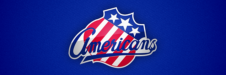
The Amerks. A true minor hockey classic. In a league where tradition takes a backseat to filling arenas, it's comforting to know that some things don't change. The Rochester Americans were founded in 1956. Their current logo has been in use since 1972 — decades longer than any of their AHL brethren — and the shield itself has been around since 1959. It's no coincidence that the oldest logo is No. 1 on my list nor is it a coincidence that this mark has been around so many years.

2. Chicago Wolves

In my mind, this is the quintessential minor league hockey logo, and yet it's not obnoxious. We have a crazy-eyed wild animal alongside a hockey stick and a puck — just to make sure you know what sport this is. And yet I just want to wear a Chicago Wolves jersey. The logo was created in 1994 when the team joined the International Hockey League. They were saved in 2001 when the IHL merged with the AHL.

3. Omaha Ak-Sar-Ben Knights

This is where I'll probably lose some of you. This may very well be a logo you have never seen. So how could I place it among my Top 5? Well, just look at it. The Omaha Ak-Sar-Ben Knights debuted in 2005 as the Calgary Flames' top AHL affiliate. That fact is clear when you look at the back of the knight's head. It's the fire from the flaming C logo beautifully incorporated into a logo that that has nothing to do with fire. I also like that while "Ak-Sar-Ben" gives the team an enigmatic vibe, it's really just Nebraska spelled backwards. The Knights existed just two seasons before being moved to Illinois. They currently exist as the Abbotsford Heat.

4. Manitoba Moose

Also in 2005 came this gem when the Manitoba Moose got all new logos and uniforms. Angry animals with text are the standard flavor in the minors, so it's really about finding the ones that stand out. This moose just looks like a badass you don't want to cross. It was a sad day when the Thrashers moved to Winnipeg, forcing the Moose to the east coast where they became the St. John's IceCaps.

5. Bridgeport Sound Tigers

Rounding out this group are the Bridgeport Sound Tigers. This logo has undergone some color changes over the years, but it's been one of my favorites ever since this team joined the AHL in 2001. The lines are perfect and the tiger is scary. It's a sharp design in a style we don't see very often. In fact, it's almost too good for the minors.

Honorable Mentions

Doing a Top 5 means a lot of good logos don't get a mention, so I've opted for some honorable mentions. The Peoria Rivermen logo is a minor hockey classic that's been around for years. It's existed as three separate franchises in three different leagues with the earliest dating back to the IHL in 1984. Each iteration of the Rivermen has utilized the same riverboat captain chewing on a puck though the palette always included red until the team joined the AHL in 2005. The question is, is this logo great because it has survived or has it survived because it is great?

The Milwaukee Admirals have been around for decades — at least since the 1970s. They went pro in 1977 when they joined the IHL but always had lame logos — until the skinless admiral appeared in 2006. And finally, there's the Hartford Wolf Pack. Again we have an angry animal showing its teeth, but that doesn't mean we don't have a solid logo. It has been sorely missed since the team was rebranded as the Connecticut Whale. Speaking of which...

Bottom 5: The Worst Logos

1. Connecticut Whale

Yeah, it's no secret around these parts that I have nothing but hate for this logo. Howard Baldwin promised a return of the whale. I didn't think he meant that would be the team's actual name. And I didn't think the logo would be so pathetic. It's everything that's bad about minor hockey logo design. It was so bad it spawned a new word. When the logo was unveiled, Icethetics reader Connor Hanley famously called it "horr-awful." And he was right.

2. Rockford IceHogs

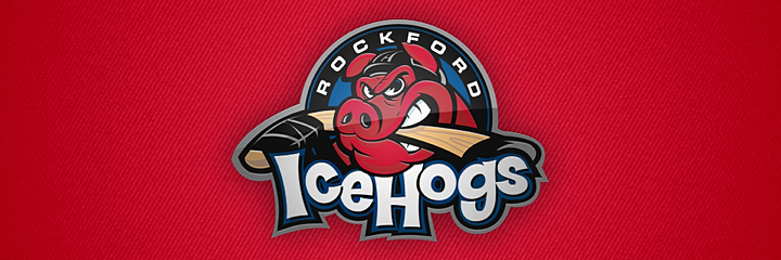
The second-worst logo in AHL history was actually born in the now-defunct United Hockey League in 1999. It ticked all the terrible boxes: A ridiculous name with "ice" tacked onto it, a silly mascot biting a hockey stick, and a pathetic font. There's nothing to like about this logo and there's no reason to name a hockey team after swine. The IceHogs joined the AHL in 2007 after winning the last UHL championship and didn't bother to update their name or logo.

3. Albany River Rats

It would be easy to just keep cherry-picking logos that feature angry animals wielding hockey sticks, but the offenders on this list are the worst of the worst. The Albany River Rats logo debuted in 1993 after the Capital District Islanders were sold and rebranded by their new owner. McKinley Griffen was the design firm hired to give the River Rats their new look. It was their first ever sports logo, and they now take credit for setting an industry trend (angry animal with a hockey stick isn't something I'd be proud of) along with "multiple awards." It also led to them getting more sports logo design jobs.

4. Kentucky Thoroughblades

You want someone to blame for these logos? We have the name. McKinley Griffen. A couple years after "setting a trend," that firm brought us this monstrosity. Lexington, Kentucky got its first pro hockey team in the form of the Thoroughblades when the AHL expanded in 1996. Today, the team is known as the Worcester Sharks — and it has much, much better logos.

5. Abbotsford Heat

We finish this list with the AHL's westernmost franchise. I'll be honest, this is technically bad design. It's just lazy. Their NHL affiliate is the Flames. They're called the Heat. But I don't get any feeling of heat from this logo. Just a FoxTrax puck flying around. It's as bad as the NBA's Oklahoma City Thunder. You can do better, Abbotsford. Just look at who you used to be in Omaha.

That wasn't too painful. Any glaring errors on this list? I got taken to task here and on Twitter for leaving out the Maple Leafs and Red Wings from my NHL Top 10. Did I leave out any critical AHL logos?

The ECHL is next up tomorrow in the same format. Then Thursday we get the Top 10 worst NHL logos. If we're all still here Friday, geez, I don't know what I'll do.

Top 10 NHL Logos of All Time

So. A handful of ancient cultures tell us the world ends on Friday. Guess there's no better time than now to quantify the history of hockey logos — since obviously there won't be anymore to come. Ever.

Before we start, understand this is just me picking my favorites. Yours may differ wildly. And if we all survive December 21, you'll get your chance to vote in a new sort of logo tournament after the new year. Now let's go. Clock's ticking.

1. Hartford Whalers

Its perfection lies in its subtlety. The use of negative space has a lot to do with the brilliance of the Whalers' logo. Often the H in the middle is what catches people off guard. They say, "how could I have missed that?" When a designer is able to incorporate every inch of their design into important symbolism, they've struck gold. Peter Good is responsible for this logo and even though it was retired in 1997 with the relocation of the Whalers, hockey is better off for having had it.

2. Minnesota Wild

It was hard not to place this logo at No. 1. I think the Whalers logo only got it because of longevity. It happened to come first. But if the world weren't ending, I'd say this logo will be around for a long time as well. Imagine being told to design a logo for a team called the Minnesota Wild. What does that mean? And yet this mark so perfectly captures the wilderness the team is named for. You can see something new every time you look at it. The trees and setting sun are perhaps most obvious. Then there's the shooting star, flowing river and distant hills. It all comes together in the shape of a wild animal's head. Some people see a wolf. I see a bear. It's a remarkable symbol that I hope survives the apocalypse.

3. Montreal Canadiens

No list of this sort would be complete without this juggernaut toward the top. Montreal's classic CH has survivedin some form for more than a century. It's lived through wars, depressions and even lockouts. So what's a little armageddon? Long live the CH. And just so it's being said here, the H does not stand for Habs, but rather simply, "hockey" as the organization's official name is le Club de hockey Canadien.

4. Colorado Avalanche

It may seem blasphemous to put so many logos created in the last two decades so high on this list, but I wouldn't do it if they weren't awesome. The Avalanche logo is another that approaches perfection. Created by Adrenalin in 1995 after the sudden relocation of the Quebec Nordiques, this logo is striking. It conveys motion splendidly with a color palette found nowhere else in sports. A logo this good. There's no way it could wait to hoist the Stanley Cup.

5. St. Louis Blues

The Blue Note originated in 1967 when the NHL expanded beyond the Original Six. Over the years it's been upgraded and revised. The mark we see today is beautifully balanced and it almost makes you hear music in your head when you look at it. There's no better symbol for a team named the Blues. They got it right the first time. They were smart to stick with it.

6. New Jersey Devils

Clearly this isn't a list of my favorite teams. And for as much as I may dislike the Devils, they have a superb logo. It's no wonder they don't have any secondary or alternate logos. Just this one. The only difference you'll find in the history books is that green replaced black at the beginning when the team arrived in New Jersey in 1982. (By the way, Wikipedia would have us believe that the logo was designed by the wife of the owner at the time of the team's move. But I can't find any corroborating evidence for that.)

7. Boston Bruins

The spoked-B has always been in league with Montreal's CH in my book. I don't mean that literally. Of course they are both members of the NHL and have been since the early days. But the idea of logos so simple, I think, is beyond what would be considered good sports logos these days. When was the last time a new team sprang up with nothing but a letter as its primary symbol? Over the years, the Bruins' logo has been upgraded and refined, each time for the better. It's one of those great, recognizable marks.

8. Chicago Blackhawks

No doubt many of you will complain this logo wasn't higher on the list. But you've heard my position before. I don't think it's a bad logo. I just don't think it's the best the way so many other people do. I've never understood that. Still, it certainly has a place on my Top 10. Only the Blackhawks could pull off such great use of color. (There are 8!) It's another one that's been around for a long time and seen a lot of refinements. But it's old and it shows. For a logo, there's no better compliment.

9. Colorado Rockies

Yep, the Rocky Mountain State shows up twice on my list with two different teams. In 1976, the Kansas City Scouts moved to Denver and became the Colorado Rockies (the original ones!). Their logo struck the ideal balance between a team's nickname and its location. It was only a shame they left town in 1982. I always hoped the Avalanche would get a chance to wear this mark in a Winter Classic or something. But with the Four Horsemen supposedly on their way, I guess that's out of the question.

10. Philadelphia Flyers

How does anyone finish a Top 10 list? It's so difficult. And so final. Here I've decided to go back to the first expansion again. Some logos are just so instantly identifiable, that you'd only need to see them for a fraction of a second. The Flyers logo is one of them. Like the Devils, I can't stand the team. It's ingrained in me. But when I look at their mark, I can't deny a fantastic design.

I'm sure a number of you will find fault with my ranking, but that's what the comments are for. How did I do? Any serious oversights? Any big blunders? I'd love to see your Top 10s.

Check back on Thursday for my Top 10 worst NHL logos. Tuesday and Wednesday will be dedicated to the minor leagues — AHL and ECHL.

IceHL Artist Makes Mark in ACHA

Neat story to share today. It's about one of the artists who contributed his work to the IceHL Project and what he's been up to these days.

Back in 2008, Nick Matarese created just one entry for the IceHL logo design contest. It was for the North Carolina Nighthawks. And it won. Nick's black and neon green bird struck apparently a chord with Icethetics voters. Even today, it remains one of the league's best logos.

But that was then. What's he been doing since? Well if you've ever heard of the Fightin' Blue Hens, you might recognize elements of the logo above. Currently, Nick is the goalie coach for the men's ice hockey team at the University of Delaware — where he actually tended goal for four years. The team is a Division 1 member of the ACHA (American Collegiate Hockey Association).

This season, Nick tells me the organization is celebrating its 40th anniversary. So he pitched in with a logo and jersey design to help mark the occasion. You've seen the logo, so how about the uniforms?

Photo by Tisa Della-Volpe

Nick says the original design he pitched was a little more intricate and not so much of a Montreal Canadiens knock-off, but the cost of such a custom jersey would've been a bit high for a college team.

"I am kind of over the old school look throughout hockey design," Nick tells me, "but it is a big anniversary year and we are playing in an outdoor game in a month so I am ok with it."

Photo by Tisa Della-Volpe

The crest is actually a retired logo no longer in use by the University of Delaware. Nick said he "had to jump through a million hoops" to be able to use it. But it definitely adds to the retro theme of the sweater. Certainly better than just running text across the front as well.

When Nick's not coaching the Fightin' Blue Hens' goalies or designing their anniversary sweaters, he's running his own design firm, Matarese Designs. Right now, he caters to mostly corporate clients, but is hoping to make a run at some minor league hockey or baseball teams in need of a rebrand over the coming year.

It's great hearing from Nick and getting to see what he's up to. With any luck, maybe he'll join us in the first round of IceHL rebranding that will be starting soon.

Portland Pirates Celebrate 20 Years

Over the weekend, I wrote up a post outlining the variety of theme jerseys the AHL will see this season. During my research, I discovered the that Portland Pirates have already worn their share of creative sweaters for this season.

Pirates mark 20th anniversary with special logo and jersey

The Pirates were actually founded in Pennsylvania in 1975 as the Erie Blades. In 1982, they moved to Maryland and became the Baltimore Skipjacks. Then in 1993, the club arrived in Portland, Maine. That's the anniversary the Pirates are celebrating this season.

So they needed a logo. But the final version you see above didn't just happen. As with any logo, a lot of options were created and considered. In fact, a member of the team that designed the mark has given us a peek inside the process. Scott Lyle posted these photos on his blog.

Photos by Scott Lyle

Lyle also lists these other members of the design team: Adriana Warner, Alyssa Harvey, Christopher Moore, Kelsey Raymond, Lucy Henson, Paige Wojcukiewicz, Rachel Carter, and Sheyenne Rivers.

That project also included designing this colorless 20th anniversary sweater.

Rendering from Portland Pirates (official Facebook)

I'm not sure why they decided to drop the red — a key part of the Pirates' color palette for all of its 20 years. Might've made this jersey stand out a little bit more.

Throwback and Pink in the Rink theme night jerseys

Earlier this season, the Pirates held a couple of theme nights that saw them wearing special uniforms.

On Sat., Oct. 27, it was Pink in the Rink, their sixth annual Breast Cancer Awareness Night. Naturally, the players had their pink-infused jerseys on. What's funny is it also happened to be Boy Scout Night.

Photo credits: AHL official Facebook page (left); Pirates official Facebook page (right)

Then a week later, on Fri., Nov. 2, it was Throwback Jersey Night. The Pirates brought back the 20-year-old sweaters from their inaugural season in Portland. I kind of miss the simplicity of old logos like that.

Happy Holidays from the Pirates

That about wraps up today's coverage of the Pirates. Now I'd just like to leave you with this.

Bears Unveil Outdoor Classic Jersey

Hershey Bears revealed design online Monday

The AHL's Hershey Bears are hosting hockey's only outdoor game of the 2012-13 season. The Outdoor Classic at Hersheypark Stadium will take place on Sun., Jan. 20, 2013. And just two days ago, the Bears unveiled the special uniform they'll be wearing for that game — complete with white pants and oodles of chocolate stripes!

From the press release:

When the Chocolate and White lace up their skates for the 2013 Outdoor Classic game on Sunday, January 20 they will be wearing commemorative jerseys. The jerseys will be brown and white stripe, and have the Outdoor and 75th Anniversary logos on respective sleeves. These game-worn jerseys will be signed and auctioned off following the game, with proceeds donated to charity.

Rendering from Hershey Bears (official website)

The Bears will be facing off against the Wilkes-Barre/Scranton Penguins for this game. But I've yet to find the jersey the Pens will be sporting — and you know they'll have one! This is a team that will wear a special sweater just because it's Wednesday. Heck, you need only look back to this past weekend to see them in their Christmas sweaters.

So what's your take on Hershey's Outdoor Classic jersey?