A Tail of a Whale
/ With word coming down this week that merchandise emblazoned with that classic Hartford Whalers logo is among the hottest selling in the NHL, it's only fitting that we talk about its inexorable return to professional hockey.
It's been 13 years now since the Whalers left Connecticut for Raleigh, N.C. Despite that, T-shirts, hats and jerseys with that iconic blue-and-green mark continue to sell like that of a team that just won the Stanley Cup.
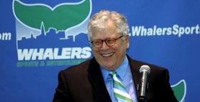
 Howard BaldwinHoward Baldwin is a man bent on bringing back his team. And he may get his wish sooner than we think.
In June, Icethetics reported on Baldwin's plans for Whalers Hockey Fest 2011. A day of outdoor hockey featuring Connecticut's best college teams. But he's not nearly done.
Howlings, a blog dedicated to the AHL's Hartford Wolf Pack, has been following some interesting developments. Blogger Mitch Beck says Baldwin will be taking over the Wolf Pack and renaming it the Connecticut Whalers.
As many have read in local newspapers, or here on Howlings, the last hurdle has been cleared for Howard Baldwin and his Whalers Sports & Entertainment to take over operation of the Hartford Wolf Pack.
Well, it is only a matter of time now, as early as next week, that it should become official. When that happens, the Hartford Wolf Pack will be no more and the new team will be the Connecticut Whalers.
This will be a huge moment for the city of Hartford and for the players as well. With Baldwin running things there should be a renewed interest in the team and making it an event once again. Expect the team to once again start drawing big crowds and become the place to be.
 Connecticut Whalers T-shirtThat was posted about a month ago. While we wait for something official, Beck at Howlings continues to stress the inevitability of the change as recently as a week ago.
[The] Greenville Road Warriors will be the new ECHL affiliate for the Rangers and the Connecticut Whalers… Technically they’re still the Hartford Wolf Pack, but that’s only a matter of time.
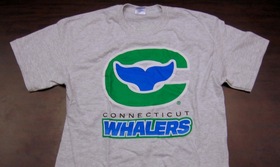
And even now you can buy a Connecticut Whalers T-shirt from Baldwin's website, WhalersProShop.com — complete with a brand new logo and everything. The potential new logo for a rebranded Wolf Pack franchise?
It's not a great logo, but how much can really stand up to that original HW design? Some people go years before even noticing the H in the negative space. It's a logo so great, it gets featured in a book titled Design Principles and Problems, published in 1995 and referenced by Paul Lukas on Uni Watch last December.
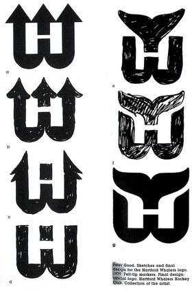
 Whalers logo evolutionWhen the WHA folded in 1979, the New England Whalers were forced by the Boston Bruins to change their name before they could enter the NHL. That meant the need for a new logo. The following is an excerpt from Design Principles and Problems:
When Peter Good was commissioned to create a new logo for the Hartford Whalers hockey team, he was given a specific message to convey. Good's challenge was to give the H of Hartford and the W of Whalers equal billing in a design that suggests whaling and the feeling of a partnership between a dynamic team and a dynamic city.
The trial sketches and the final solution reveal Good pushing this basic idea through a variety of solutions until a design evolved that conveyed the desired message well. The first solution shown (a) was accepted by the client but unsatisfactory to Good because the H repressed by the enclosed, unfilled area was stronger than the W.
In the second sketch (b), Good softened the impact of the H by opening it to look more like harpoons than in the first solution. In the third sketch (c) he extended the attempt to soften the H, pushing the harpoons to the side. This possibility he rejected as ugly. In the fourth sketch (d) Good tried omitting the harpoons. The result balanced the W and H but was not particularly exciting.
The fifth sketch (e) reveals the sudden inspiration of using a whale's tail. Sketch after sketch followed, with Good trying to develop a more flowing interlock between the tail and the W. When he hit on the final solution, he wrote, "Eureka! Good 'W' and good 'H' living happily together."
Finally, Good notes a special effect created in the "empty" H space: Light seems to flow into the H legs from the outside, becoming trapped in glimmering optical pools of brightness at their base. This heightens the contrast between the straight-based H and the curved both of the W, giving the design an exciting look.
Stories like this always help me find inspiration when designing.
 Anyway, though Baldwin might get his wish with the Wolf Pack, the chances of the NHL returning to Hartford in the near future are slim. Let's not forget the nature of expansion in the NHL over the past decade. This has been the league's most stable period since the 1960s.
Brian Favat of SB Nation Boston also makes a good point:
Thirteen years later, the primary factors that caused the Whalers to leave town — a viable market and lack of modern playing facilities — are still present. When the Whalers were in town, Hartford was the smallest market in the NHL. As Hartford straddles both the New York and Boston markets, their marketability was severely limited by geography.
In addition, Hartford still doesn't have a new hockey arena. The city's XL Center is 35 years old and there are no plans to build a new arena. The AHL's Hartford Wolf Pack ranks only 18th in the AHL in attendance, drawing a little over 4,000 fans a night.
Hartford's limited appeal as a viable NHL market isn't the city's only hurdle to overcome. Today, the city faces increased competition from cities like Kansas City, Winnipeg, Quebec and Hamilton, all vying for their own NHL franchise. Despite these obstacles, however, Baldwin remains positive about his chances.
Icethetics will continue to track any Howard Baldwin-related Whalers news, including any possible name change for the Wolf Pack.
