More on the Millionaires Tribute

We received some surprising news last Friday when the Vancouver Canucks revealed how they'll be honoring the old Vancouver Millionaires on their uniforms this season. Since this is actual jersey news in a season where we weren't expecting any, you can bet this will be a frequent topic of discussion.

Vancouver Canucks official website

On Friday, the Canucks' alternate jersey made its season debut with a new addition — the blue Vancouver Millionaires patch on the chest. It only improves upon a jersey that's already outfitted with some pretty awesome logos. (That Johnny Canuck V mark needs to become the primary logo. What are they waiting for?)

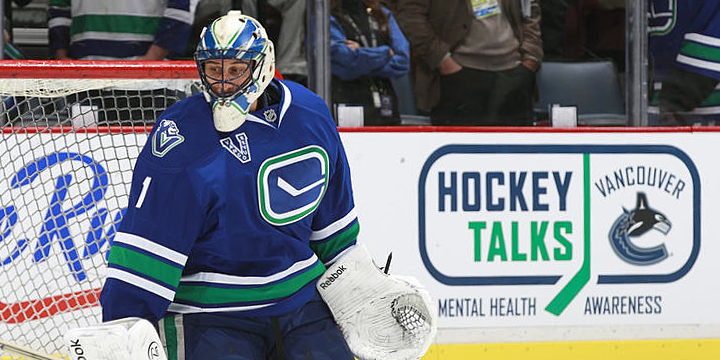
By the way, I'm not ignoring that Hockey Talks logo. All seven Canadian teams will have a version that they'll wear as a helmet decal at various points during the month of February. I'll have a post on that later this week.

Vancouver Canucks via Twitter

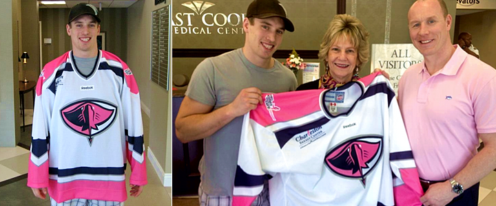
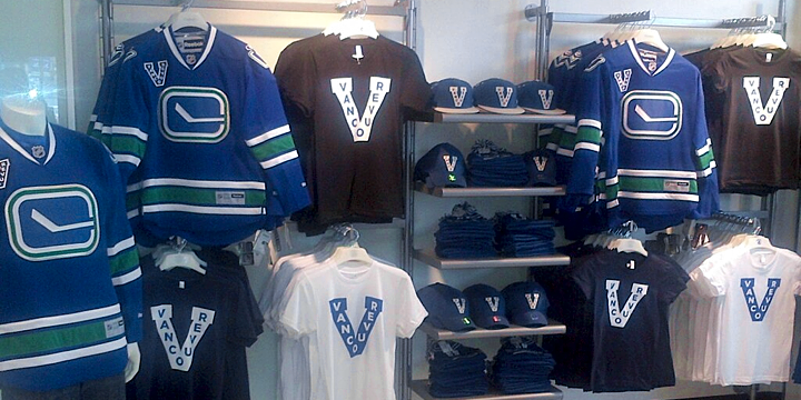
But back to the Millionaires. If you're looking to deck yourself out in that classic logo, clearly gear is not in short supply. This photo was posted to the Canucks Team Store Twitter account on Friday. They're even selling the five-year-old third jersey with a new patch. Pardon the pun, but millionaires indeed.

Of course we can't leave out the new sweater that's at the center of all this exciting news. As modeled by Ryan Kesler in photos released by the team last week, this is the Vancouver Millionaires jersey the team will wear at least once during this shortened season. All indications point to March 16 when the Red Wings are in town.

Photos by Severin Samulski via Fort Nucks

Believe it or not, the Red Wings as an opponent for this game isn't as random as it seems. This requires a bit of a history lesson to understand why.

In 1912 came the formation of the Pacific Coast Hockey Association (PCHA), of which the Millionaires were a founding member along with the New Westminster Royals and Victoria Senators. In 1913, Senators became the Victoria Aristocrats. (Honestly, after four lockouts in 20 years, can you imagine any NHL team today being named the Millionaires or Aristocrats and still having fans? Yeah, the naming thing gets worse...)

Before the 1916-17 season, the Aristocrats left Victoria for Spokane, Wash. where they were renamed the Canaries. (Told ya.) But no one in eastern Washington cared to attend games and the club folded before the season even ended.

Victoria, B.C. returned to the PCHA scene in 1918 with a brand new team — also called the Aristocrats. (Think Winnipeg Jets, except with fewer relocations.) In 1922, the club was renamed once again to the Victoria Cougars. That might actually be a name you recognize if you're at all familiar with Stanley Cup history. (Also, the Millionaires became the Maroons.)

Two years later in 1924, the Seattle Metropolitans folded, leaving just two teams in the PCHA. The Cougars and Maroons moved to the Western Canada Hockey League where the Cougars promptly won their first and only Stanley Cup championship against the Montreal Canadiens!

The Cougars played one more season in the newly renamed Western Hockey League where this time they lost the Stanley Cup Final. It also spelled the end of the team as the WHL was unable to compete financially with the NHL. The teams were disbanded and players' rights were sold to NHL clubs.

Guess who bought the rights to the Victoria Cougars in 1926. Yep, a group from Detroit, who named their new team the Detroit Cougars. The Cougars became the Falcons in 1930. And ultimately, in 1932, they became the Detroit Red Wings we know today.

So you see, the Canucks are really trying to stir up a century-old rivalry. Can't wait to see it. Now if only someone could convince them to wear their 2009 Winter Classic jerseys — which were in fact Cougars jerseys!

Then we'd have ourselves a hockey game.

Design Firm Reveals Stars Concepts

Torch Creative via dribbble

Torch Creative releases concept logos designed for Dallas

What will the Dallas Stars look like next fall? That's still a big question mark. However, the design firm that's worked closely with the team in recent years has designed and released a pair of logo concepts via social media this past week.

Torch Creative is responsible for the logos above. After tweeting them out on Wednesday morning, the company posted more images — including the Stars' 20th anniversary logo — to their dribbble account the following day. As a reminder, here's that anniversary mark.

It's not clear from their tweets if Dallas-based Torch is working on the Stars' forthcoming rebranding or if those logos were just for fun. Have to think they put together a proposal at least.

In any case, Torch called the above logo concepts "the favorites." They don't specify whether it's their own favorites or the Stars'. Though presumably, if they were the team's favorites, they would've used them and we wouldn't be seeing them like this.

Torch Creative has done a lot of design work for the NHL, including the 2008 Winter Classic, the 2009 and 2011 All-Star Games, the Stanley Cup Playoffs logos, and much more. I recommend a trip to Torch's website to peruse some of their past work. It's very impressive.

What do you think of these logos? Could you see the Stars going with something like that next fall?

Arena Logos: The Retirees

Last weekend, my posts on Arena Logos were an unexpected hit. Turns out, like me, a lot of you are fans of the esoteric. So I thought I'd revisit the subject by displaying some arena logos that are no longer in use. Check out the retirees.

From 2005 to 2009, the home of the Boston Bruins was known as TD Banknorth Garden. Four years ago, Banknorth was removed from the name and the arena is now known simply as TD Garden.

In 1999, the Buffalo Sabres' building was renamed HSBC Arena. That lasted for 12 years before they started calling it the First Niagara Center. But what the heck is going on with that logo? Might be the most abstract arena logo I've ever laid eyes on.

One of the more recent arena name changes saw Raleigh's RBC Center become PNC Arena last year. The Carolina Hurricanes call that building home.

Thanks to its unique roof design, the home of the Calgary Flames will always be called the Saddledome. But that doesn't mean sponsors won't try to stick their names in front of it. Before Scotiabank shelled out in 2010, Pengrowth Energy paid for 10 years worth of naming rights.

When United Airlines merged with Continental Airlines, a corporate rebranding led to a new logo for the United Center as well. This logo was used from the day the doors opened in 1994 until 2011. The Chicago Blackhawks have played there since 1995.

Not unlike the situation with United Airlines, when Pepsi rebranded itself, Denver's Pepsi Center also got a new logo. It was a really more of an update with some mountains added and the sponsor's logo revised. Still, what you see here is how the arena was branded when it started hosting Colorado Avalanche games in 1999. The new logo came about in 2009.

The home of the Florida Panthers has endured more than its share of names during its relatively short life so far. This was the third logo used since the arena opened in 1998. It was known as the BankAtlantic Center from 2005 until 2012, when it became the BB&T Center.

The New Jersey Devils got a shiny new home in the Prudential Center in 2007. But before that, they played out of the Continental Airlines Arena. That building actually became the Izod Center shortly after the Devils moved out.

The Nashville Predators played at Sommet Center from 2007 to 2010. There was a lot of drama with the company that paid for the name so the building actually went back to its original name, Nashville Arena, for a short time before Bridgestone stepped in. Speaking of which...

Eagle-eyed readers might take note that there have actually been two logos during the Bridgestone Arena era. This one above was the original. But it only lasted one season because of Bridgestone's corporate rebranding in 2011. To see the differences in the company's logos side-by-side, look here.

I'm not exactly sure when the change happened on Long Island, but this was the longtime logo of the Nassau Veterans Memorial Coliseum before the current logo came along. The new mark features the New York Islanders colors of orange and royal blue.

Now my favorite part! Between 2002 and 2012, the Tampa Bay Lightning played at the St. Pete Times Forum. The building's name changed when the newspaper's did just over a year ago. But the old logo was quite bold and quite boring. And that's not easy to achieve. But that might just be lingering distaste for the name change in the first place.

That's because when the arena opened in 1996, it was called the Ice Palace. Admit it, that's just a badass name for a hockey arena. Why did they ever change it? Everything comes down to money.

As a bonus, I stumbled across this mark in one of my old Lightning game programs. A couple readers mentioned they like seeing how arenas are represented graphically in logos. I think this is one of the coolest ever designed. But again, I'm not hiding my bias here. The ThunderDome also had a pretty great logo before it became Tropicana Field. I'm trying to track down a clean version to display here.

And finally, General Motors Place was home to the Vancouver Canucks until it was renamed Rogers Arena following the 2010 Winter Olympics. Its logo really has nothing to do with the buildling, sticking to natural elements of the Pacific Northwest — green mountains and, well, the sun is just wishful thinking.

That's all for now. One reader also suggested I tackle AHL arena logos at some point. Think I may prepare that post for next weekend if you guys are interested.

Canucks Celebrate Millionaires

Photos by Severin Samulski via Fort Nucks

How long have we been waiting for this?!

The Vancouver Canucks revealed some great news today. As part of their season-long tribute to the 100th anniversary of pro hockey on the west coast, the Canucks have unveiled a Vancouver Millionaires jersey — modeled above by Ryan Kesler.

So when will this jersey see game action? That's not entirely clear, but I'll get to that in a minute. First, the reason this unveiling came today is that the Canucks will wear their third jersey tonight — a third jersey that will feature a special Millionaires patch on the front.

Here are some details from the press release:

The Vancouver Canucks are proud to announce they will celebrate 100 years of hockey on the West Coast by wearing the Vancouver Millionaires “V” patch on their sweaters for select home games in the 2013 season beginning tonight versus the Chicago Blackhawks.

The Vancouver Millionaires were the first professional hockey team on the West Coast, playing in the Pacific Coast Hockey Association from 1912 through 1922. The Millionaires won the Stanley Cup in 1915 against the Ottawa Senators of the National Hockey Association, which later became the NHL. The Millionaires played at the 10,500 seat Denman Arena built by Frank and Lester Patrick at the corner of Georgia and Denman and were the first Canadian team to play hockey on artificial ice.

The Canucks will wear the “V” on the front right chest of their sweaters in honour of Vancouver’s original hockey heroes such as Fred “Cyclone” Taylor, who was a member of the Stanley Cup winning Vancouver Millionaires squad.

To my knowledge, the Canucks have not yet released their third jersey schedule.

Now back to that Millionaires jersey at the top of the post. A line in that press release may indicate that the Canucks are planning to wear it in a game next month.

Check back often for more exciting Millionaires news as the Canucks continue to honour Vancouver’s hockey roots, particularly in-game March 16th as the Canucks host the Detroit Red Wings.

There's no reason Reebok would produce this jersey if there was no intention to wear it in a game. Looks like we may get it sooner rather than later. Mark your calendars for Sat., March 16. That could be one nice looking hockey game if true!

The Jersey Brief: ECHL Edition

Ever since the return of the NHL, I've been back to ignoring the minor leagues. Sorry about that. Hopefully I can make up for some of what I've missed with this post and others to come.

Solar Bears disappoint with third jersey

I've had this one in the chamber for a little while now. But I can't ignore it anymore. The Orlando Solar Bears — of the ECHL's current top-selling jerseys — debuted their third jersey on Dec. 28 against the Florida Everblades. And it was extremely disappointing.

Photos: ©2012 Gary Bassing/OSB via Solar Bears official Facebook page

The Joe Bosack Graphic Design Co. created a wide and varied set of phenomenal logos for this team last year. And despite that, the Bears managed to create a rather boring jersey. So they play in the Sunshine State, you say? I'm all for simplicity, but it just feels like there's a big hole in the middle of this sweater. If you're interested, you can find more photos on the Solar Bears' Facebook page.

Solar Bears go pink for one night in January

While we're talking Orlando, might as well mention the Solar Bears' Pink in the Rink jerseys. That fad isn't going anywhere. The team's cancer awareness night was Jan. 19 and they were fully clad in hot pink and their familiar purple in front a crowd of 9,000-plus.

Photos: ©2013 Fernando Medina/OSB via Solar Bears official Facebook page

Those are certainly bright. But as pink jerseys go, they aren't the worst we've ever seen. Of course that contrasting nameplate thing won't die. Don't think the Bears have worn a single jersey yet that didn't have it. (Way to go, Flyers.) Of course you can find more photos on the team's Facebook page.

Wranglers to go "topless" on Over 18 Night, Feb. 4

Fresh off their Indoor Winter Classic victory, the Las Vegas Wranglers are going "topless" next week. The club known for weird and wacky theme nights will be wearing these jerseys on Monday.

Photo by IIA Photography

Since there's nothing I can think to say, I'll give you an excerpt from the press release:

“Going bottomless was simply out of the question,” said Wranglers President and Chief Operating Officer Billy Johnson. “Yuck.”

The specialty Wranglers jersey, featuring a bare chest and sculpted abs, has a Wranglers crest tattooed over the right pectoral. Adorning the shoulders are a “topless hockey” and Wranglers word mark, with light arm hair filling out the details.

“The guys have never looked to be in better shape,” said Johnson. “Nor have they appeared to be as identical.”

The Wranglers host the Colorado Eagles for "Over 18 Night" on Feb. 4. "In addition to topless hockey," the team says, "fans can enjoy mild adult humor throughout the game, including uncensored clips from well-known movies applied to game situations."

Also the numbers look absolutely illegible. Can't wait to see pictures from the game.

Stingrays set to sport pink-infused jersey on Feb. 23

Rounding out our ECHL coverage tonight are the South Carolina Stingrays, who yesterday unveiled their Pink in the Rink Night jersey. As pink jerseys go, it's surprisingly decent. Icethetics reader Sean M., who let me know about the unveiling, even called it "tasteful."

Again, as pink jerseys go, I can't say I disagree. The pink-infused sweaters will be worn by the Stingrays on Sat., Feb. 23 when the host the Greenville Road Warriors.

I understand this doesn't completely make up for my lack of minor league posts recently, so there are more to come. For one thing, the AHL's Outdoor and All-Star Classics were this month, complete with lots of neat jerseys. Stay tuned for more.