New Look for Islanders by 2014?

There was a fascinating report in the New York Post last week. Apparently, the New York Islanders are looking into the possibility of a complete rebrand to accompany their move to Brooklyn in a couple years.

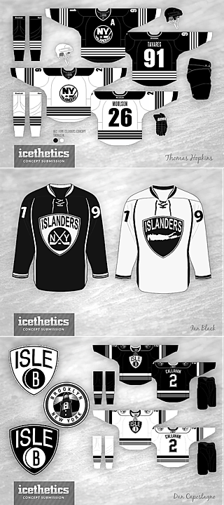
Artist conceptsThe changes would include a brand new color scheme — and probably a new logo, though they aren't that far along in the process it seems.

The sports marketing brain trust at Barclays Center is weighing a change in the team’s royal blue, orange and white team colors, sources said.

Barclays Center, which will take over the business operations of the team when it moves from Nassau County as soon as 2014, is currently holding separate focus groups of Islanders fans and Brooklynites, sources added.

A member of one group told the Riverhead News-Review earlier this month he was asked to rate a new team jersey without any orange, one that looked like the old Brooklyn Dodgers uniform — blue and white.

The focus groups will be done in about 45 days — and then team owner Charles Wang will be updated, a source said.

You may recall that when the move to Brooklyn was announced last October, Wang said the branding of the club would not be changing. Guess this is one of those "never say never" things.

Also worth noting is that they previously announced the move to take place in time for the 2015-16 season. Now it's sounding like that could be moved up a year to 2014-15.

Barclays Center CEO Brett Yormark is leaning toward a recommendation that the team, which has the worst attendance in the National Hockey League, undergo a complete rebranding, the source said.

Yormark is encouraged by his efforts at rebranding of the Nets upon landing in Brooklyn from Newark. Team colors were changed to black and white. Attendance rose from a league-worst 13,961 to 17,187 per game, and jerseys, which hadn’t cracked the top 10 in popularity, finished No. 4 this past season.

Yormark ... said, “The colors black and white are the new badge of honor in Brooklyn. The question is, can we weave that into the [Islanders] color scheme, and create a connection to the fans here in Brooklyn?”

Of course the article points out that the organization isn't dying to grab Nets fans so much as keep their own existing Long Island fans.

What does all of this mean? Could those concept artists envisioning the Isles in black and white really have been on to something? What do you think?

Confirmed: Wolf Pack Coming Back

It was first speculated two months ago. Now multiple sources are reporting that the AHL's Connecticut Whale will once again become the Hartford Wolf Pack next season.

The news turned up online Tuesday morning, via WTIC's Scott Gray, who cited team sources saying the league has approved the name change. Later, the Hartford Courant said Connecticut Wolf Pack was a possibility for the club's rebranding, but the Bridgeport Sound Tigers didn't like the idea.

Apparently an official announcement could be coming within a week.

Neither report was clear on whether they'd also go back to the old Wolf Pack logo, created in 1997 with the team's arrival from Binghamton, New York. But if you ask me, they'd be insane not to. (It was on my list of the best AHL logos last year.)

What do you think of the imminent return of the Wolf Pack?

Iowa Wild Unveil Logo and Sweater

Relocated AHL franchise holds press conference

That happened fast. Today, the Iowa Wild (still known as the Houston Aeros until the Calder Cup Playoffs end) unveiled their new logo and home jersey for the 2013-14 season. And it looks familiar.

Iowa Wild jersey via TwitterThe new logo is not surprising. It's based on the script font found on both the Minnesota Wild and Houston Aeros third jerseys. It was shown off today on their new website.

It's really not that great of a uniform or logo design so I'm a little stumped as to why this organization keeps coming up with new versions of it. What worries me is that the NHL Wild are working on a new road (white) jersey for next season. Is this a preview of what's to come for them?

I'm also a little annoyed at the name change. I don't mind Iowa Wild the way some folks do. What I mind is them using "Wild" in the first place as now every time we mention the name we'll have to specify NHL or AHL.

At least with the other instances of the NHL/AHL name duplication, there are easy ways of distinguishing them — B-Sens, P-Bruins, Baby Pens (though I know a lot of folks hate that). But with this team? The I-Wild?

It's also disappointing that one of the great minor hockey identites of the last two decades is going away. We'll miss the Houston Aeros and I'm not sure anyone would miss the "Iowa Wild" even if they'd been around 20 years.

All right, enough complaints from me. I'm just disappointed by the lack of creativity of this team's new branding. I'll get over it, but first I'll take out my frustrations by whining here on the blog.

What do you guys think of the new look of the Iowa Wild? Am I being too hard on them?

Official: Aeros Becoming Iowa Wild

It is official now. Two decades of Houston Aeros hockey has come to an end. But their loss is the gain of hockey fans in Des Moines, Iowa. Yesterday, the Minnesota Wild received permission from the AHL's Board of Governors to relocate and rebrand the franchise, starting in 2013-14, the Iowa Wild.

It all came down to the club's inability to secure a new lease at their arena. But Houston is one of the biggest markets in the U.S. so I can't imagine they'll be without pro hockey for too long. For now, though, they are.

The press release made no mention of a timetable for the introduction of new logos and uniforms, but obviously they'll come before the fall. Sometime this summer I'd imagine. Definitely something to keep an eye on. (UPDATE) The Minnesota Wild haven't officially announced the renaming of the Aeros but the Minnesota Star-Tribune is reporting that right now.

Rocket hold off on becoming P.E.I. Islanders

In other rebranding news, the QMJHL's P.E.I. Rocket were supposed to officially unveil their new logos and uniforms on Thursday. They were to be renamed the P.E.I. Islanders for next season. However, the owners suddenly put the team up for sale, according to The Guardian, taking the rebrand off the table for now.

Unless a local group can come up with the money to keep the team on Prince Edward Island, it will be sold to a group planning to relocate to Sorel, Quebec, where they'd be rebranded as the Sorel Eperviers — a team that played there from 1968 to 1981.

Either way, this team will get a new look before the start of the 2013-14 season.

Thanks to Matt M. for the tip on the Rocket story.

AHL Calder Cup Playoff Logos

Over the last couple of weeks, the American Hockey League has been revealing Calder Cup playoff logos for each team as they clinch their spots. As of this writing, 9 teams have clinched. Here are the logos we've seen so far.

I'll keep an eye out for the rest as they're revealed.