Lethbridge Hurricanes Unveil New Logo

WHL team forced to rebrand by Washington Capitals

Back in March, we learned the WHL's Lethbridge Hurricanes would need to come up with a new logo. The NHL's Washington Capitals decided the Lethbridge logo was too similar to their own to continue being used.

That report came from CTV reporter Darrell Romuld, who then said that the Hurricanes would simply promote the logo being used on their alternate jersey at the time. That look was created by former IceHL GM and CanesCast founder Joshua Schroeder.

However, it seems that was not the case as Lethbridge unveiled an entirely new logo at a special event on Thursday. You can see it at the top of this post.

Photo by Patrick Burles (via Twitter)

Despite dumping the Caps-style wordmark, the Hurricanes will still basically be wearing Caps jerseys. This is probably a Reebok thing. The new logo has two variations. The stylized H is in blue on the red jersey and red on the white one, as you can see below.

The Hurricanes have struggled with identity issues for as long as I've known them. This logo is an improvement on the ugly wordmarks they've used in the past. It's simple and bold. And original. Well, mostly original. Some readers have claimed similarity to the Hilton Hotels brand, but I think they're really just reaching.

The Hurricanes posted another article on their website about AKQA creative director Chris Polychronopoulos, who I'm assuming led the rebranding efforts for Lethbridge — assuming because article doesn't say so specifically. And all it really is is a bio. It outlines his credentials.

Photos from Lethbridge Hurricanes

Anyway, if you want to see more photos of Lethbridge's new look, a number of people were tweeting from the unveiling event, including Cody Nickolet (WHL From Above), Joshua Schroeder (CanesCast) and Patrick Burles (Country 95 News).

What's your take? Is this an upgrade for the Lethbridge Hurricanes or not? (Head over to this post to see the original logo.)

Checkers Get New Uniforms

Following the lead of their NHL parent club in Raleigh, the AHL's Charlotte Checkers unveiled new uniforms on Wednesday. The redesigned sweaters are based on those of the Carolina Hurricanes, who revealed their look to the world on June 4.

Photos from Charlotte Checkers (via Flickr)

On first glance, it looks like they duplicated the Canes and swapped out the crest. But first glances can be deceiving. There are more differences than that and some are key to making this uniform work for Charlotte in a way it didn't for Raleigh.

By now you've probably read my review of what Carolina did. Overall, it wasn't great. But the Checkers have changed some details that really make their version easier to swallow. So let's go through them. The Checkers have made this very easy, outlining the differences on their website.

Some differences between the Hurricanes and Checkers' new jerseys

First, and most obvious is the black stripe on the red Checkers jersey. Come on Carolina, how hard would that have been? It wouldn't saved all the Team Canada grief you've gotten over the last week and a half. Then there's the lace-up collar on the white jersey. This isn't a big deal for me. A lot of folks bemoaned the non-matching home-and-roads in Carolina. I kind of liked that.

The Checkers also have a shoulder patch, something the Canes went without. Of course it's the standard Hurricanes logo, but at least it's something. Other changes pointed out on the Checkers' website include the Checkers retaining the shiny silver on the crest while Carolina opted for a matte finish. And, naturally, the collar doesn't have a row of storm flags like it does for the Hurricanes.

Photo from Charlotte Checkers (via Flickr)

The reason I like Charlotte's version better is quite simply the black stripe on the red sweater and the shoulder patches. Seemingly minor details can turn out to be important.

And there's something else. The Checkers identity dates back to the 1950s in the old Eastern Hockey League. That's about 60 years of history there. Because of that, a traditional-style hockey uniform works for them in a way it doesn't for the 16-year-old Hurricanes. Plus, it never made sense for them to wear those storm flags around their waist like it did for their parent club. Moreso now that the Canes themselves stopped using that particular feature.

So for Charlotte, this is an impressive upgrade to the look. They will be one of the AHL's best-looking teams in 2013. How can two teams wear jerseys so similar and yet look so different? Now you know. 

More photos of the new Checkers uniforms on Flickr

The Checkers have posted a series of artsy shots of their new uniforms on Flickr. I highly recommend taking a peek. There's also a video if you're interested in seeing the jerseys in motion.

Your turn. Did the Checkers make the right move? Share your take in the comments.

Introducing the Utica Comets

Canucks' AHL affiliate unveils name, logo and uniforms

The AHL's Peoria Rivermen have been searching for a new home over the last several weeks after the Vancouver Canucks purchased the franchise and announced it would be leaving Illinois. This afternoon at a press conference in Utica, N.Y., the team officially became the Utica Comets.

The new logo was first to be unveiled. Its shield design gives it an almost soccer-like quality. But the flying puck leaves no doubt this is New York's newest hockey team. The crest is styled after the look of the Canucks, the club's owner and NHL affiliate. Which is good because the jerseys belong to Vancouver too.

Utica Comets home, road and alternate jerseys (via Canucks website)

Comets to wear modified Canucks sweaters

Also unveiled at today's news conference were the new home and road uniforms, which are essentially Canucks jerseys with a different crest. And rather than using the Canucks' primary logo on the shoulders, it's the secondary mark — the stick in the rink. 

This has naturally led to questions from readers about whether it "means something" for the Canucks' future. I think it has more to do with aesthetics (the orca logo doesn't have any green) than anything else. And they're actually not alone. The Worcester Sharks wear on their shoulders the same shield logo the San Jose Sharks wear on their pants.

I like the simple carryover from the Canucks on the home and road designs. But that third jersey doesn't do it for me. There's clearly an effor there to call back to a Comets jersey from an earlier era, but text and numbers on the front rarely find favor with me.

Comets announce name, logos and uniforms at press conference (via Facebook)

New name a nod to the region's hockey history

Today's announcement marks the return of AHL hockey to Utica. The city had previously been home to the Utica Devils (who are now, somewhat ironically, the Abbotsford Heat) but that was 20 years ago. The franchise left town in 1993.

The name Comets has a long history in the area. Nearby Clinton, N.Y. was home to the Clinton Comets starting way back in 1927 — though they didn't pick up the Comets moniker until 1949. The team played in a number of leagues over the years but they made their name after joining the Eastern Hockey League in 1954. Can you name the other EHL team that's now a member of the AHL? It's the Charlotte Checkers.

The Canucks posted a neat infographic on their website that delves into the history a bit. It explains how the new logo was inspired by the old Clinton Comets logo. The mixture of Canucks elements really brings it all together if you ask me.

It's a great, simple design that accomplishes everything it needs to as far as establishing an AHL franchise in a new city. Sure we'll hear complaints about the text in the logo, the puck, and probably even cracks about the lack of creativity in the jerseys themselves. But consider the amount of time the organization had to put this all together.

The Canucks bought the Rivermen franchise in April. That's just two months to get logos designed and approved and put jerseys and other merchandise into production. That's a very fast turnaround for something like this. And it's rather impressive to see what the end result was.

Comets to begin play in Utica this fall

The Comets will hit the ice in October and have this inaugural season logo to mark the occasion. Looks familiar, right? Like the Canucks' 40th anniversary logo from a couple years ago? Certainly a logo design time-saver if I ever saw one. That said, it's well executed.

For more on the new Utica Comets...

There was a lot put on the web today about the Comets, especially through official channels. So if you want to learn more, how about a nice link dump? 

After you get your fill, drop back by and share your thoughts on the new Utica Comets.

Islanders GM Talks Jerseys, Logo

How about a little news that's not about Dallas or Carolina? On Monday, New York Islanders general manager Garth Snow spoke with members of the Islanders Booster Club as part of a Q&A session. Jesse from IslesNation wrote up a piece detailing the discussion, which included some jersey and logo talk.

Special sweaters to be worn for all Stadium Series games

Snow confirmed that all teams participating in next winter's Stadium Series, including the Islanders, will all have specially designed jerseys for their outdoor games. (We've already seen the uniforms that will be worn by Detroit and Toronto for the actual Winter Classic.)

"Our focus regarding jerseys has been to come up with an outdoor jersey," Snow said, according to IslesNation. "It won’t be too much different than what we wear now but every team has a different jersey that they wear for it."

It even sounds like the design is done and a prototype has been produced. Snow went on to say he's seen it: "I can say from the pictures of it, it’s a sharp jersey. I think everybody will like it, but it won’t be drastically different from what we wear now."

Does that mean we'll get a standard Isles jersey with retro beige replacing white? I hope not. Or is it possible we'll get a "fauxback" style design instead?

For a recap, click here to see the six outdoor match-ups we're supposed to get in 2014. The NHL has confirmed all but the Senators-Canucks game in Vancouver.

Isles may get new third jersey in Brooklyn

Snow was also asked about whether the Islanders' regular uniforms would change when the club moves to Brooklyn to play at the Barclays Center in the next couple years.

"I'm not gonna get into the whole Brooklyn situation," Snow said. "To my knowledge, it'll be all the same jerseys and colors. Will there be a new third jersey? Probably."

That's a new one but not altogether surprising. The black jersey has not been received well by fans. I can only imagine that's translating to lousy sales. But I'm only guessing. If the Isles debut a new third when they move, that opens the door for a lot of possibilities. What would you like to see?

Snow ended the jersey/logo conversation by saying: "The information I have is that we’re going to keep the same logo, the same history."

True, you can't get rid of your history. But it's good to hear they're not planning to change the logo — though I wouldn't mind seeing a new crest on a Brooklyn third jersey.

Lots to discuss. Now that we know we're getting outdoor jerseys for everybody, what do you hope to see? And how can the Isles come up with a new third that everyone will like? Is that even possible?

Review: New Star Rising, Part 3

Photo from Dallas Stars (via Facebook)

First, my apologies for the delay. I know you were expecting this review Monday (probably because I told you to) but events conspired to keep me busy elsewhere. Not only did I have 11 pages worth of polls to post (IceHL logo voting!) but there's also that pesky day job of mine.

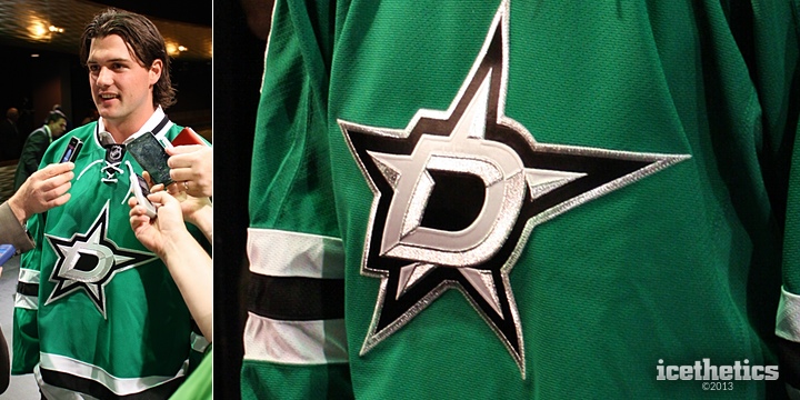
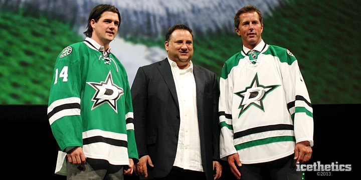
The Dallas Stars unveiled their new logos and uniforms at an event last Tuesday. Let's pick things up at the end of that event, when I got some close-up, hands-on time with the two new sweaters.

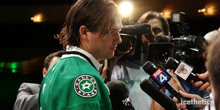
After the fans departed the Winspear Opera House, the media mob of which I was now a member crowded around three men up on the stage. Jamie Benn, Mike Modano and Stars owner Tom Gaglardi had a lot of microphones and cameras pointed at them, mine included.

But to be perfectly honest, I didn't care what Benn and Modano were saying. I wasn't there to cover hockey operations. I was there to cover the new branding. So while the "real" reporters were squeezing in for questions about offseason training habits and plans for next season, I was squeezing in for photos of the brand new threads.

Initial Reactions

The first thing I noticed when Benn and Modano stepped out onto the stage, this is a very striking green. Truthfully, I took a moment to consider whether I was even awake. Here I am sitting in Dallas watching the Stars unveil new logos and uniforms — and it turns out they're the greatest shade of green I could imagine — something I've been pushing hard for over the past six years. Was it really real?

But a dream it was not. Or if it was, it had come true in that moment. The Stars' new look feels like one of the better designs we might see on the Concepts page — where many readers would undoubtedly declare it would never come to fruition. But this one did.

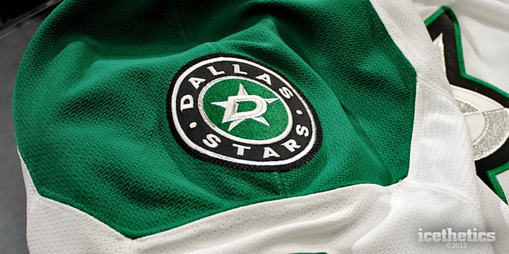
As we get started, the one thing I have to tell you is that photos simply don't do this color justice. If you get an opportunity to go see the Stars next season, I highly recommend it if only to see this green I'm so nuts about.
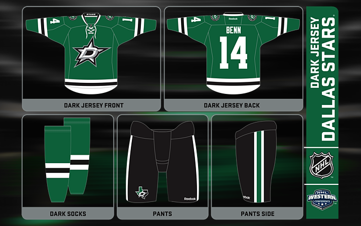
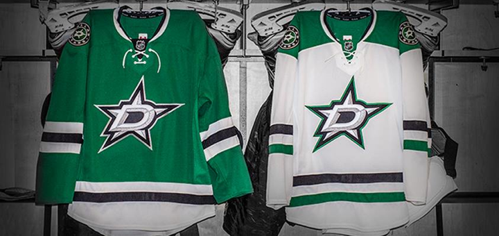
The Home Uniform

Unfortunately, I haven't seen any great photos of the full uniform on a player like we got from the Hurricanes. While this graphic shows all the important details of the look, it's sterile and detached. You don't get the same impressions as when it's being worn over full gear.

The Stars have gone back to a classic, retro style, following the trend in hockey uniforms of late. The simple, traditional striping cleverly draws the eye straight to the sharp new crest. The one-color numbers and letters are subdued yet unique. And while back in Raleigh the Hurricanes opted for a less sparkly silver in their crest, the Stars have fully embraced it.

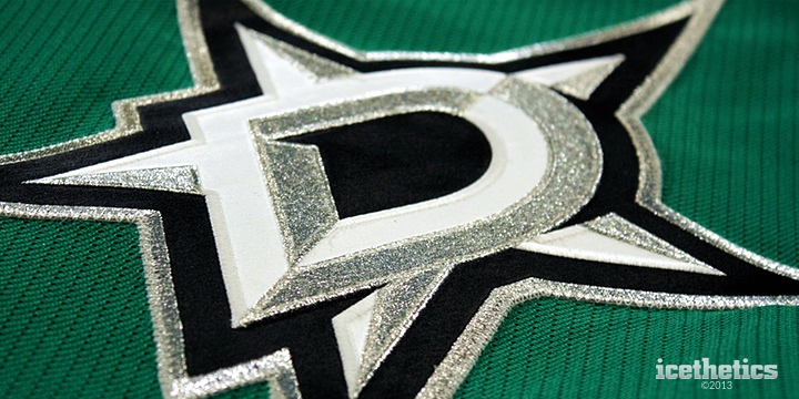
Up close, the detail is stunning. This is going to be a great hockey uniform and should be around for a lot of years. The Stars were part of the NHL's first expansion in 1967. And somehow this logos feels like it could've been introduced back then only to be updated now, 46 years later. Even the green feels like an update to what the North Stars originally wore.

I think what I might be happiest to see is that for the first time in two decades, the Stars aren't wearing a wordmark on their chest. That's been my biggest pet peeve with them over the years. It's the reason their uniforms have always been at the bottom of my list. Now suddenly they find themselves at the top.

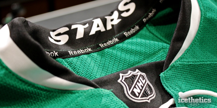
One Reebok trend I actually like is the "Hanger Effect," as they're calling it, where some sort of design detail is incorporated into the inside of the collar. That means it's only visible on a hanger, so you have to own the jersey to be able to appreciate it. 

On the green jersey, it reads STARS in the collar. Meanwhile, as you'll see below, it reads DALLAS in the collar of the white jersey. It may not be as cool as Nashville's piano keys or Carolina's storm flags, but it's a nice detail to include in the design.

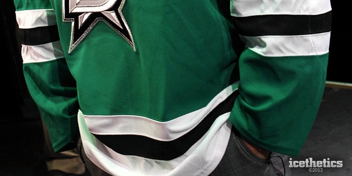
So what is there not to like about this jersey? A few things, actually. I mentioned that I liked the traditional striping style. But it runs into a problem similar to Carolina's in that it isn't strictly unique. I know positioning stripes on a sweater in a unique but traditional way is a difficult task, but the sleeves are straight off a Chicago Blackhawks jersey.

However, the matching waist stripe is where the jersey differs from Chicago's and helps the whole look stand on its own. Gaglardi said he wanted the colors of the team to be green, black and white. This accomplishes that and makes me wish the Lightning had considered keeping black two years ago.

There's another great story about Gaglardi and his stripes. After the event, I spoke with Jason Walsh, the Stars' VP of production and entertainment — the man who ushered the rebranding process. He explained how involved Gaglardi was. Multiple times a week they met to look at new designs. And when one of the final prototypes came in from Reebok, Gaglardi glanced at it for a moment and immediatley asked for a ruler.

The three sleeve stripes were supposed to each be the same width. But the the black one happened to be 1/8 inch too big. He spotted the problem that quickly. That's how dedicated this man was to the details. That's how much he wanted to get this right.

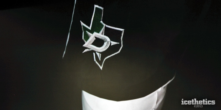
The other thing that bugged me was the placement of this alternate logo. The Stars came up with a new Texas-shaped mark only to bury it on the pants. I think I would've like to see it on the shoulders — as its predecessor had been in years past.

But in fairness, Walsh told me that idea was among the 236 variations the team looked at during the process. And he said it just didn't look right. I understand the state of Texas has an odd shape, but I'm just not thrilled about the outbreak of circular logos.

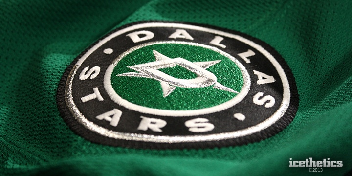
As circular logos go, this isn't a bad one, but I don't feel like it brings anything to the overall identity. It's a wordmark surrounded the D-star of the primary logo. That said, I think it serves its purpose, which is to have a shoulder patch. Carolina went without them and I do think that was a mistake.

I don't mean to keep bringing up the Hurricanes but they're fresh on my mind because both unveilings happened on the same day. And there are plenty of comparisons to draw anyway, with both teams going the traditional route with their new looks.
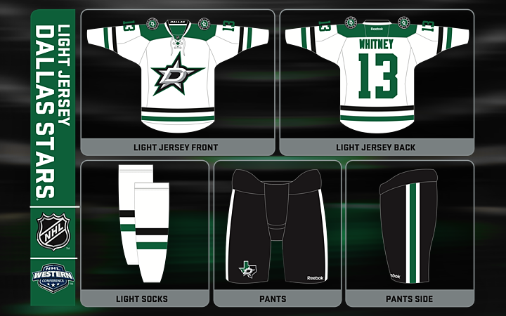
The Road Uniform

Moving on to the white jersey it's clear we're looking at a brand new template from Reebok. Every since the launch of the Edge jersey in 2007, fans have bemoaned the lack of variation in the uniform designs. But with the Stars' rebrand, a new one was certainly added to the mix.

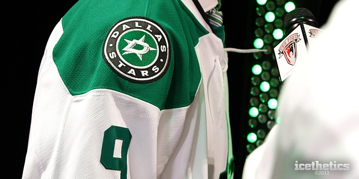
The first thing that stuck out to me, in fact, was the shoulder yoke. It's not simply rounded as is typical with hockey sweaters. But it's not square either, like the new design we saw from Carolina. It's a neat touch that makes this jersey unique among not just NHL clubs but all Reebok-clad teams.

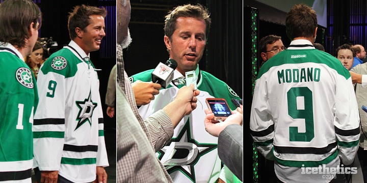
Mike Modano sure does wear it well. It's just a shame we'll never see him in action in it. But it is nice in the transition to get to see the new jersey with No. 9 on the back — since it will be the last time. As we learned Tuesday, it gets raised to the rafters next spring.

While we're looking at these photos, let's talk striping. It's still a three-stripe design like the green uniform, but it's not quite an inverse. And also like the green one, as some fans have noted, the striping isn't exactly novel. In fact, it's a lot like what the University of North Dakota has worn (both the green and white jerseys for that matter).

But despite that, both jerseys retain a feel that's uniquely Stars, and indeed unique in the NHL.

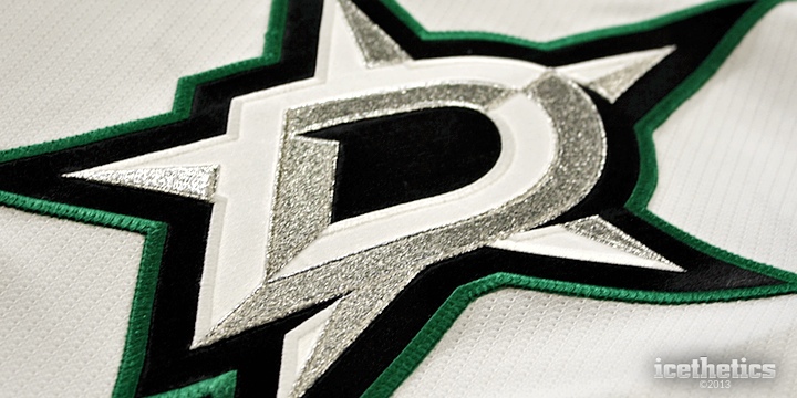
The crest varies slightly depending on the jersey. As we saw on the green sweater, the D-star is outlined in silver. Here on the white uniform it's green. It's the only green in the primary logo, in fact. But it's all you need. You don't want the logo be primarily green if that's the color you want for your sweaters.

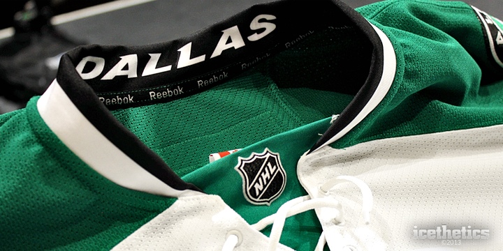
As I mentioned before, both jerseys have Reebok's Hanger Effect. You can see the DALLAS wordmark inside the collar of the away jersey. And also noticeable here is the lace-up collar. It's featured on both sweaters and it's one of those things you add to a jersey when you're going for that traditional appeal.

Just from an aesthetic standpoint, I like it. And I probably wouldn't mind if every NHL team did it. Is it functional? No. But it is a treatment that is unique to hockey sweaters. You wouldn't find it a football or baseball jersey. For that reason alone, I like it. But I can't give you a good reason for why I think it works. It's just something that appeals to my design sense.

I have to squeeze in one more close-up of the shoulder yoke. I really like the idea of the Stars differentiating their look this way. Could any other team have tried this? Sure. But the Stars did it first so now they get to own it. It's one of those details taht makes me love this sweater.

And it's also why I'll have a difficult choice to make in the fall. Do I buy the green one or the white one? Maybe both.

If you'll permit me to compare/contrast the Stars and Hurricanes once more, the biggest point I have to make is how each franchise approached its identity. I wrote that I felt like Carolina lost what made it unique. On the other hand, the Stars have gone out of their way to create a look that is both unique and beautiful.

In a nutshell...

I'll wrap this up with a summary of my thoughts.

The Good:

  • GREEN! (Again!)
  • Unique shoulder yoke
  • Wordmark gone from the crest

The Bad:

  • Striping, while fitting, is somewhat unoriginal
  • The circular logo on the shoulders is a bit tired

So you've heard my take. What's yours?