Sabres Share More Jersey Previews

Photos from Buffalo Sabres (via Twitter)

New photo tweets expose very little 

I'm just back from a long, relaxing vacation in Alaska — albeit a little worse for wear. (Literally now limping around after ruining my ankle — I don't want to say how.) But as that has little bearing on my typing abilities, let's get to the news of the day. Or should I say the old news of last week.

While I was away from the Internet, the Buffalo Sabres shared a couple more of those "sneak glimpses" of their forthcoming third jersey. And really, I'm not sure why. They didn't really offer anything new. You can see them both in the graphic above at their original resolution — small.

Both show roughly the same area of the sweater, reiterating that it will be gold. We get it. The first one, posted on July 26 appears to show a new white stripe somewhere on the front. Hard to gauge the precise location. Then on Thursday (Aug. 1), we got another one again showing the crest with what seems to be the sleeve in the foreground.

I'm normally a fan of these drawn-out unveilings with little tidbits along the way — like what the Hurricanes did this summer. But are the Sabres just trying to bother us by showing the same thing in different tweets saying stuff like "another sneak peek" and "exclusive pics" and the like?

If so, Sabres 1, jersey geeks 0. I'll be looking forward to seeing something that's actually new.

What do you guys make of these reveals? Because for me, it's not a whole lot.

Heritage Classic Logo Surfaces

Photo from Noah Kallner (via Twitter)

Logo for 2014 event is remarkably similar to 2011 version

The logo for the 2014 NHL Heritage Classic surfaced on Twitter last night. Noah Kallner tweeted the photo above, which shows a Heritage Classic t-shirt emblazoned with the never-before-seen mark.

The logo is remarkably similar to the one belonging to the last Heritage Classic which took place in Calgary in 2011. If you need a refresher on what that logo looked like, here you go.

On first glance, they look exactly the same but for the skyline in the center. But the eagle-eyed will note a few more updated details — the ribbons, the frame, etc. I'm actually very happy about this. It'd be easy to say the league wasn't be creative by retooling an old design, but it was such a beautiful design to begin with. I'm glad it's getting a second life in Vancouver.

The 2014 NHL Heritage Classic takes place Sun., March 2 at B.C. Place in Vancouver, B.C. between the Vancouver Canucks and the Ottawa Senators. No official word on the jerseys yet, but it's rumored the Sens are working on a light version of their black Heritage Jersey introduced in 2011.

If that's the case, the Canucks could break out their Millionaires sweaters again.

It's possible this could be my last blog updated for a little while. I'll be on vacation until the beginning of August with very little web access. I'll try to keep up with Twitter so make sure you keep an eye there.

Panthers, Ducks Plan Throwbacks

They're not even of legal drinking age and they're already getting nostalgic. Two teams will commemorate their 20th NHL seasons this fall. Let's talk about how.

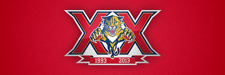
When the NHL schedule was announced this past week, the Florida Panthers used the opportunity to announce their plans for the year as they mark their 20th anniversary. The Cats open their season on the road, but when they return home on Oct. 11, they'll have what they're calling a "Throwback Night" — though it's not entirely clear what that means.

Instantly, jersey geeks like us have been conditioned to immediately assume we're getting a throwback jersey. I could see that. Those triangular shoulder yokes don't get used anymore in the Age of Reebok, and that's sad. But the Panthers haven't said anything about a special jersey.

In fact, they haven't really said anything yet. From the press release:

The Cats took on the Penguins in their first regular season game in South Florida on Oct. 12, 1993, nearly 20-years to the date. The night will be a “throwback” night with details on all of the Opening Night festivities to be announced in the coming weeks.

So we'll keep an eye on things over the coming weeks.

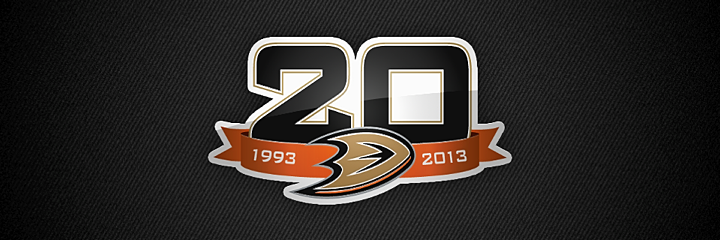
Then there's the Anaheim Ducks. They also used the the schedule release to talk about their 20th anniversary plans. And it sounds like the old Disney Duck could be making an appearance. 

Icethetics reader and Ducks season ticket holder Andrew Heidecker emailed me excitedly last week to share some details.

I am a season ticket holder for the Anaheim Ducks. During their select-a-seat promotion, they had all the high-ups of the Ducks organization there. I spoke with one of them and he informed me that the Ducks will become Mighty once more during a game in October.

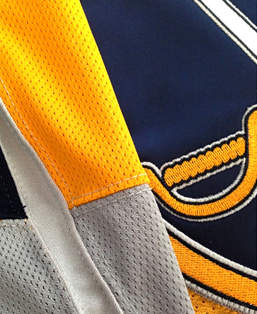
They will revive the 1993 [inaugural] jersey (he was not sure if it would be eggplant or white since home was light colors back then) but he did say that it will be set to the new Reebok Edge jersey and will be available for sale all season long in the Ducks team store.

Currently, the jersey is set to be worn for only one game early in October, but that can be altered to more than one game. Not to sound antsy, but the way he said it, it sounded like there may be more than one "MIGHTY" jersey being produced for wear this season.

If I find anything else out, I'll let you know!

If true, that's exciting news for fans of the old Mighty Ducks brand. We'll keep our fingers crossed.

It's worth noting that the Ducks' own press release fits in line with this report. 

As part of the 20th anniversary celebrations, the 2013-14 regular season will include a number of special events at Honda Center. Planned occasions will include look backs at great moments in Ducks history and retro merchandise available for purchase.

In addition, the club will host a “Throwback Night” near the start of the 2013-14 regular season, paying homage to the inaugural 1993-94 Mighty Ducks of Anaheim season. The club will have further announcements surrounding the festivities at a later date.

That "further announcements at a later date" line again. Heard it before.

Anyway, it sounds promising. And for what it's worth, the Ducks could get double-use out of such a throwback jersey. Don't forget that they play the Kings outdoors on Jan. 25, 2014. That'll probably involve a throwback jersey of some kind just as every other outdoor NHL game has in the past six years.

So what do you guys think? Is 20 too soon for throwbacks? Or are you nostalgic enough to take a throwback in any form at any time? Hockey does love its traditions after all.

Sabres Sneak Another Glimpse

Photo from Buffalo Sabres (via Facebook)Today was an odd sort of non-stop day for me. That's why I'm only now getting around to writing about a new third jersey photo the Buffalo Sabres shared 15 hours ago.

Incidentally, if any fans of The Postal Service are reading, you should know they put on a good live show. Though the music's the same as it was a decade ago.

But back to the point. The Sabres revealed another ambiguous look at their forthcoming new sweater on Thursday morning. It doesn't really show us anything we haven't seen before.

However, I have to follow-up on some tweets I wrote earlier today. In response to some saying parts of the jersey were clearly grey, I said I wasn't convinced.

Remember that busy day I've been having? I'd only seen this photo on my tiny smartphone screen. But when I got home tonight and got a better look on a proper computer screen, Idecided to change my tune.

I'm joining the group that says the bottom half of the sleeves are grey. The stripe down the arm, however, I'm less sure of. Still could be white. The lighting in this photo does seem a bit odd.

Feel free to chime in with your thoughts on what we've seen so far. For more, take a look at my review of the sneak peek video from last Friday.

Iowa's Wild New Logos

Back in April, the Iowa Wild unveiled their new logo and home uniform. Since then, we've gotten a look at some other elements of the franchise's visual identity. For one thing, the graphic above shows how the logo is colored on a dark background. It's been seen on the backdrop at recent press conferences.

Previously, we'd only seen the green version used on white backgrounds, including the white jersey that was shown to us. (We still haven't seen a road or alternate jersey yet.) Here's a reminder of what the green version of the logo looks like.

But that's not all. A few weeks ago, the Wild tweeted this photo of new T-shirts fans can get their hands on. And it showed yet

Photo from Iowa Wild (via Twitter)

On the right you can see a modified version of the logo Minnesota uses on their home sweater. Does that mean Iowa could be taking a similar route? Might not be the worst thing if they did. I know it's easy to complain when a minor league team takes on the branding of its NHL affiliate, but sometimes it's cool to see the variations.

I believe that covers all of the Iowa Wild's logos for the 2013-14 season. But there is one more thing I wanted to mention. Obviously, this team has yet to take the ice, yet you can already find "photos" of the new uniforms in action — all thanks to Photoshop.

Images from Iowa Wild (via Instagram)

The image on the left was featured in an Instagram promotion and the one on the right was part of splash page graphic on the team's official website. (They have a different splash screen now but are still using a similarly Photoshopped player.)

It's basically just the old Houston Aeros alternate jersey with the new logo pasted on. Not a terribly complex solution, but at least fans get the feel of seeing the new Wild in action, right?

What do you think of teams Photoshopping new jerseys onto their players in the offseason? We've also seen it a lot with NHL teams given all the player movement since free agency began. Does it bug you? Could you care less?