Buffalo, It's Getting Old Now
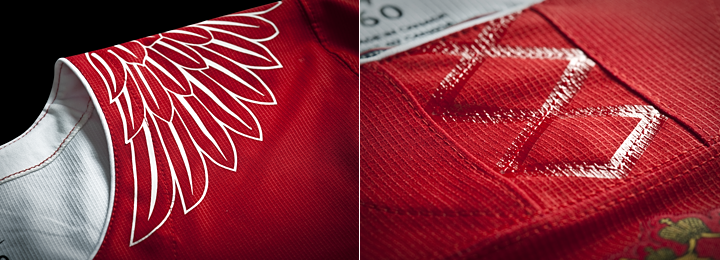
Photo from Buffalo Sabres (via Twitter)

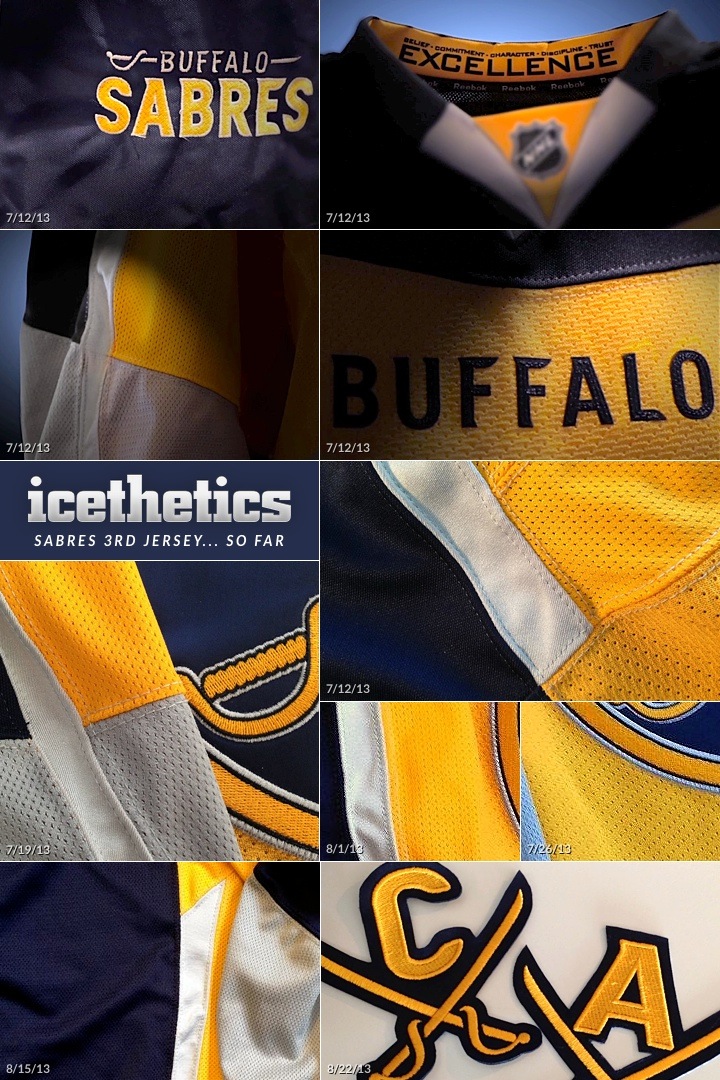
Sabres' latest teaser exposes pants shell

You know I'm normally a cheerleader for the teams that do these sneak peeks leading up to a jersey unveiling. But, like many of you, I'm coming around to being less and less amused by the Buffalo Sabres and their excruciating process.

First, these images seem to coming out at isolated moments — though I'll admit we have seen them on Thursdays with some regularity. And second, what's the end date? How long will this continue? Other teams have done teasers this summer, but none have dragged it out for six weeks. And all have given us a final date to look forward to.

Anyway, the Sabres did end up revealing another element of their new alternate uniform yesterday. But in a single tweet, they told two untruths. Did you catch them?

First, this is not a piece of the third "jersey." (Unless they're really going out there with this new look!) Now, maybe I'm nitpicking or maybe I'm just a stickler for language. You know, how words have different meanings and all. And let's bear in mind they actually teased the teaserposting this tweet 17 minutes before the pants shell photo.

Also, this whole "new aspect" and "you haven't seen yet" language wasn't quite true either. Did you guys forget that the pants were, in fact, among the first things we saw when that video teaser was released back in mid-July? Granted, that video didn't show the yellow portion of the stripe on the side, so we'll call this a half-truth. But was it really worth the extra promo?

I'm usually a fan of these sort of drips-and-drabs reveals. It's often fun to follow along and it quells the appetite for unauthorized leaks. But the Sabres have made some fatal errors. They're taking too long, the releases are too infrequent, and they refuse to say when the madness will end.

What's more, it's not just a handful of jersey nerds whining on a blog in some dark corner of the Internet. The Sabres' own fans are getting tired of it. Just read the replies to the tweets and Facebook posts.

I think that does it. I'll still cover every reveal, because that's what I do here. And I'm genuinely interested in seeing how this all comes together. But I think all that needed to be said. Who's with me?

The First 4 Wild Jersey Teasers

Photos from Minnesota Wild

Latest photo shows new sweater's striping

The Minnesota Wild have now released four of the seven teaser images planned ahead of the official unveiling of the new road jersey on Sunday. Prior to today, all we'd learned about were the details of the collar. The latest photo shows us the striping.

For those expecting a reversed version of the Wild's green alternate jersey, this is evidence to support you. Whether we're looking at a sleeve or the waist, this striping pattern looks awfully familiar. But that makes sense.

At the moment, all three of Minnesota's jerseys look wildly different (accidentally pun) — none use the same template. So I wouldn't be surprised to see this new jersey move closer in style to one of the others. And given how much the green appears in team marketing and promotions, it's a safe bet they're going in that direction.

Again, the full jersey will be revealed at the Minnesota State Fair on Sunday at 11:30 AM CT. I'll have photos here once they're available.

By the way, is anyone terribly disappointed that it's late Thursday morning and we still haven't seen a new teaser photo from the Buffalo Sabres? Yeah, me neither.

Nike Unveils Olympic Team Jerseys

All images from Nike

United States gets classy new look for 2014

Nike has been using this week to unveil the hockey jerseys slated for use during the 2014 Winter Olympics. Today, they revealed the new look of the United States. Team USA will be sporting these classy numbers. They're minimalist in their overall aesthetic and very tasteful.

I particularly like how they swapped out the tired collegiate text for a beautiful new crest. Another feature of the jersey is the slogan "land of the free, home of the brave" printed inside the collar. I suppose that's just a feature for the players to see as they pull their jerseys over their head before they hit the ice. There's no other way to see it, really.

It turns out even Nike isn't immune from Reebok's "hanger effect" trend. The inside of the collar pays tribute to the years the U.S. brought home gold medals. It's a nice touch, even if it's only visible when it's hanging on a rack in a store. Still, it's probably a good reminder for the players when they walk into the locker room.

We'll wrap up with the feature that was exploding Twitter at last check. The same effect used to create the twinkling stars on on the shoulders has been fashioned into a fake lace-up collar. I guess the point is that the lace-up collars on hockey sweaters are strictly for appearances. So Nike figures, why not make them even more pointless.

But if that's the worst thing these jerseys have to offer, I think we're in pretty good shape. Some might question the lack of sleeve and waist striping — a problem I noted for the San Jose Sharks not long ago — but there's a different aesthetic to national team jerseys. They don't need bells and whistles. They need to be classy. I think Nike hit the mark for Team USA.

But wait, there's more...

All images from Nike

Russia revises uniforms for Sochi

As the host country of the 2014 Winter Olympics, Russia was first to show off its new uniforms. The designs were revealed by Nike on Monday, and once again, we get a solid pair of jerseys.

The red one features the Russian flag wrapped around the sleeves while the white one has an entirely different feel — both with lots of Russian iconography. In fact, that's addressed in Nike's media release:

Taking inspiration from Russia’s national emblem of the two-headed eagle, the jersey has been redesigned with streamlined design lines, lighter graphics and a modern neckline reinforced with Nike Flywire. The result is a lightweight, breathable jersey that moves naturally with the body, and is steeped in hundreds of years of history and heritage.

Featured on the shoulders of the red jersey are eight stars — four on each side — commemorating what Nike refers to as "past successes." A similar feature is on the white jersey but in the form of eight gold crowns on the right sleeve. But by my count, Russia/Soviet Union has only won seven gold medals in Olympic hockey. What am I missing? Anyone know what the eighth star references?

UPDATE: I was forgetting about 1992 Olympics and the Unified Team, for which Russian players suited up. That accounts for the eighth gold star/crown. Thanks to Corbin LeGrand for pointing that out.

Speaking of the white uniform, here's a look at some of the detail. That faux lace-up collar shows up again — on both jerseys, in fact. Too bad, and Nike had such a good thing going otherwise. The other thing that got some negative feedback, at least through Twitter, was the eagle wing graphics on the shoulders.

I may be in that group. It doesn't really feel like it belongs with the rest of the jersey. Especially when you see it on Alex Ovechkin. Check out these shots.

The red one looks incredibly cool. The white one... well, let's just say I hope they get to play more games while wearing red. Both designs are very Russian, but I'm partial to the red, obviously.

How about you? How do you feel about what Nike's done for the U.S. and Russia?

Wild Reveal First Jersey Teaser

Image from Minnesota Wild

Photo shows green shoulders and two-tone collar

Photo from Minnesota Wild (via Twitter)The Minnesota Wild will unveil their new road uniform this Sunday, Sept. 1 at the Minnesota State Fair. Until then, though, they're releasing new teaser images every day on their website and social media platforms.

A new splash page on their official website (above) shows this first image, which you can also find on Facebook and Twitter.

The first of seven images was released this morning. So what does it tell us? First, based on the marketing slogan, "White Hot.", it's probably a safe bet this will be a white jersey — and not wheat-colored or anything.

And yet, there's not a speck of white in the photo released today (right). It's all green and red. So we know the shoulders are green and the collar is two-toned, green and red.

The other thing we can tell from the cut of the collar is that this will be another lace-up jersey. They already have the ties on their home and alternate jerseys, so it was just a matter of time for this one.

But there's something else about this jersey. It looks to me like an oversized shoulder yoke. On most Reebok Edge jerseys with the yoke/lace-up combo, the yoke ends at the corner of the collar or just above it. See these close-up examples from 2007.

Reebok Edge jerseys / Minnesota Wild & New York Islanders

The yoke on this new Wild jersey continues down. How far, we can't tell from this photo. I don't think this jersey or its template will look much like anything that's come before it. Just a hunch. I could be proved wrong tomorrow with the next teaser image.

What's your take on it? Are you excited to see what the Wild have planned?

Sabres Reveal New Captain Letters

The Buffalo Sabres have been listening. Instead of revealing another angle of the same part of their new third jersey, they gave us a look at the redesigned captain patches. And they're pretty interesting.

To get everyone up to speed on where we are with regard to these weekly sneak peeks, I've assembled the giant graphic below. At the bottom you'll find the new photo that was released today.

By the way, in putting this together I realized there is a method to this madness. We've been getting new images once a week, every Thursday since July 12 — except Aug. 8 for some reason. So it's probably safe to say we'll get another one on Aug. 29. But I'm still more interested in an actual release date.

 So what do you think? How's the new look shaping up so far?