Kings prepare to unveil jersey for 2015 Stadium Series game

We're just two weeks away from seeing the jersey the Los Angeles Kings will wear for their 2015 NHL Stadium Series game.

The Team LA Store shared a photo on Instagram Monday night indicating "the big unveiling" is set for Tues., Dec. 16.

We've got some BIG things to be excited about! 12.16.14 #ThisIsBIG

A photo posted by TEAM LA (@teamlastore) on

This news comes just a week after the Kings' video production crew, Kings Vision, tweeted a photo to get some buzz going.

Photo from @KingsVision via Twitter

Why would they need that short-lived 1996 third jersey to do make a video about their new Stadium Series jersey?

There's no chance the jersey seen in the photo will be seen on the ice in February. First, that would defeat the purpose of a tease. And second, this is the original from almost 20 years ago — clear from the jersey material and collar style.

So could the Kings have a replica of that "Burger King" jersey in the works? Maybe.

My best guess is that the final video will show a series of past Kings jerseys leading up to the reveal of the newest one.

But let's not forget that the Manchester Monarchs, the Kings' AHL affiliate, wore that jersey last season as part of a theme night.

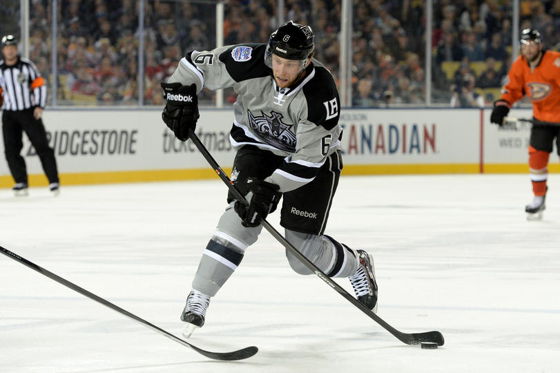
The Kings played in the NHL Stadium Series last season. They hosted the Anaheim Ducks at Dodger Stadium wearing grey.

This season, they will visit the San Jose Sharks on Feb. 21 at Levi's Stadium, home of the NFL's San Francisco 49ers.

The Sharks have yet to announce an unveiling date for their jersey.

Kings' 2014 Stadium Series uniform

Kings' 2014 Stadium Series uniform

Dallas Stars reveal road to rebrand with loads of concepts

About 18 months ago the Dallas Stars unleashed Victory Green upon the world. Now we're finally getting the whole story on how it came to be and what might have been.

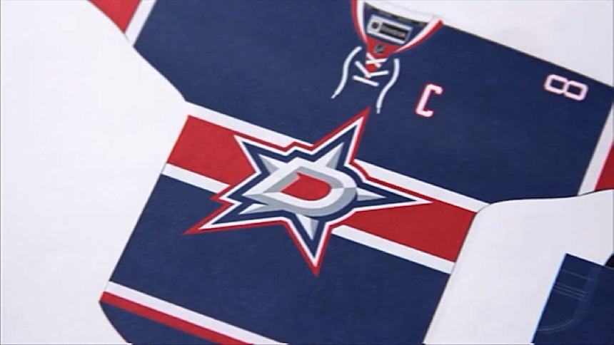
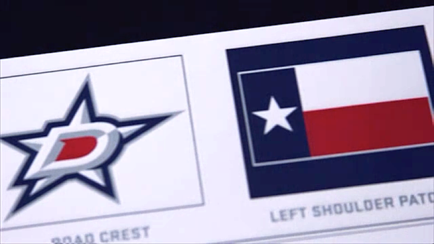
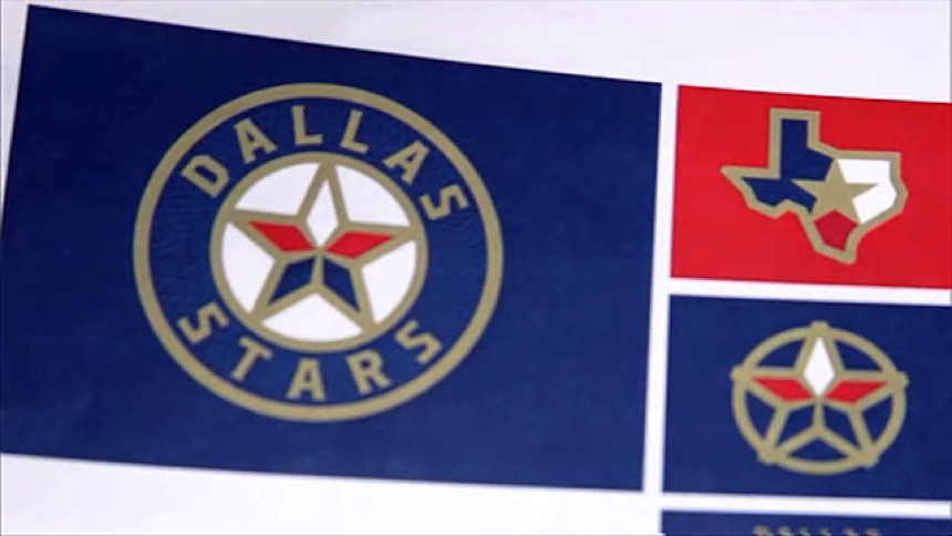
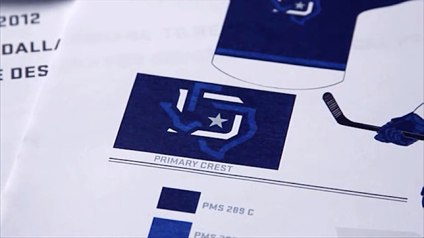
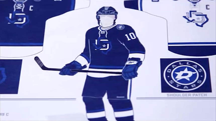
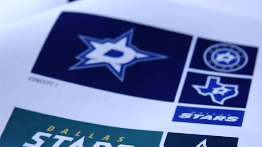
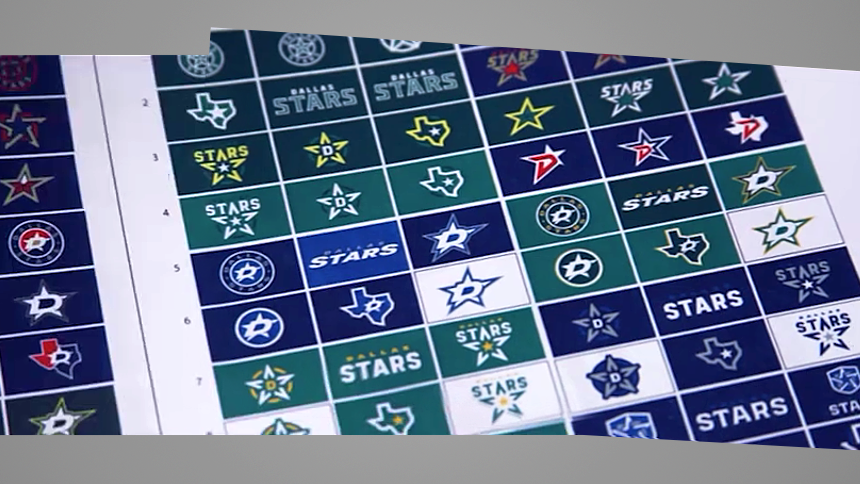
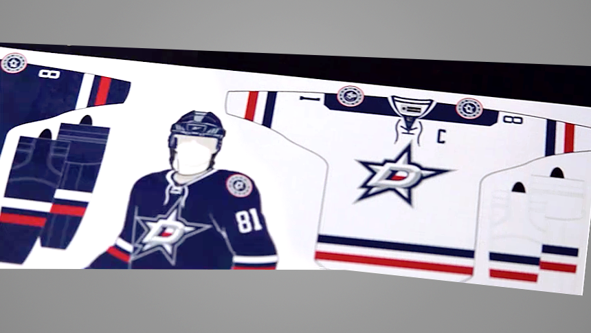
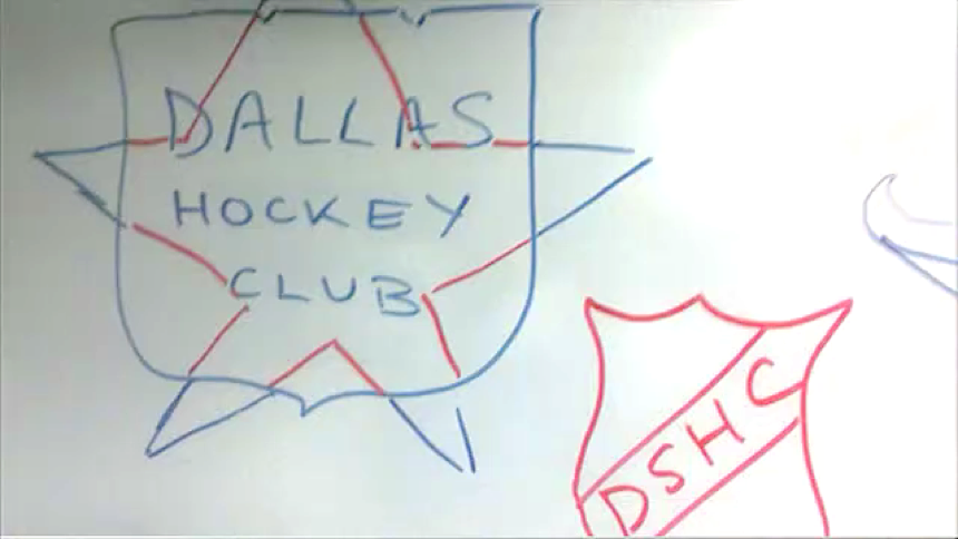
The team released a video today that explained the process and included something to please every Icethetics reader — loads of concept logos and jersey prototypes. Check out some still frames from the video below.

It's fascinating to see how many options the Stars went through before ending up where they did. It sounds like many within the organization, lead by TV color analyst Daryl Reaugh, were eager to see the team go blue to match the other pro sports teams in Dallas — the Cowboys, Mavericks, Rangers and even MLS's FC Dallas.

In the end, the Stars decided to pave their own path, not only sticking with green, but introducing their own custom shade of green — Victory Green. The video talks about the NHL encouraging the Stars to stay green so they could own the color.

Perhaps the league forgot about the Minnesota Wild, who also wear a lot of green. And it's funny when you think about it because Minnesota itself is the only reason the Stars wear green today. The North Stars wore it and the franchise chose not to change the logo after relocating in 1993.

In fairness to the Stars, theirs is a much lighter green than the Wild's, of course. But that Minnesota connection cannot be denied. Here's the full video.

If you want more to read on the Stars' rebrand in 2013, I wrote a three-part review after being invited by the team to cover the unveiling event last year. I got the chance to speak with Stars broadcast/creative AVP Jason Walsh, who spearheaded the rebrand project.

So what do you think of the many concepts above? Any that stand out to you? Did they make the right call ending up where they did?

Canucks freak out Vancouver with green fashion jersey

Photos: @canucksstore via Instagram / @QuinnMellCobb via Twitter

The Vancouver Canucks made waves by introducing an eye-catching new product to their team store this week — a green fashion jersey featuring a Johnny Canuck crest.

Let's start by defining "fashion jersey" for the uninitiated. The first thing to know is that it is not a game jersey. You won't see the Sedin twins wearing it on the ice. It is produced solely as a piece of team merchandise no different from a hoodie or T-shirt emblazoned with a club logo.

It's difficult for many Icethetics readers to understand fashion jerseys because we tend to want the real deal or nothing. So these threads are generally targeted to a younger crowd less interested in tradition and more interested in what looks "cool."

In fact, there's a popular line of fashion jerseys out right now from Reebok called Cross Check. They're dark grey with black stripes and an accent color.

Screen shot from Shop.NHL.com

Those are very obviously not game jerseys.

So the reason for all the commotion in Vancouver is that this green jersey is manufactured to look like the Reebok Edge Premier (replica) version of a game jersey. Leading to the obvious question: Are the Canucks going to wear these at some point?

Instinct tells me no. This is probably more of a fan marketing strategy than an effort to rebrand the franchise on the ice. Having said that, if they sell well, anything is possible.

By the way, Icethetics has showcased green Johnny Canuck jersey concepts in the past. Last year, Rob Sulava created one that feels quite similar to what's hanging on a store shelf in Vancouver right now. And another design from Ben Macdonald in January even uses all the same logos.

I praised the use of the full body Johnny Canuck logo in those concepts, but seeing it here in the real world — not really a fan. Just looks out of place. I'll still push to see the V logo front and center at some point, though. And I'm absolutely convinced the Canucks should introduce a green jersey option immediately. What are they waiting for?

What do you think of this jersey? If you're a Canucks fan, will you buy one?

NHL exec declares advertising is coming to sweaters

I've spent most of today contemplating a tweet.

A lot of people who are passionate about hockey sweaters read this blog, so I wanted to take the time to work out a measured response to the notion.

My gut reaction, of course, was probably quite similar to yours. Ridiculous. The NHL would never do that.

Would they?

Advertising on NHL uniforms is the very antithesis of what Icethetics stands for — great design in hockey.

I created this site out of veneration for hockey sweaters — during a moment in history when Reebok was given the green light to homogenize our league with generic, uninspired templates.

If what Allan Walsh reported today is true, it'll turn out I had arrived just in time to cover the death knell of the hockey sweater as we knew it.

It'll also mean Icethetics' days are numbered. If the NHL begins adding anything more than manufacturer logos to its uniforms, I'm done.

This website is done.

Was that measured enough?

– – –

I realize what I just said sounds like a bad knee jerk overreaction. It's not. I've thought about this a lot.

I thought about it just two months ago when the NHL's owners rejected the idea of placing ads on player uniforms — even though they could make a lot of money on it.

But the fact that they were taking the idea seriously enough to even have a vote was a bad sign, in my mind. And the fact that major money is on the line makes the whole thing absolutely inevitable.

We're on a collision course with NHL sweater ads and there's very little any of us can do about it.

Proof is right in front of us. Other leagues already have jersey ads. The European leagues are practically known for it.

Here in North America, it's less prevalent but a number of AHL and ECHL teams wear advertising — usually just a single sponsor with a small patch on the chest or below the number on the back.

But those leagues lack the big ticket draws like Steven Stamkos or Alex Ovechkin. So the extra revenue can often be critical to the operation.

NHL teams, on the other hand, aren't struggling to survive. Even at their worst, they are organizations valued at hundreds of millions of dollars. One even tops a billion. A billion dollars. You can't even begin to contemplate what kind of money that is.

Advertising on jerseys would be absolutely nothing more than pure, unfiltered greed. And despite what Gordon Gekko might have you believe, it's not good. Not here.

Not on a hockey sweater.

In fact, the league has gone to great lengths in recent years to keep non-manufacturer logos off the uniforms. Consider the major sponsor events.

Bridgestone sponsors the Winter Classic. Coors Light sponsors the Stadium Series. Their logos are everywhere — except the jersey patches, where a special unbranded version of each logo is used.

Branded and unbranded logos for the 2015 NHL Winter Classic

Branded and unbranded logos for the 2015 NHL Winter Classic

At least they're doing that right for now.

What's more, sit down in any NHL arena. There's literally no direction you can look to avoid being sold something. Ads covers every available space — even the very surface on which the game is played.

Then there's this.

Walsh mocks "hockey purists" because as an agent, he's conditioned to worship that almighty dollar and ignore what brings fans to the arena night after night. It's the heart and the tradition of the game.

So that's fine, but here's the thing. Fans don't clamor to buy the latest dasher board. The dasher board doesn't represent an aspiration.

We wear the sweater. Proudly.

Our hopes are reflected in it.

The sweater is a symbol of history and tradition. We rally around it. It means something. The greatest teams have never changed it.

It's bad enough when a club doesn't show enough respect for its history in its uniform. But we won't stand idly by and see it violated for profit.

Tough talk to be sure — but what's a fan to do, really? Money is a powerful thing in this world.

– – –

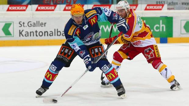
The sad fact is some NHL teams have already taken to wearing sponsor logos on their practice jerseys. Most of us never see them, but there are some jarring examples.

Photo from Los Angeles Kings

Photo from Los Angeles Kings

Los Angeles wears a yellow McDonald's logo. But Kings colors are black and silver.

Photo by Chris Smith/Icethetics

Photo by Chris Smith/Icethetics

Tampa Bay has a red DEX Imaging logo. But Lightning colors are blue and white.

Photo from Detroit Red Wings (2010)

Photo from Detroit Red Wings (2010)

And Detroit was the first to do this in 2010, having worn a blue Amway logo. But Red Wings colors, as anyone alive could tell you, are red and white.

You don't need me to tell you these sponsors' colors clearly clash with the teams' colors in alarming ways. Is this really the future of NHL game sweaters?

As an admirer of great design in hockey, I'd be left with no choice but to retire Icethetics. There'd be nothing left worth writing about.

Don't get me wrong, I am a hockey fan first. I'll still be in front of the TV to root on the Lightning every night from my living room with the same unwavering passion I've had since my very first game more than two decades ago.

Actually, fervor is a better word to describe it.

But if the sweater is desecrated in this way, there's simply no longer a reason for this blog to exist.

I'll have to find a new hobby.

– – –

Obviously, I have strong feelings on this subject. It'd be hard to keep up with a blog like this if I didn't.

But my opinions aren't really that important. Tell me about yours. What do you think of the idea of jersey ads in the NHL? Catastrophic or no big deal?

Blackhawks reveal familiar sweater for 2015 NHL Winter Classic

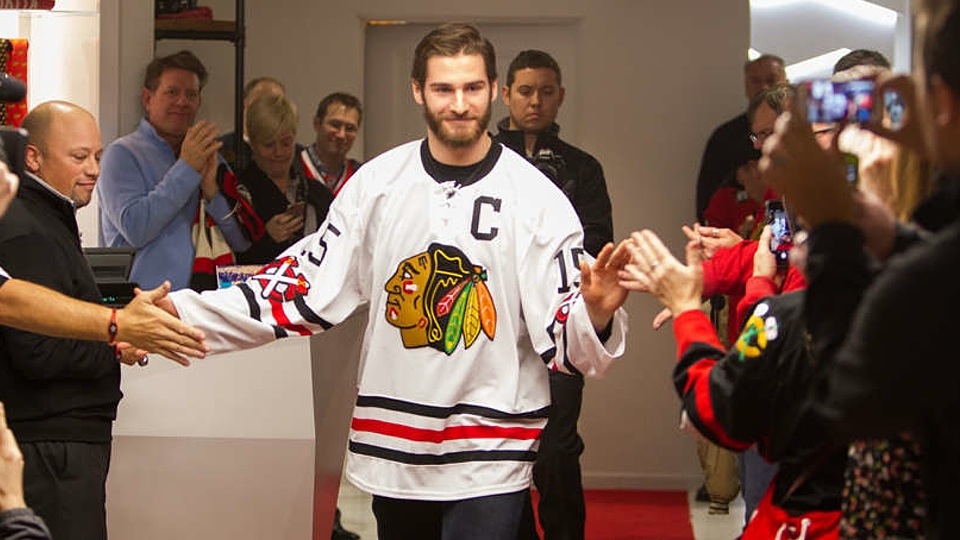
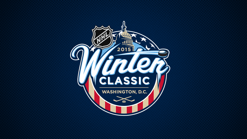
The Chicago Blackhawks will look very familiar when they take the ice at Nationals Park for the 2015 NHL Winter Classic in Washington, D.C.

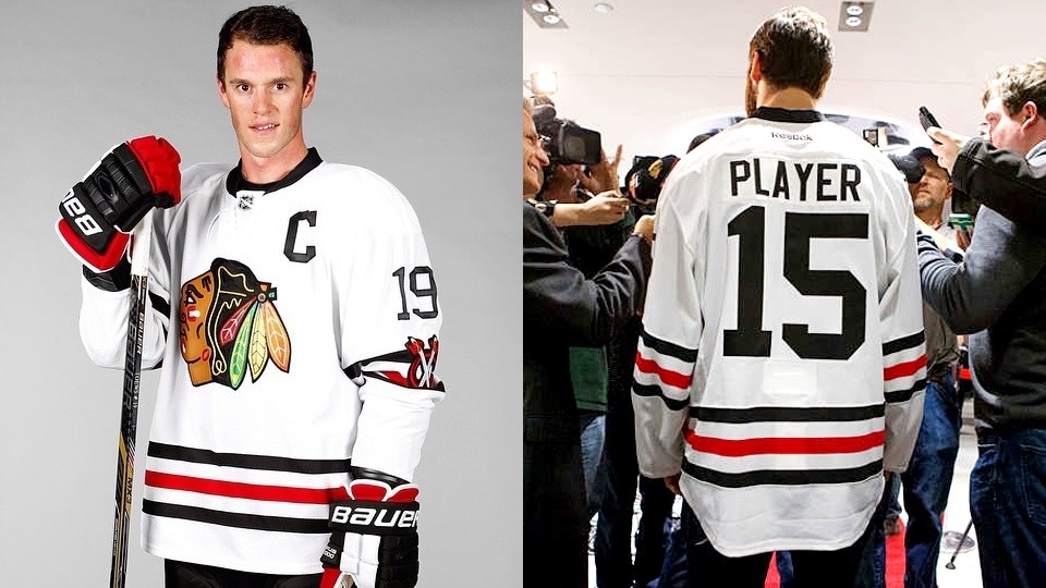
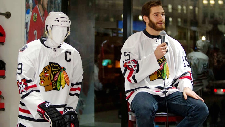
As promised, the Hawks unveiled their newest outdoor game sweater earlier this evening — a design inspired by a uniform the team first wore almost 60 years ago, way back in 1957.

You can find more photos on their website.

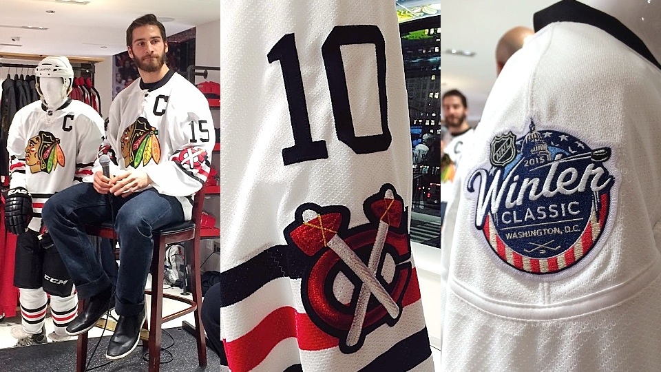
At first glance, it looks a lot like the current road uniform. It kind of is — with a few differences.

  • The tomahawk shoulder patch has retro colors and is moved down the sleeve.
  • There's a lace-up collar.
  • The red outline is removed from the jersey numbers.
  • There's no black on the cuffs of the sleeves.

The reaction to the jersey unveiling on Twitter was mostly negative, despite the fact that it's nearly identical to a sweater many consider among the greats in NHL history.

That said, I'm not surprised. We've grown accustomed to traditional yet dramatically different jerseys for the Winter Classic. In fact, the Blackhawks were a great example of that in 2009.

This is certainly traditional but it doesn't feel different.

I am surprised, however, that the Blackhawks decided to be so conservative. During the 1920s and '30s, the franchise wore striking black and white sweaters that would've looked great against what the  Capitals will have on New Year's Day.

Perhaps they're holding out for a second Winter Classic in the Windy City? Wishful thinking maybe.

Regardless, I have to admit I'm among those that find this jersey to be a disappointment. It's not a bad design, but a little creativity goes a long way. And there's a lot in Chicago's historical arsenal that would've been cool for the NHL's marquee event.

But that's just me. What do you think of the Hawks' Winter Classic jersey choice?


Uniforms for the 2015 NHL Winter Classic in Washington, D.C.