
0101: Lighting the Way
/
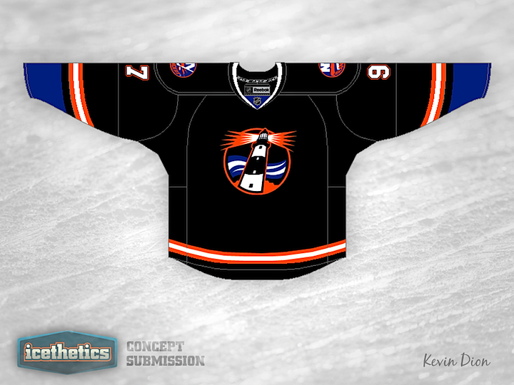
According to the Islanders, their black third jersey is here to stay for a while. But the most common complaint I've heard, beyond the fact that it's black, is that it doesn't have a logo. And what could be a better logo for this team than a lighthouse? Kevin Dion set out to design a black alternate for the Isles with that in mind. And the best part is that the team already has a lighthouse logo in its history. But it's been overshadowed by the frozen seafood character that was placed on the front of the jersey. I'm guessing it won't be popular simply because it's black, but I think it actually works as a third color for the Islanders. How about you?
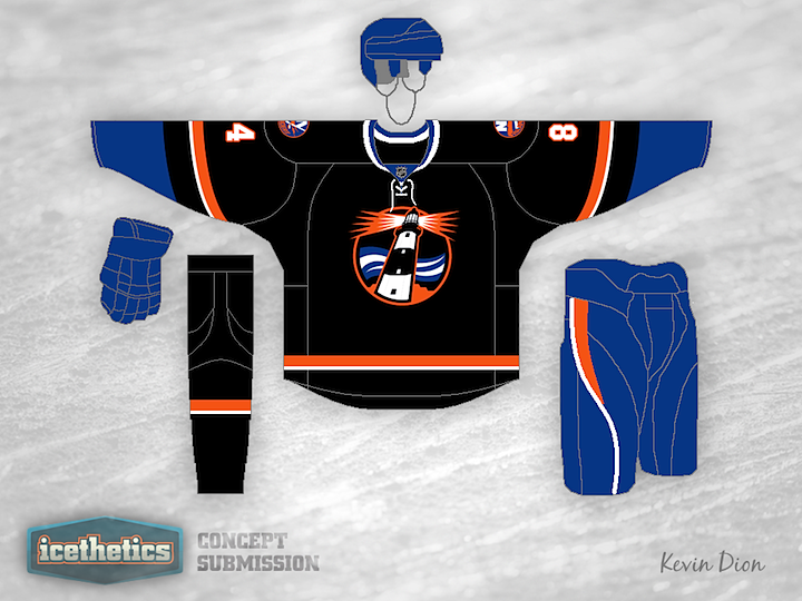
Kevin has made a few adjustments to his design and wanted the revised version shared here. What do you think? Is it an improvement?