A More Natural Leaf

Mark Morgan writes:

I know that it is hard to mess with an original six design, but I cannot understand why the "Toronto Maple Leafs" needs to be spelled out on their logo designs — especially because the maple leaf shape can stand alone (see Canadian flag).
Here is my leafs concept that drops the words and tweaks the logo just a touch, giving it a more "natural" leaf feel.

Ranger Danger

It's a risky proposition to redesign the classic sweaters of the New York Rangers, but Dylan Nowak may be on to something with this jersey. The shield isn't necessarily a deal breaker either.

Bolt of Blue

This concept by Ryan Christensen is a pretty good example of why it may have been a mistake for the Lightning to drop black and silver from their sweaters. 

Bruin Brown

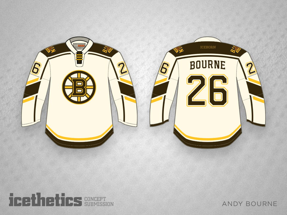
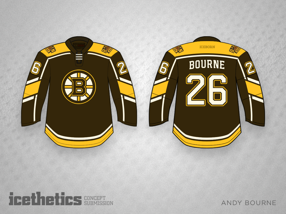
The Bruins have been black and gold for a long time, but shouldn't they return to their roots? Brown and gold would be a welcome sight, just as it is in this set by Andy Bourne.

Ontario Blackout

The AHL's Ontario Reign look an awful lot like the L.A. Kings from just down the road. But this third jersey by David Parkinson would give them their own minimalist style.