
Arenas in a Stadium
/I've been waiting a long time to make that pun. Peri Strathearn designed this Maple Leafs jersey inspired by the Toronto Arenas long before the NHL Centennial Classic was announced. But it would be a good fit, don't you think?
I've been waiting a long time to make that pun. Peri Strathearn designed this Maple Leafs jersey inspired by the Toronto Arenas long before the NHL Centennial Classic was announced. But it would be a good fit, don't you think?
Could the Buffalo Sabres' uniforms work if brown replaced blue? D'Arcy Murphy is taking a shot at a color scheme that's only ever been used by the Bruins before. It's interesting.
Also, Happy Freak Out Friday!
UPDATE · Once again I've been caught accidentally posting a concept that's been featured on the site in the past. Whoops. I thought I was pretty good at keeping things organized, but I keep proving that's not quite the case. So, to make up for it, I offer this.
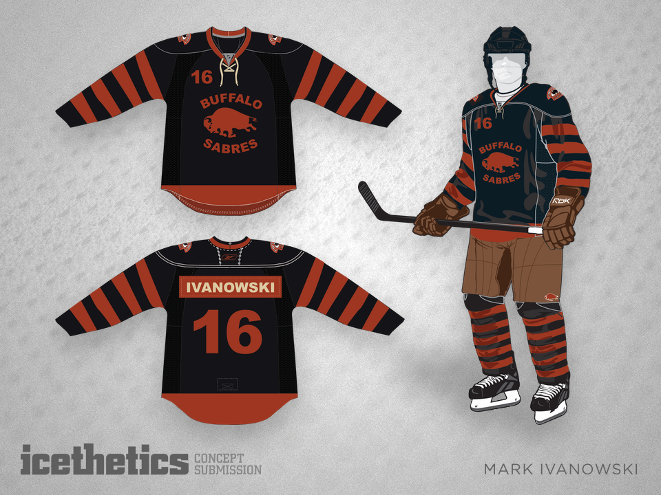
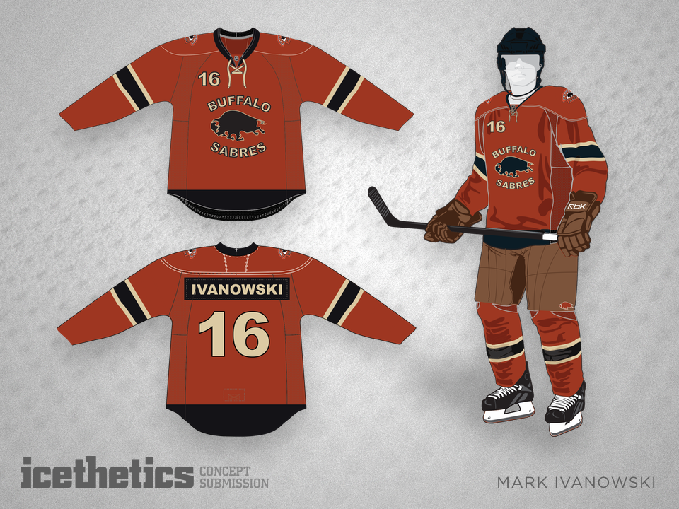
Mark Ivanowski sent this on after thinking about historically-inspired third jersey options for Buffalo. He writes: "This concept is based off the 1931-32 Buffalo Bisons jersey. The original Bisons logo is used as shoulder patches." It's a cool idea, but still freaky in black and brown.
I know the Rangers are one of those untouchable teams, but they got their modernization right back in the mid-90s. I'd love to see the Lady Liberty logo make a comeback — even if it is in royal blue instead of navy. Lucas Daitchman has done a nice job with this one.


Two weeks ago, I posted an Islanders concept that prominently featured the NY logo introduced at the 2014 Stadium Series. Recently another design came in along those same lines, this time from Avi Stein. Any takers?
Matt Marczel pitches a more traditional style of sweater for the Flyers today. By the way, have you picked up on this week's subtle theme yet?