

Hartford Mariners Unveil New Logo
/Today, the Hartford Mariners sport a brand new logo!
 Hartford Mariners' new logo designed by Micah Loyed
It's a great new mark and the Mariners will "wear" it well. But as the commissioner of the IceHL, I'm disappointed, to report the reason for this sudden change.
It was brought to my attention yesterday that the previous Mariners logo bore a striking resemblance to the trident symbol found on the national flag of Barbados. In fact, it was more than a resemblance. The very shape was unchanged.
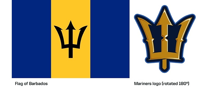
I contacted the designer, Eric Poole, who submitted the logo to our contest last year to get an explanation. Eric told me he'd never seen this flag but found the trident in a book of clip art and worked from that. Regardless, the simple fact is I've always made it very clear in every design contest that designers are to submit only their own original artwork and not to copy someone else's.
Being that the symbol comes from a national flag — designed by Grantley W. Prescod — this isn't an issue of copyright infringement. A national flag by its very nature is in the public domain. But that doesn't change the fact that this artwork submission violated Icethetics/IceHL contest rules.
With that, we move forward. The Mariners were not among the 13 teams designated for possible rebranding this summer as part of 13 Weeks of R&R. Because, as a 2012 expansion team, their design contest was only held last year, I didn't feel it right to ignore all of the great entries we previously received and voted on.
As commissioner, I decided to reward the runner-up in last year's voting. Micah Loyed's Mariners logo set will now become the team's new look. You saw the primary logo at the top of this post. Now, here's the secondary mark.

They're very sharp and distinct logos and should serve the team well. We should all congratulate Micah on a job well done — even if this wasn't the ideal way for his logos to be adopted.
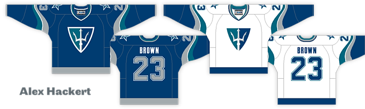
Next, there's the question of the jerseys. As part of last year's expansion project, a jersey design was selected by voters. Unfortunately, it bears the old logos and colors. I didn't want to punish the uniform creator, Ian Dyck, by replacing his design, but nor do I want to hold another design contest for the Mariners.
Instead, I want you to decide so that I'm not making all the decisions. Using the new palette, I've recolored the top two jersey designs from last year's voting. I've also incorporated the new logos.
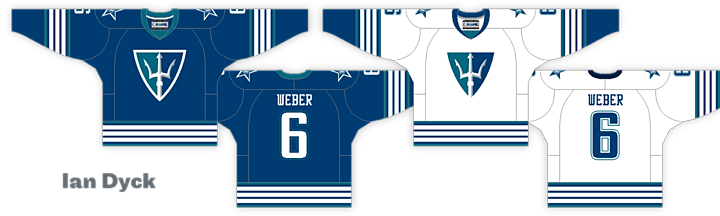
First, we have Ian Dyck's winning design — with revamped colors and logos. And then there's the runner-up, created by Alex Hackert. Vote in the poll below for one of these. After a week, I'll tally the votes. And the winner will be the new uniform design for the Mariners.
Cast your vote here:
If you have any questions, please ask. I'd be happy to answer. While it's not my intent to embarrass Eric Poole by executing this change, I do hope it will make future submitters think twice before submitting something that wasn't their original work. I'm all for taking inspiration from other designs, but here, to copy them outright does not sit well with me.
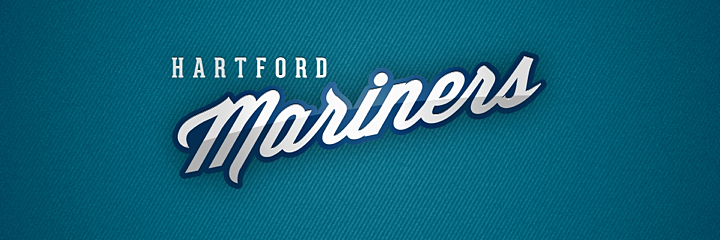
Don't forget, 13 Weeks of R&R starts tomorrow! Look for details on the main Icethetics blog Saturday afternoon. For now, I'll leave you with a look at the Mariners' new wordmark.
The jersey poll is now closed. The recolored version of Ian Dyck's original design will be the new jersey of the Mariners going forward. Thanks for your votes!