
Retro Revamp for Logo Champ
/Why repair what's not broken? Tradition is a common response in this sport. The only thing that bothers me about it.
The London Knights of the Ontario Hockey League officially announced last month their intentions to sport a new — or old, rather — look for the next season. Interestingly, they didn't even bother to post their own news release on their web site, but rather borrow from Ryan Pyette of the London Free Press.
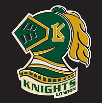 The Knights recently updated their web site to reflect the new symbol, seen here to the left. I'm all for a throwback except for when it goes out of its way to be aesthetically unpleasing. Which I feel like this does.
What I will give them is the new shades of green and gold. Huge improvements over the previous design. That's what you should be seeing on a hockey jersey.
GM Mark Hunter said, "When we took over the team, we didn't know what that Spider-Man Knight thing was. We wanted to go back to the old look, the green-and-white."
I half-agree with him. That logo was always a little off. While I don't know where he got "Spider-Man" from, it never seemed like it was balanced quite right. Despite its lack of clean, sharp design elements, this new logo is actually balanced.
 However, I think hundreds of Icethetics readers and fans might disagree. After all, it was just over a year ago that the previous incarnation of the London logo beat out 19 others and was declared the best in the OHL by voters here. And not two months later, deemed to have the overall best logo of the 60 Canadian Hockey League clubs.
I think there could be no better reason to call a rematch. As we move into the summer, I plan to relaunch a feature that allows Icethetics readers to do what they do best: Express your opinion and vote! Logo tournaments will be back with a new format and everything. But I'm getting ahead of myself.
After the Knights unveiled their new logo, shouldn't a jersey have followed? Reebok has infiltrated even the OHL now and has deemed it inappropriate for any team to unveil their new look prior to the giant, soul-crushing corporation's say-so. Or more accurately, "The OHL has a new sweater agreement with Reebok so teams have to wait for the cue in early September." Right.
So we'll wait until then to see it, but in the meantime, the article says to expect something from the early days circa 1968-70. For a better idea of what that means, we visit KnightsHistory.com, an offshoot of the Knight's official web site. See the following image.
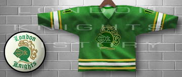
I really hope Knights fans are happy with this. I mean it's for you guys anyway. It just seems like taking a giant leap backwards. On one hand, yes, it truly looks like a hockey sweater. But on the other, "Those sharp-looking green third jerseys are done," writes Pyette.
Being a Lightning fan, I don't think I deserve a vote. So let's hear from some Ontarians. (Is that what you're called?) Is the retro look an improvement or did the Knights already have the best logo in all of Canadian junior hockey?