
Season Preview 2010, Part II
/The 2010 Icethetics Season Preview trudges on today with a look at new and different logos around North America's top minor leagues — specifically the AHL and ECHL. So let's dive right in.
AHL Logo Changes
The American Hockey League adds one new team relocates two others for the 2010-11 season. It brings the total number of teams to 30, equal to the NHL, allowing each team to have its own major league affiliate.
Primary logos
Five AHL teams will sport new primary logos this season.
![]()
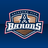
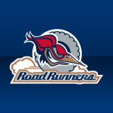
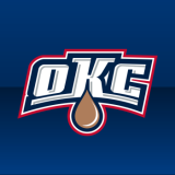
The Oklahoma City Barons are the newest member the league, a reincarnation of the Edmonton Oilers dormant AHL franchise. The last time this team saw action was during the NHL lockout, in 2004-05, in the form of the Edmonton Road Runners. Five years later, they're back in action in Oklahoma.
The new primary mark incorporates the Oilers' color palette while adding an extra, darker shade of copper. In addition, the logo highlights various forms of energy cultivated in the Great Plains by incorporating symbols of wind and an oil derrick along with a wheat field.
![]()
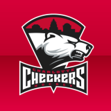
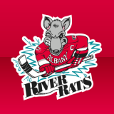
This summer, the Albany River Rats relocated to North Carolina and assumed the branding of the ECHL's Charlotte Checkers. The decision was made in order to move the franchise closer to its NHL parent club, the Carolina Hurricanes. Additionally, the blue of the original Checkers logo was changed to black.
![]()
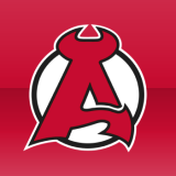
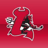
The void in Albany left by the departure of the River Rats lead the New Jersey Devils to return their top affiliate to New York's capital district. The Lowell Devils are now the Albany Devils. As is standard with Devils affiliates, the team's new logo is a play off of the NHL club's, with a stylized devil forming the letter A in this instance.
In addition to these logo changes, two other clubs changed their color schemes upon signing affiliation agreements with new NHL teams.

![]()

The Syracuse Crunch, formerly affiliated with the Columbus Blue Jackets, are now part of the Anaheim Ducks organization. As such, the team will now wear Ducks colors. The logo itself remains the same aside from the color changes. The previous logo and colors were introduced in 2000.
![]()
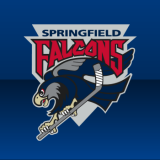
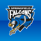
With the Oilers now affiliated with the Barons, the Springfield Falcons signed a deal with the Blue Jackets. In doing so, the team, which previously had its own unique identity, changed its colors this summer to match the Blue Jackets. Aside from the new color scheme, the logo itself remains the same.
It was announced earlier this month that the Hartford Wolf Pack will be rebranded the Connecticut Whale at midseason, as a tribute to the old Hartford Whalers. The logo will be officially unveiled tomorrow, at which time this post will be amended.
Alternate logos
A handful of teams will have new logos in a supporting role this season.
 The newest AHL team, the Oklahoma City Barons, will wear this patch which pays homage to both its city and NHL affiliate.
The OKC is displayed in the same typeface as BARONS is on the primary logo. And the copper oil drop is a clear reference to the Edmonton Oilers. This logo along with the primary mark were unveiled by the team over the summer.
This logo will be worn as a patch on the left shoulder of both home and road uniforms. The Oilers' primary mark will be worn on the other.
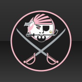
 The recently relocated Charlotte Checkers will wear this new logo on their black third jersey.
The mark is clearly meant to merge the Checkers and Carolina Hurricanes identities — why else would a polar bear be carrying a tropical storm flag?
Aside from the primary, the Checkers will not carry over any of the other secondary and alternate logos from the ECHL franchise's identity. The Hurricanes primary logo will be worn as a patch on both shoulders of the home and road sweaters.
 This is just a bonus because I thought it was clever, but the Portland Pirates have unveiled the design for the specialty jersey they'll wear for Breast Cancer Awareness Night in October.
The black and pink threads will feature this logo as the crest. It's a synthesis of throwback logos belonging to the Pirates and their NHL affiliate Buffalo Sabres.
A black and silver version of the Sabres' primary logo will be used as a shoulder patch on this sweater only. No other Pirates logos will be changing this season.
Team Event logos
Three AHL teams are celebrating key anniversaries with specially designed logos for the 2010-11 campaign.
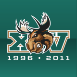 The Manitoba Moose mark their 15th year in Winnipeg this season.
Their anniversary logo features the Roman numerals XV on either side of the moose head mark used on the uniforms. Beneath it reads the years 1996 and 2011, the years the team has played in Winnipeg.
This season marks 15 years since Winnipeg Jets left town, vacating the city where the Moose now play. This franchise has made a name for itself filling voids left by relocated NHL teams as it was created in Minnesota just a year after the North Stars went to Dallas. The Minnesota Moose moved to Manitoba in 1996.
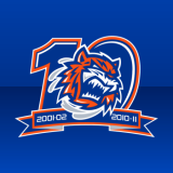 Five years after that, Bridgeport Sound Tigers were established in Connecticut. They now celebrate their 10th anniversary this season.
Similar to the Moose, the Sound Tigers use their jersey crest inside of a numeral 10 for their logo. A ribbon at the bottom of the logo displays their inaugural and current seasons, 2001-02 and 2010-11.
The Tigers are affiliated with the New York Islanders and have been using their colors since 2006. As of last season, they changed from navy to royal blue to match what the Islanders had planned for this season.
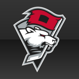
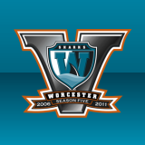 The Worcester Sharks celebrate five years in Massachusetts this season.
The 5th anniversary mark prominently features a large Roman numeral V (in a terrible gradient) with the Sharks' secondary logo on top. Beneath that, a ribbon reads 2006 - 2011, Season Five.
Technically, the franchise turns 15 this year. It was established in 1996 as the Kentucky Thoroughblades but moved and became the Cleveland Barons in 2001. Five years after that, in 2006, was the relocation and renaming to Sharks.
So technically, they're due for another move in 2011. Not funny?
League event logos
A couple of league events will be marked with special logos.
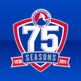 The AHL celebrates its 75th anniversary this season, doing so with a special logo.
The logo reads 75 SEASONS, 1936-2011. Hopefully there are many more to come. The logo features the standard blue and red of the AHL logo.
Part of the anniversary celebration will include an opening weekend in which the league's six oldest teams face off against each other sporting throwback jerseys. Those will be outlined in Thursday's edition of the Icethetics Season Preview.
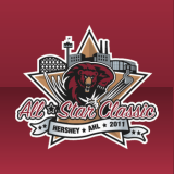 The 2011 AHL All-Star Classic will be hosted by the reigning Calder Cup champion Hershey Bears on Jan. 31.
The logo features the color palette of the Bears as well as the bear in the club's primary logo. It also includes a representation of the Hershey, Penn. skyline.
The previous All-Star Classic was held in Portland, Maine on January 19, 2010. The AHL has held an all-star game every season since 1995.
And that's it for the American Hockey League.
ECHL Logo Changes
The ECHL will see few changes this season, but the biggest is the relocation of a storied franchise.
Primary logos
![]()
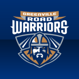
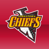
The Johnstown Chiefs, founded in 1988 at the formation of the East Coast Hockey league, were relocated to South Carolina and renamed the Greenville Road Warriors this summer. The Road Warriors carry over none of the Chiefs' branding as there is a hope that hockey will soon return to Johnstown and bring the name back.
Greenville, S.C. was previously home to the ECHL's Greenville Grrrowl, who played from 1998 to 2006.
Alternate logos
Only the Greenville Road Warriors introduce new alternate logos this season.

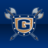
The new marks were unveiled this summer and have been in use on the team's website. While uniforms have yet to be unveiled, it is believed they will feature these logos. The one on the left will be the crest while the other will likely serve as a shoulder patch. No date has been set for an unveiling but the team plays its first exhibition game on Oct. 8.
Team Event logos
Only one ECHL club is marking an anniversary this year.
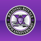 The Reading Royals will celebrate a decade of hockey during the 2010-11 season.
The 10th anniversary logo features the primary logo on a purple Roman numeral X and a silver ribbon that reads 2001 - 2011. It's also encircled by the team's name and the text 10TH ANNIVERSARY leaving no mistake as to what's being signified with this logo.
The Royals were resurrected in 2001, formerly an ECHL team called the Columbus Chill which played from 1991 until 1999. So technically, this franchise has now existed for 20 years.
League Event logos
Only one major event is taking place in the ECHL in 2010-11.
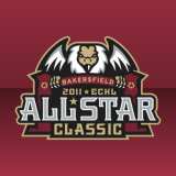 The 2011 ECHL All-Star Classic will be hosted by the Bakersfield Condors on Jan. 26, 2011.
The event mark incorporates the Condors color scheme and even a new angle of the massive bird that dominates the team's own logo. This logo reads ALL-STAR CLASSIC while last year's version simply said ALL STAR with no other specification.
The game jerseys were revealed earlier this month and will be featured in Thursday's edition of the Season Preview.
Hope you enjoyed today's edition. I'm sure you guys will let me know if I missed anything. Tomorrow's preview? A surprise. Be sure to check back.