
NHL JerseyWatch 2011
/ May Edition Reebok released its planning catalog to retailers for the new season in January. That's when we got our first look at NHL JerseyWatch 2011 here at Icethetics. In the months since then, we've learned a lot more.
As always, keep in mind that, with rumored information, nothing is official until the specified team or league says so. For example, last year's early catalog for retailers suggested the Predators would have new home and road uniforms this season. That never happened. All we know is what's planned — and that's subject to change.
For each team, I've listed what's changing along with speculation on how said changes might manifest. The keyword being "speculation" in most cases. New or updated information is noted in red.
Now join me in celebrating the 4th birthday of Icethetics with a look at what's coming to the NHL in 2011!
Atlanta Thrashers
updated

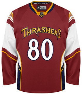 RIP: Thrashers third jersey / NHL.comNo alternate jersey Atlanta surprised a lot of us last month when they came out and said they were axing the third jersey.
True, they had what many considered to be the ugliest sweater of the Reebok era. But despite a look that merges elements from football and basketball uniforms, it got points for standing out in a market where hockey is a sport often overlooked.
The Thrashers have confirmed that not only is the maroon jersey going away (yay!), but the team will not wear an alternate uniform at all during the 2011-12 season.
In previous editions of JerseyWatch, we speculated that a new third jersey was in the pipeline. So how did we get that one wrong? Pretty simple mistake. The information Reebok gives to retailers regarding changes for the new season isn't specific. "TBA" is a term used frequently.
In most cases, we take "TBA" to mean a new design is being implemented. It turned out that in Atlanta's case, it actually meant that there wouldn't be one at all anymore. (Hence the overuse of the word "speculation" at the top of this post.)
And lastly, as much as I loathe bringing this up for the sake of Thrashers fans, it's worth pointing out that as of Friday, the NHL appears to have a deal with the city of Glendale to keep the Phoenix Coyotes there for at least another season.
I'm no expert on this subject by any means, but based on the news stories I've been reading, it sounds as though this would increase the likelihood of the Thrashers relocating — possibly to Winnipeg. They're still on the hunt for a new owner and no one local appears to be interested.
In other words, all three Thrashers jerseys could disappear this summer in favor of a relocated, rebranded team. But that still remains to be seen. The deadline would be late May when the NHL gets going on the 2011-12 season schedule. If nothing happens by then, nothing will until next year.
Buffalo Sabres
updated

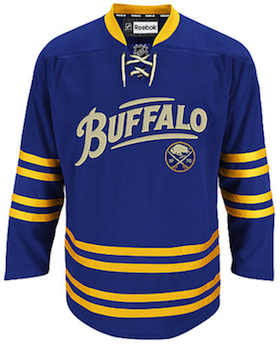 Sabres third jersey / from NHL.comNo changes Sabres new owner Terry Pegula says none of the team's current uniforms will change heading into 2011-12.
This means Buffalo will hang onto the alternate sweater introduced this season as part of the franchise's 40th anniversary celebration in 2010-11.
One question does loom. The jersey features the throwback Sabres logo with their founding year, 1970, set inside. This was used as the team's 40th anniversary mark but because it's not specific to this season, it may well stick around.
For what it's worth, the Buffalo wordmark appears by itself without the throwback logo on the helmet worn with this alternate uniform.
Overall, the Sabres might be the best set of sweaters in the NHL. It's all a result of them paying attention to their past and their fans. And with the new owners injecting a bit of excitement, it will likely stick around for years to come.
Dallas Stars
updated

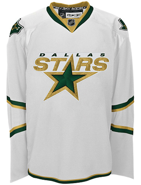 Stars current third jersey / from NHL.comNew alternate jersey Reebok says the Stars are looking to launch a brand new third sweater. And most of us are hoping they run far away from their current look.
The most recent rumors suggest it will indeed be green with a nod to the past. As we know, retro is all the rage lately. What that means for the actual design is anyone's guess at this point.
Looking back, Dallas may have been the hardest hit by the transition to Reebok Edge in 2007. They went from having a beautiful and unique set of sweaters to some of the blandest in the league. And green — already in short supply around the NHL — disappeared almost entirely.
Currently, the Stars wear a black jersey and a white jersey, each of which simply has the word "DALLAS" arched above the sweater number. They're trimmed in gold and only the white uniform has any hint of green. Their third jersey (right) is the only one with any kind of a logo on the front.
 Stars 2003-2006 / from Getty ImagesNow it seems they're finally ready to advance the brand and add something new — or retro, anyway. I think green would be welcomed as a color that's slowly but surely returning to the league after a long absence.
Maybe even a new logo to go with the green? So long as they learned their lesson from the "Mooterus" (left). That lesson being, don't get too cute with your logo or it will come back to bite you.
Let's be honest, anyone who's ever opened up a sixth grade health class textbook would recognize that shape without a second look. We can all pretend it's the constellation Taurus, but no one is being fooled here. Least of all Trevor Daley.
Not only that, but what was with the red? That was never in their color scheme. And they don't need it. They already have two great colors in green and gold.
Ultimately, it sounds like Stars VP Brett Hull is determined to see the club in something that might've been worn during his NHL playing days. And that's what we like to hear.
Edmonton Oilers

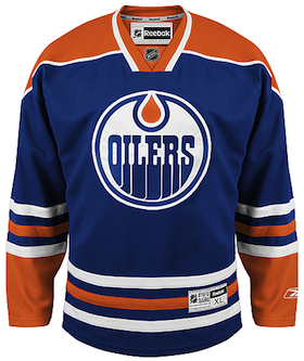 Oilers home jersey / from NHL.comNew road jersey At last, Oilers fans can rejoice! A new white sweater is coming to Edmonton this fall.
If the Stars fared the worst in the switch to Reebok Edge jerseys in 2007, the Oilers weren't far behind. The blue and navy uniforms were a disappointment. As with many new Reebok sweaters, there were no waist stripes. And the sleeve stripes inexplicably stopped on top of the elbow instead of wrapping completely around the arm. From the side, it made the entire jersey appear to be solid navy.
Only a season later, the complaints of fans were quelled by the introduction of a retro third jersey (right) that brought back the brightly-colored blue and orange from the 1980s — most associated with Gretzky's Cup-winning dynasty.
 Oilers 1981-1996 / from Getty ImagesJust one year after that, the fan-favorite uniform got top-billing as the new home sweater. Things have been quiet on the jersey front this season. But now with a new white sweater in the works for 2011, fans should be excited.
Most likely, the new road uniform will be a white version of what they wear at home — a look we haven't seen on a regular basis since it was retired back in 1996.
To remind you of what that looked like, I tracked down this shot of Mariusz Czerkawski specifically because you can see that the sleeve stripes wrap completely around the elbow. We have indeed missed that feature.
Many fans were expecting hoping the white jersey would make its return this season, but after three consecutive seasons of uniform changes in Edmonton, the NHL probably frowned upon the notion of a fourth — even though the Islanders got away with it. And as disappointing as that may be, let's take solace in the fact that it's being rectified next season and not five years from now.
Unfortunately, however, the third jersey will not be changing. So those wanna-be stripes aren't disappearing entirely quite yet.
Now for this final paragraph, I could go off on a tangent about how we don't know anything for sure and they could come out with an entirely new design for the white jersey... but I think we all know the Oil would not dare be that reckless. Or would they?
Florida Panthers

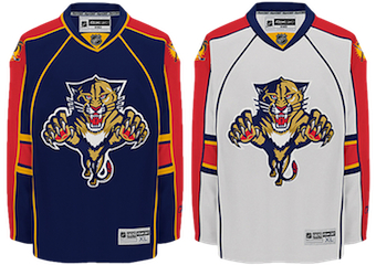 Panthers current home & road jerseys / from NHL.comNew home & road jerseys Reebok says that Florida's piping-happy home and away sweaters are going away at the end of this season.
And even a Lightning fan will admit that's a good thing. Because these are terrible and I have to see them at least six times a year.
Over the last season or two, there's been a noticeable shift away from the leaping panther logo to something more simplified — similar to what we're seeing in Nashville. The Cats' new third jersey is a great example of this.
More and more, Panthers marketing materials have featured either the third jersey logo or a paws up version of the leaping cat. It's hard to say for certain what changes are in store for the new sweaters, but there are no plans to change the third jersey at this point.
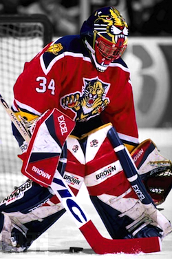 Panthers 1993-2007 / from Getty ImagesIf the Cats really want to do it right, just look back. Under the heading of you don't know what you have until it's gone, the funny thing is they're one of those teams that got it right the first time.
And even though the red jersey (left) that we'll always associate with John Vanbiesbrouck was relegated to alternate status in 2003, it's too good to disappear forever. Bring it back.
Following the January JerseyWatch post, Miami Herald writer George Richards revealed that he's heard from players and team officials that the red is, in fact, coming back. He believes the third jerseys will remain intact as well. And that's a good thing.
Since the Panthers have a navy blue jersey that actually looks good, they should hang onto it (as a third) and bring the red back. To the Panthers I say, let the Lightning be blue and reclaim your original colors.
Of course the odd thing is that the Panthers' new marketing campaign — The Blueprint — which is their way of trying to make fans feel better about their last few lousy seasons (i.e.: "we're rebuilding"). Mixed messages.
Hopefully the hot Florida summer — which I no longer have to deal with — will yield some answers. Until then, like Richards, all we have is speculation. And hope that they do it right.
Los Angeles Kings
updated

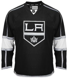 Kings current third jersey / from NHL.comNew home, road & alternate jerseys Apparently the Kings intend to toss out everything and go back to the drawing board in 2011. (Kind of.)
In late March, Los Angeles Kings blogger Rich Hammond confirmed that the club will make some rather sweeping uniform changes in 2011.
The alternate sweater launched in 2008 (right) will become the team's new home jersey. A white version of it will be launched for use on the road. Technically, that will be the only new one for the Kings next year.
The current home jersey — now the only one with any purple in it — will be used as a third. The current road jersey will be retired.
The team has been dropping hints over the past year. For example, the players opted to wear the black third jerseys throughout their 2010 and 2011 playoff runs.
Plus, Icethetics reported in October on photos of possible jersey prototypes seen in Luc Robitaille's office at the Kings' practice facility. Those being essentially white versions of the current third jersey — as confirmed by the Kings.
The disappointing news from Los Angeles is that the purple throwback launched this season — very popular among fans — will go back into the mothballs for now.
Nashville Predators
Updated

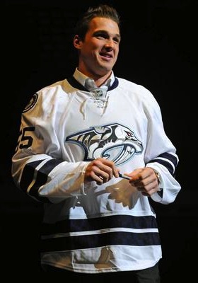 The "limited edition" jersey / Nashville PredatorsNew home & road jerseys In the 2010 catalog, Reebok reported new home and road uniforms were in the Predators' pipeline. It appears to still be in the cards — just delayed a season.
The thing is, it almost seems the Nashville rumors are changing by the week. Last year, it sounded like the third jersey would become the new home sweater and a white version of it would be added (right).
That was not to be. After an event in which these "limited edition" jerseys were auctioned, the team immediately denied it would become Nashville's new road jersey.
In late February, the team started sending out renewal notices to season ticket holders, which offered a free "new look Predators home jersey" to those with full season tickets. This officially confirmed new uniforms are on the way, but gave no details about the design.
 Predators 2001-2007 / Getty ImagesA fan emailed me to say his ticket rep said a mustard-colored jersey was being tested. The Predators wore a love-it-or-hate-it third jersey of the mustard variety (left) from 2001 until the Age of Reebok. Just ask Marek Zidlicky. And many Predators fans will tell you they loved it.
Just this month, more rumors have suggested a gold jersey indeed on the way — and that it will be the home uniform. The road jersey will probably still be white.
The same source claims the home jersey will be unveiled at the 2011 NHL Entry Draft (June 24), though the Predators do not have a first round pick. Will they still hold a draft day party? We're also told the new road uniform will come out in July.
A small matter worth noting relates to the new secondary mark on the uniforms. A new "NP" logo was seen on Pekka Rinne's recently unveiled mask design for 2011 and has been rumored to be a shoulder patch.
Other speculation involves a freshening up of the very '90s primary logo — perhaps swapping the navy blue for a brighter shade and increasing the amount of gold in use. Ultimately we'll probably have to wait until summer for any kind of confirmation.
There's also the unconfirmed report from commenter Kiltimar on January's JerseyWatch update. He claims to have been part of a focus group which got a look at new jersey concepts — which looked like nothing we've seen before. Looking forward to seeing the final product.
Reebok says the third jersey will not change in 2011.
New York Islanders
Updated

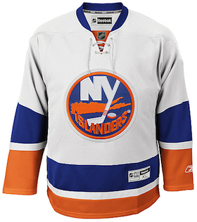 Isles current road jersey / from NHL.comNew alternate jersey Reebok is indicating a brand new third jersey for the Islanders — which will probably ruin everything now that they've finally gotten it right.
Recent rumors all but confirm that, suggesting that the new sweater will be primarily black. Wish I was making that up.
Proponents point to two other New York teams who have historically used the orange-and-blue color scheme. The NBA's Knicks and MLB's Mets have added black in recent years. Perhaps the Isles are just following the beaten path.
This season saw the Isles debuted their new white road sweater (right) to match the blue throwback that's been in use since 2008. We were all relieved and overjoyed to see it.
And that's because the folks on Long Island tend to make bad decisions when it comes to redesigning Isles uniforms. For this team, retro works and it always has.
Remember the "fish sticks" debacle of the mid-90s? If not, you're lucky. Fans revolted at the sight of the new sweaters and logo. So much so that the team was forced to bring back the old look not three seasons later.
The only time the Islanders have attempted a non-retro third jersey, it was orange. For the most part, fans liked it and it was used from 2002 until Reebok ruined the Isles in 2007. Also worth noting: Ex-Isles employee and exiled blogger Chris Botta said in a video blog that the team is indeed adding an alternate sweater next season. When asked why by a fan, his simple answer was "money."
New York Rangers

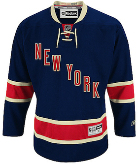 Rangers current third jersey / from NHL.comSame alternate jersey Like the Sabres, the New York Rangers will hang onto their anniversary sweater for at least another season.
None of the Rangers' three jerseys are changing in any way. But I thought it worth a mention since there was the possibility the sweater would only survive for the 85th anniversary season before being shelved.
The only difference between what the Rangers are wearing in 2010-11 and what they'll have in 2011-12 is the 85th anniversary shoulder patch. Obviously that will disappear for the fall.
Personally, I'm a bit disappointed. I, along with many of you, was hoping the Rangers would one day bring back the Lady Liberty logo and uniform. It lasted 11 years and it's arguably the best alternate jersey in the history of the NHL.
For now, though, it looks like we'll have to continue waiting for that day to come.
Ottawa Senators
Updated

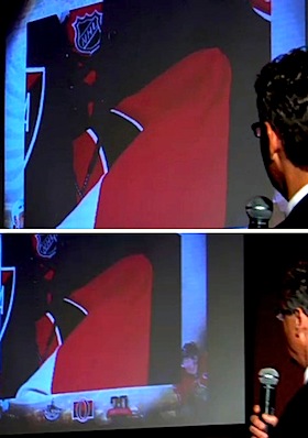 Sneak peek at heritage sweater / SenatorsNew alternate jersey Earlier I said the Thrashers may have had the ugliest third jersey in the NHL. Forgot about the Senators.
Luckily, in early March, the Sens confirmed a replacement is coming. They're calling it a "heritage" jersey. Team president Cyril Leeder later went on the radio and divulged a key detail — that being a barber-pole look as "part of the design." He even confirmed already having a prototype in the office.
Then at an event in late March, season ticket holders got a sneak peek at the jersey itself — which the rest of us were treated to later (right) in a video on the Sens' website.
The jersey was folded and framed in such a way that we can't really make out what it's supposed to look like. But you can do your own extrapolating.
Some things to keep in mind: A retro-styled concept designed by a fan has appeared in official team materials and in January, Ottawa's farm team in Binghamton wore the barber-pole throwbacks that the original Senators sported in 1930s.
Ultimately, it has to be an improvement on what they've been wearing since 2008 — with SENS across the chest. I guess the good news here is, at the very least, that jersey is going away.
Phoenix Coyotes
new!

 Coyotes PHX shoulder patch / NHL.comTeam name change One thing I haven't mentioned in previous editions of JerseyWatch is the possibility that even if the Coyotes do not relocate to Winnipeg, they could have a new name next season.
Prospective owner Matthew Hulsizer pledged to Glendale in December that he'll rename the club Arizona Coyotes — should he actually become the new owner (still up in the air).
If the name is changed, the shoulder patch on the home and road uniforms would have to be updated or removed as it reads "PHX" for Phoenix.
The patch itself is in the shape of the state of Arizona and inspired by the design of the state flag. Perhaps something as simple as replacing PHX with AZ would do the trick.
The alternate uniform's shoulder patch reads "Phoenix" as does the wordmark on the pants. If the name changes, we're likely to see it reflected in an updated primary mark as well.
Should the franchise remain in Glendale for 2011-12 (which is looking more likely), I'd definitely expect them to be renamed the Arizona Coyotes.
We may see new logos and patches, but I can't see anyone spending the money to change the actual uniforms or primary logos for what could be just a single season.
Pittsburgh Penguins

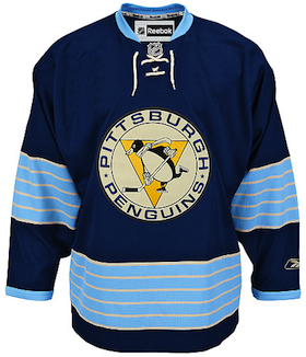 Pens' Winter Classic jersey / NHL.comNew alternate jersey This should be the least surprising news in the entire post. The Pens will have a new third in 2011.
The Penguins first talked about replacing their powder blue third jersey last year. But upon the announcement they'd be participating in another Winter Classic, those plans were shelved.
The last time the Pens added a third jersey, it was borrowed directly from the 2008 Winter Classic. Now three years later, it's all but a given that history will repeat itself.
I'd be very surprised if the new uniform isn't the 2011 Winter Classic sweater (right). Chances are this was the same design they were working on last year when the idea of changing the alternate jersey first came up.
The only difference would be the lack of a Winter Classic shoulder patch. I've altered the image to represent that. It's a nice looking jersey on its own. But I do think it would be better if they used real white instead of the trendy vintage white.
Tampa Bay Lightning
 Yzerman, St. Louis, Lecavalier, Stamkos, Vinik and Leiweke unveil new Lightning uniforms / Lightning
 New home & road jerseys The Lightning unveiled a new logo along with new home and road uniforms to very mixed reviews on January 31.
The new management team in owner Jeff Vinik, president Tod Leiweke and GM Steve Yzerman wanted to put a fresh new stamp on the team by changing the entire look.
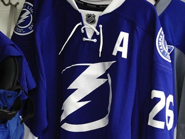 New home sweater / LightningThere are simplified logos and fewer colors than before, ultimately leading to a more traditional look worthy of an elite franchise. But for as clean as the new look was, many fans were not happy.
The new uniforms lost some of the personality and history that founder Phil Esposito built in back in 1992 — that being the underarm "victory stripes" and the lightning bolts on the sides of the pants.
After doing what they claim to do best — listening to the fans — Bolts brass made some tweaks which included adding black trim to the sweater numbers as well as white lightning bolts on the pants.
Leiweke also confirmed the "victory stripes" will be part of the uniform design going forward, but that the deadline for such a change in the 2011-12 season has already passed.
The Lightning have also said the BOLTS third jersey will remain for years to come. I imagine that even means keeping the black and gray elements as an alternate color scheme, though the shoulder logo will likely be changed to one of the new marks.
Toronto Maple Leafs

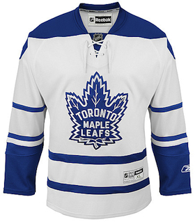 Leafs current third jersey / from NHL.comNew alternate jersey As rumored, the Maple Leafs will be debuting a new third jersey for the 2011-12 season.
The current third jersey in its Reebok incarnation launched in 2008. Prior to that, the same design was used from 2000 to 2007. It was based on a uniform and logo the Leafs used from 1958 to 1967.
When team management has recently discussed changing the uniform with the media, they've said the plan is to borrow from their own history once again.
 Leafs '70s throwbacks / from Getty ImagesA year ago, Toronto paid tribute to the 1970s as the players skated out in replica jerseys for warm-ups. They matched sweaters worn by the team from 1970 until 1992. Rumors suggest the team may look to that era for its next alternate uniform.
They look great and just different enough to distinguish themselves from the recently altered home and road jerseys. Fans always love the retro look so the Leafs would probably be wise to go this route.
Beyond that, there's not much else in the Maple Leafs' jersey history that isn't a little crazy. So unless they go with the '70s throwbacks, they'll have to come up with something completely new. And that doesn't usually work out well for them.
And I'll say it once again. We won't really know anything until next summer, fall at the latest. But the Leafs usually like to make a big deal about jersey unveilings so I'm sure we'll know when it's coming.
NHL Special Events
new!
The 2012 NHL All-Star Game will be hosted by the Ottawa Senators. The event logo was unveiled in September. It's not clear if the same "fantasy team" format from 2011 will be used in Ottawa. For what it's worth, no All-Star uniform set has been worn more than once since 2000 and 2001.
The league has yet to make an announcement regarding the hosts of the annual outdoor games. It's rumored the Philadelphia Flyers could host the Winter Classic on New Year's Day 2012, possibly against the New York Rangers. That would be unfortunate for jersey junkies as both teams already have retro uniforms.
As for the Heritage Classic up in Canada, I haven't heard a peep. Perhaps we don't get one in 2012? The Canucks, Maple Leafs and Senators each have yet to play a game in the fresh air. Could this be the year? When all of that is decided, we'll hopefully see some neat retro sweater designs.
At this time, there are no changes anticipated for the Ducks, Bruins, Flames, Hurricanes, Blackhawks, Avalanche, Blue Jackets, Red Wings, Wild, Canadiens, Devils, Flyers, Blues, Sharks, Canucks, or Capitals.
That wraps up the third edition of NHL JerseyWatch 2011. More updates will come over the summer as we'll likely see editions every month. But as always, keep an eye on the blog for the newest information.