
Lethbridge Hurricanes Unveil New Logo
/
WHL team forced to rebrand by Washington Capitals
Back in March, we learned the WHL's Lethbridge Hurricanes would need to come up with a new logo. The NHL's Washington Capitals decided the Lethbridge logo was too similar to their own to continue being used.
That report came from CTV reporter Darrell Romuld, who then said that the Hurricanes would simply promote the logo being used on their alternate jersey at the time. That look was created by former IceHL GM and CanesCast founder Joshua Schroeder.
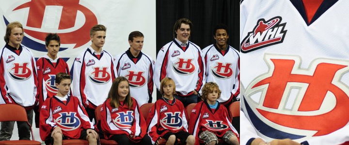
However, it seems that was not the case as Lethbridge unveiled an entirely new logo at a special event on Thursday. You can see it at the top of this post.
 Photo by Patrick Burles (via Twitter)
Despite dumping the Caps-style wordmark, the Hurricanes will still basically be wearing Caps jerseys. This is probably a Reebok thing. The new logo has two variations. The stylized H is in blue on the red jersey and red on the white one, as you can see below.

The Hurricanes have struggled with identity issues for as long as I've known them. This logo is an improvement on the ugly wordmarks they've used in the past. It's simple and bold. And original. Well, mostly original. Some readers have claimed similarity to the Hilton Hotels brand, but I think they're really just reaching.
The Hurricanes posted another article on their website about AKQA creative director Chris Polychronopoulos, who I'm assuming led the rebranding efforts for Lethbridge — assuming because article doesn't say so specifically. And all it really is is a bio. It outlines his credentials.
 Photos from Lethbridge Hurricanes
Anyway, if you want to see more photos of Lethbridge's new look, a number of people were tweeting from the unveiling event, including Cody Nickolet (WHL From Above), Joshua Schroeder (CanesCast) and Patrick Burles (Country 95 News).
What's your take? Is this an upgrade for the Lethbridge Hurricanes or not? (Head over to this post to see the original logo.)