Dallas Stars reveal road to rebrand with loads of concepts
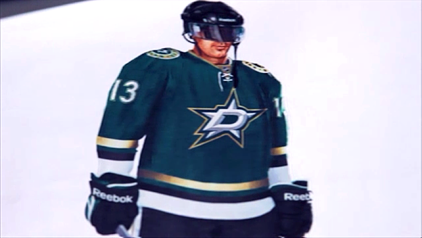
/About 18 months ago the Dallas Stars unleashed Victory Green upon the world. Now we're finally getting the whole story on how it came to be and what might have been.
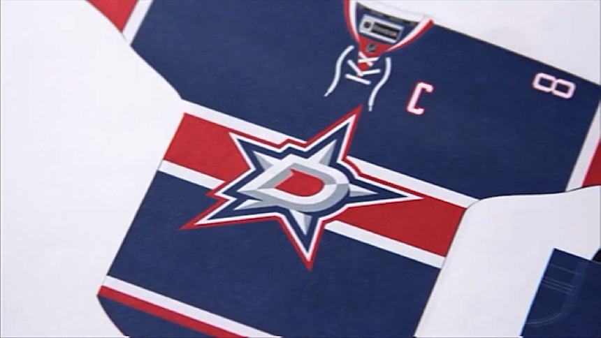
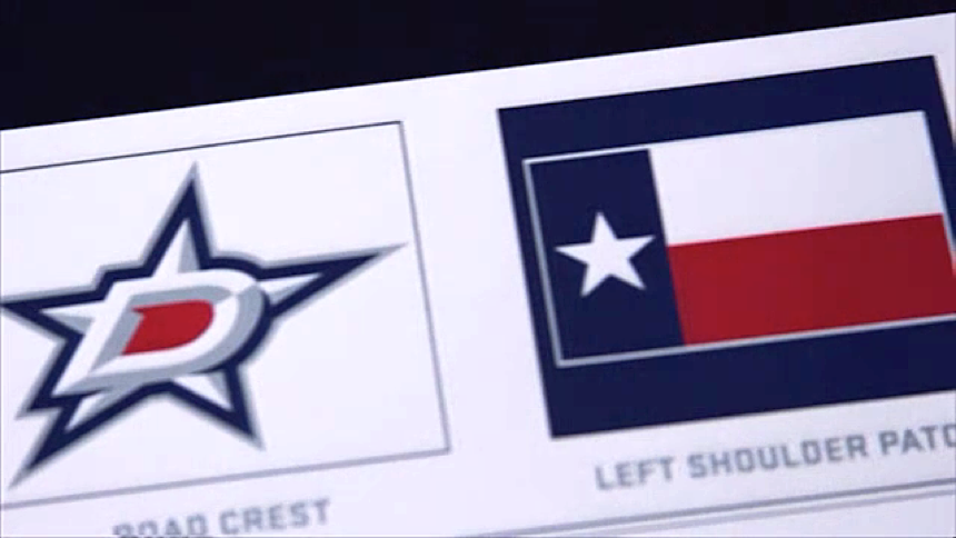
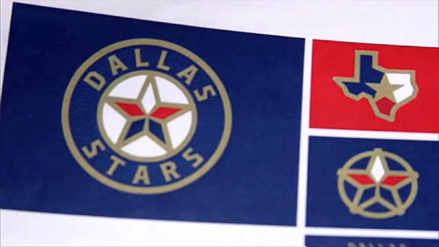
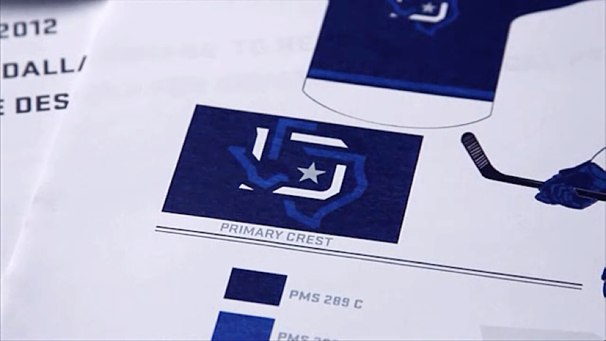
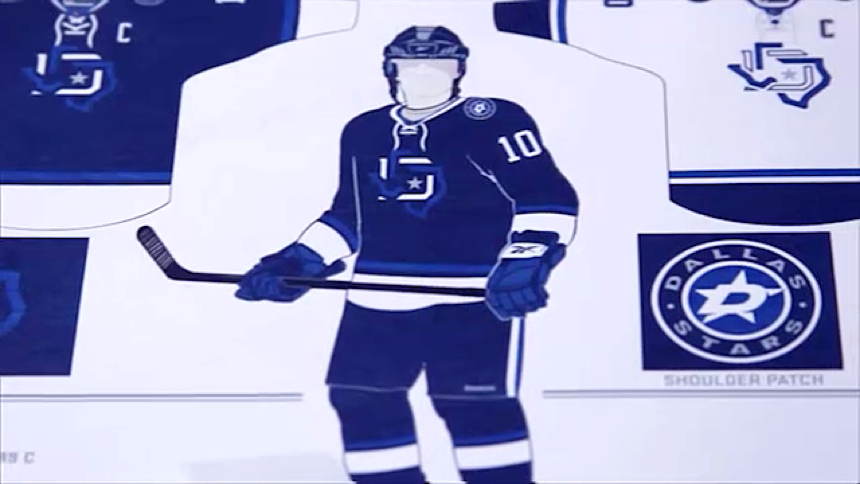
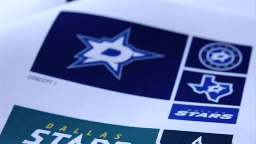
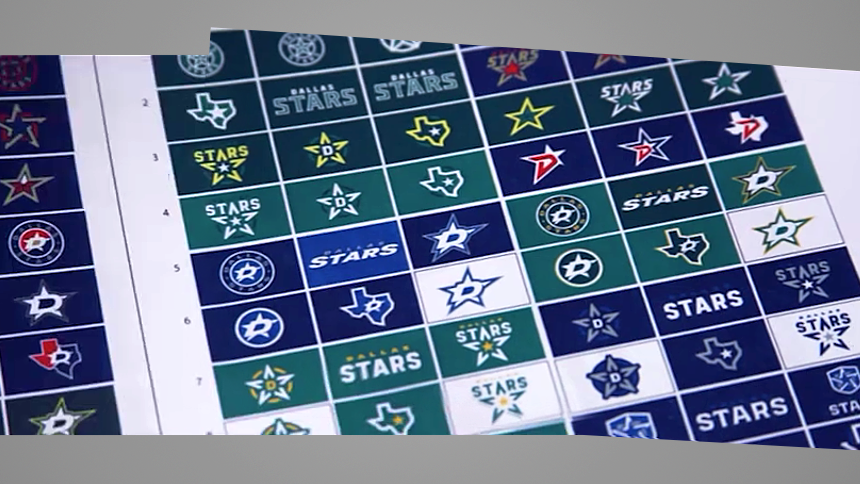
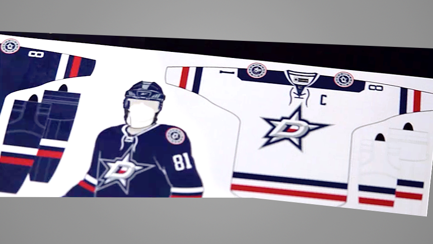
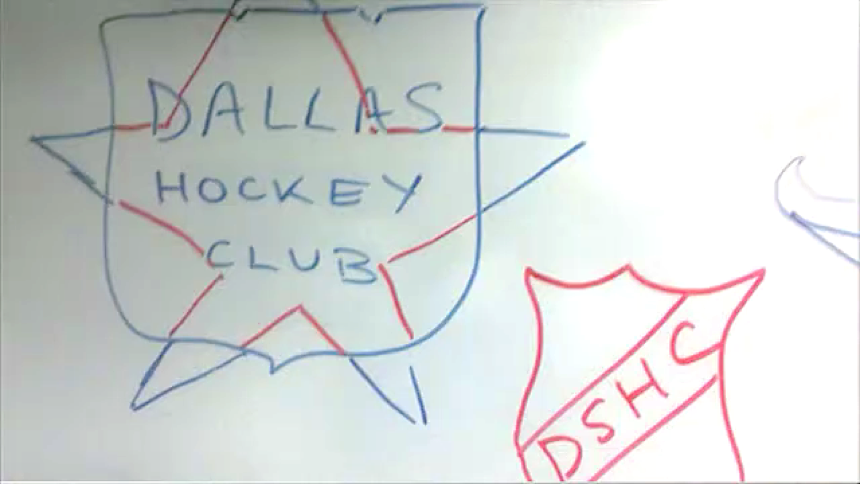
The team released a video today that explained the process and included something to please every Icethetics reader — loads of concept logos and jersey prototypes. Check out some still frames from the video below.
It's fascinating to see how many options the Stars went through before ending up where they did. It sounds like many within the organization, lead by TV color analyst Daryl Reaugh, were eager to see the team go blue to match the other pro sports teams in Dallas — the Cowboys, Mavericks, Rangers and even MLS's FC Dallas.
In the end, the Stars decided to pave their own path, not only sticking with green, but introducing their own custom shade of green — Victory Green. The video talks about the NHL encouraging the Stars to stay green so they could own the color.
Perhaps the league forgot about the Minnesota Wild, who also wear a lot of green. And it's funny when you think about it because Minnesota itself is the only reason the Stars wear green today. The North Stars wore it and the franchise chose not to change the logo after relocating in 1993.
In fairness to the Stars, theirs is a much lighter green than the Wild's, of course. But that Minnesota connection cannot be denied. Here's the full video.
If you want more to read on the Stars' rebrand in 2013, I wrote a three-part review after being invited by the team to cover the unveiling event last year. I got the chance to speak with Stars broadcast/creative AVP Jason Walsh, who spearheaded the rebrand project.
So what do you think of the many concepts above? Any that stand out to you? Did they make the right call ending up where they did?

