
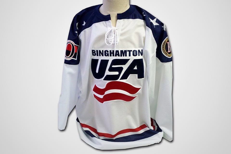
B-Sens pay tribute to Team USA with ugly jersey
/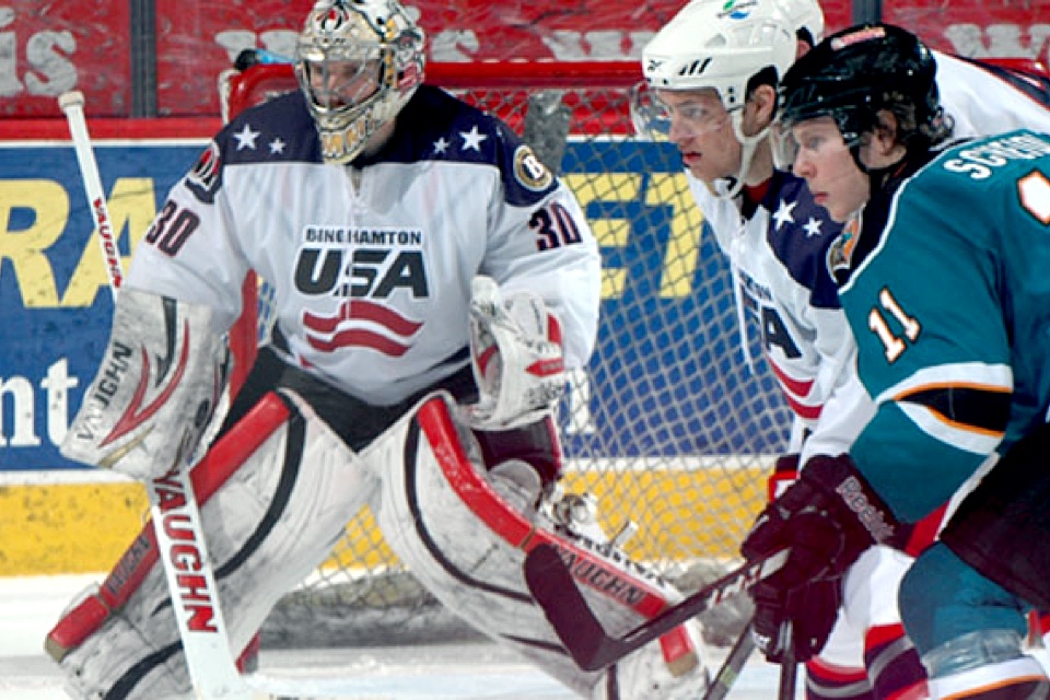
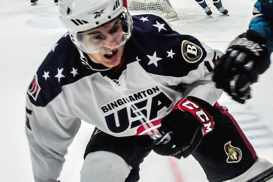
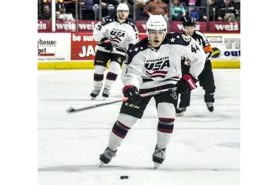
The AHL's Binghamton Senators wanted to capitalize on the excitement of the U.S. Olympic hockey team with a special jersey on Saturday.
But boy, was it ugly.
The crest was clearly modeled after the USA Hockey logo, which for legal reasons the B-Sens obviously had to avoid. So instead they tried to mimic it. Poorly.
In fact, it's so bad it ended up looking like the letters "USA" sitting atop an Austrian flag.
Kudos to the B-Sens for wanting to show their support to Team USA, but next time hire a real designer for the jersey. No reason any team has to look like that.
By the way, if the U.S.-Russia game was a nail biter, this one was decidedly not. They may have had ugly jerseys, but Binghamton cruised to an 8-0 win over the Worcester Sharks.
I usually try not to be so harsh when it comes to minor league specialty jerseys, but I'm clearly having difficulty finding the redeeming qualities in this one.