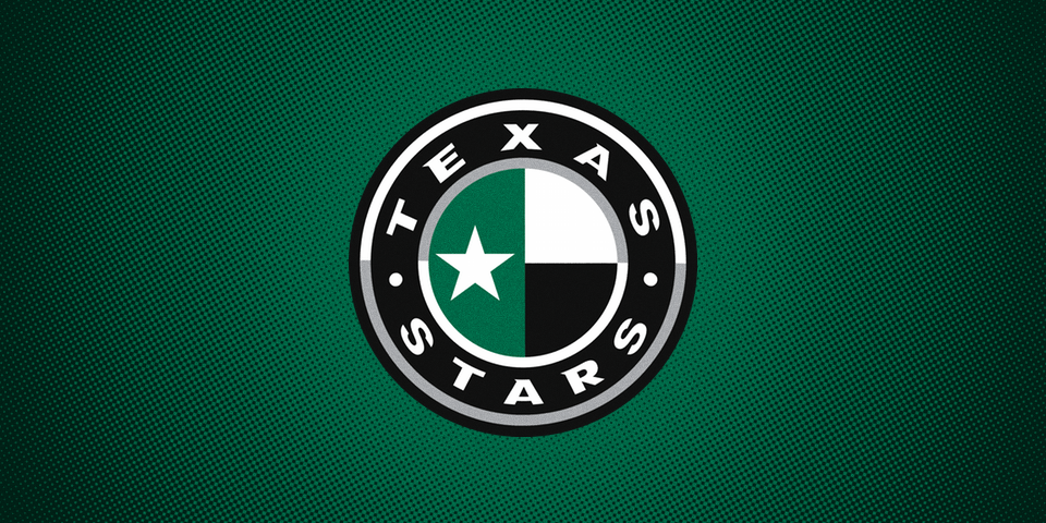
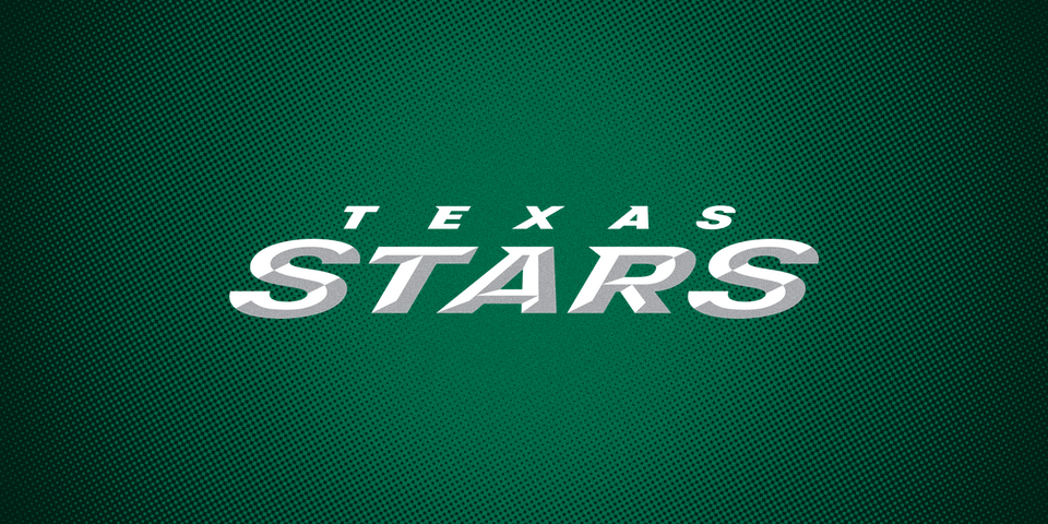
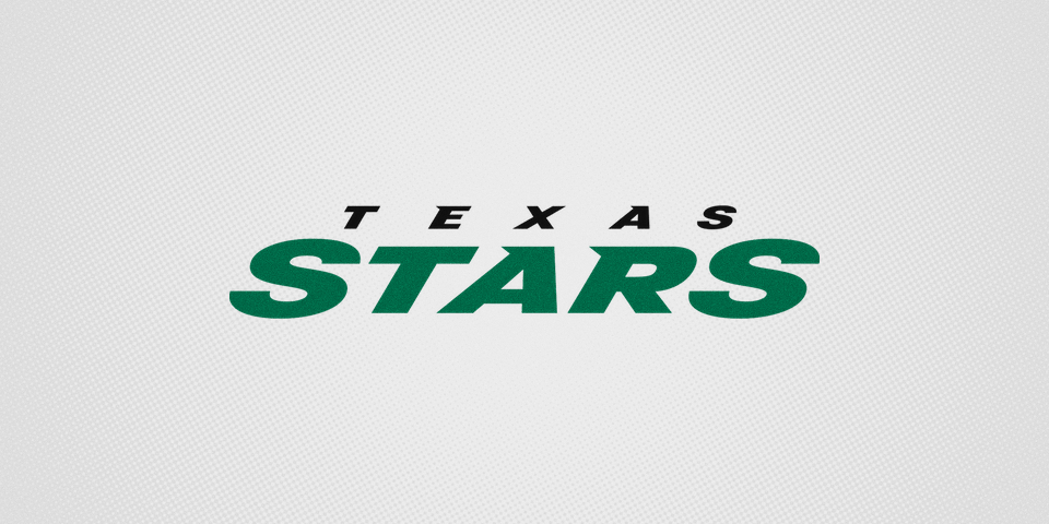
Texas Stars unveil new logos with Victory Green
/
In another example of an AHL club being made over in the image of its NHL partner, the Texas Stars unveiled its new visual identity today.
The team, which is owned by the Dallas Stars, adopted the NHL club's Victory Green, which was launched in 2013. All of the logos in the new package are modeled after the Dallas look.
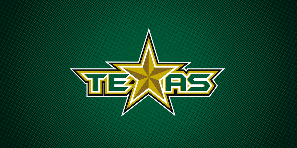
Texas' logo has been modeled after Dallas' since arriving in the Lone Star State in 2009. In 2011, the team introduced a "TEXAS" wordmark which has been used more often in recent years.
This new primary mark is basically a modernized version of that is intended to fit better within the Dallas Stars brand pantheon.
Jerseys have not been released yet, but given the alignment with the Stars identity and what we've seen from other AHL affiliates this summer, I'm betting on Dallas jersey templates all the way.
I have to be honest in saying I love this new look. The sense that minor league teams should have their own identity is not unfounded, of course. Teams like Hershey, Rochester and Grand Rapids absolutely should be unique. And maybe more should as well. But it's not necessary for the entire league, particularly where teams don't have built-in history to market.
In a case like this, imagine yourself the owner of these two franchises. They share a lot more than just a name and it makes sense to share a cohesive identity.
Then again, I was always a fan of the new Dallas Stars branding and I know many of you were not. So at some point it simply comes down to personal design preference rather than a statement about hockey teams sharing colors and logos.
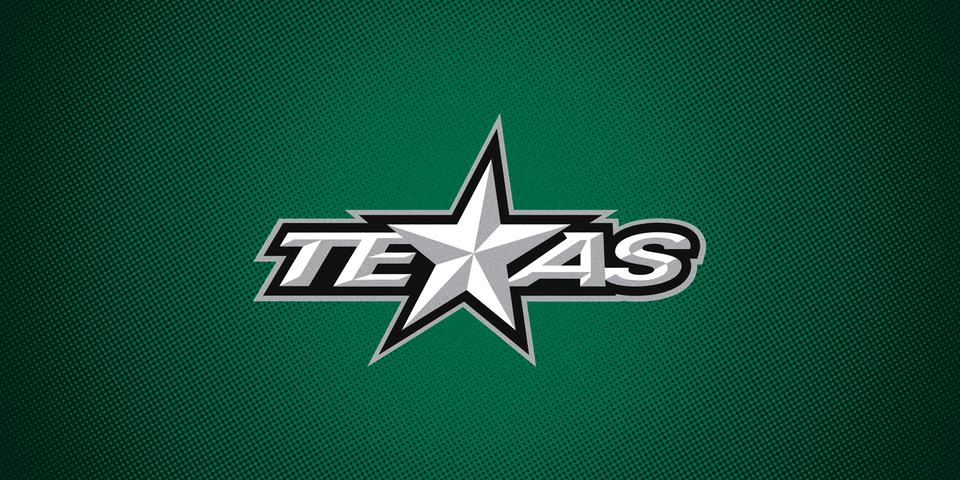
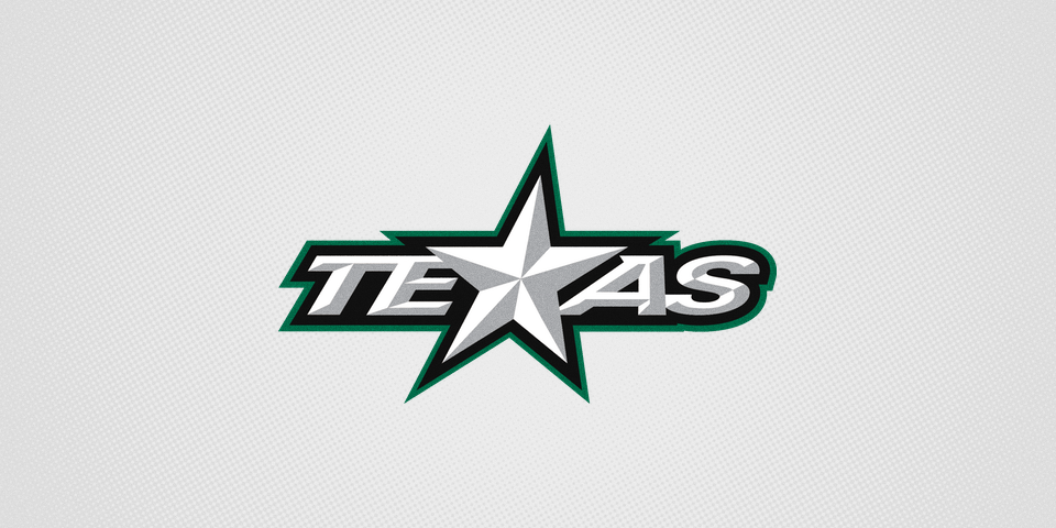
All that said, share your thoughts on the new look of the Texas Stars in the comments! And before we go, take a final look at the old logos.